Photoshop for the Curious
Levels and Curves and Oh my!
Photoshop’s Brightness/Contrast adjustment is for wimps.
There, I said it, and I’m not sorry. Sure, it’s simple, handy, and produces results that are easy to anticipate. But it can be a little dangerous. It’s a pretty good bet that every time you use it, you actually lose part of your photo. The problem with Brightness/Contrast is that it performs the adjustment with absolutely no bias. When it comes to your photos, that’s a bad thing. When you change the brightness, every pixel is adjusted, and that isn’t usually what’s best for a photo.
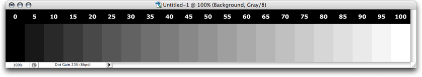
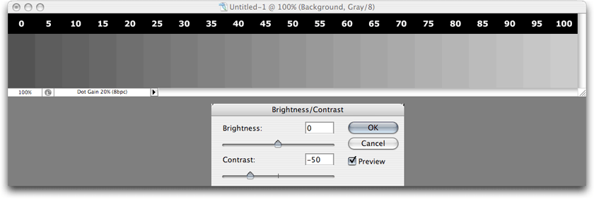
This is our control specimen. Think of it as a grayscale photo. It represents shades of gray in 5% increments, 0% = black and 100% = white.
Why Brightness/Contrast Is Dangerous
For example, suppose you want to brighten a photo by 15%. If you assume that 0% is solid black and 100% is white, then every pixel’s percentage of gray between 0 and 100 will have 15 added to it. Consequently, every pixel that’s already at 85% or higher will become 100%. The same is true in reverse if you darken a photo.
There’s often a lot of detail in those brightest and darkest areas in those photos. You may recall the tutorial from February where I started with just the Brightness/Contrast on the grayscale photo. The results looked better, but the subtle light gray details in the clouds turned solid white, and details in the dark shadows in the grass nearly disappeared.
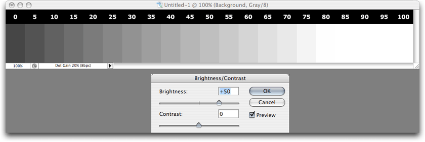
Increasing the brightness blindly lightens every pixel.
As you can see above, 80% and above has completely blown white, and as much of a concern is what +50 on the slider actually means. It clearly doesn’t mean 50%. Even though the Brightness/Contrast sliders range between +100 and -100, those numbers don’t even translate to percentage. Also notice that the solid black is now a dark gray.
Similarly, darkening a photo plugs up the blacks and changes white to a dull gray.
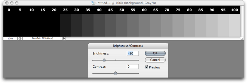
At -50 on the slider, 20% and darker has become solid black.
Using the contrast slider essentially doubles the problem.
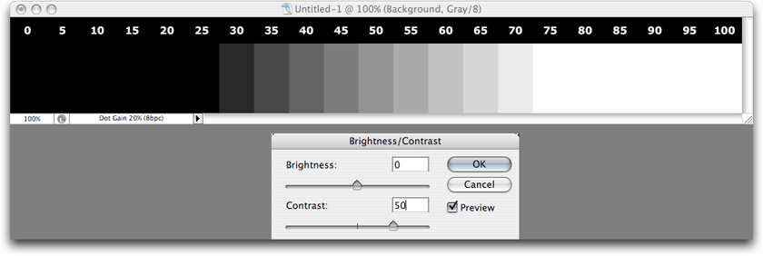
Increasing contrast blows detail out of both the shadows and the highlights—a two-fer!
Reducing contrast flattens out all the shades, causing the shadows to lighten and the highlights to darken.
I said above that Brightness/Contrast works with no bias. The truth is, most photos do not need adjustment in the darkest darks or whitest whites. It’s generally the middle shades that are in need of adjustment. So how do we adjust brightness and contrast on just those midtones?
The Levels Adjustment Window
Here’s where the Levels and the Curves adjustments enter the field. Levels is the simpler of the two and will suffice for most purposes.
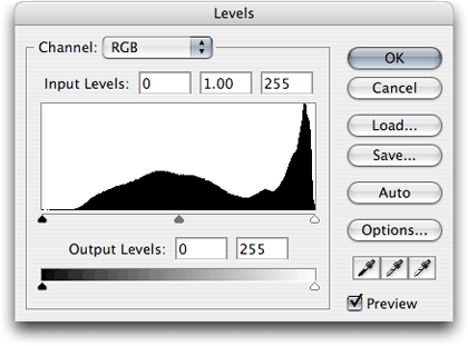
The Levels adjustment window, accessed via the Image ‣ Adjustments menu.
With the Levels adjustment, you have five sliders instead of two, but there’s really only one you’ll usually need. Look at the histogram in the Levels window above. That’s the part with the odd-looking black blob that peaks tall on the right side (but remember that its shape will be different for every image). It’s a representation of how much of a shade is in your photo—blacks (shadows) on the left, grays (midtones) in the middle, and whites (highlights) on the right. You’ll also see five little triangles that can be slid horizontally. The left slider of the upper three is colored black. Sliding it to the right affects the shadows.
This shadows slider sets the point at which pixels become solid black. Every shade at the same point as the slider and darker (to the left) is black.
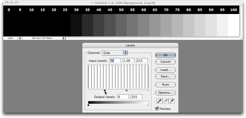
You’ll notice that the histogram area is no longer a black blob, but is now many vertical lines. Since my sample photo contains specific 5% increment shades in equal amounts, the lines you see in the histogram are representations of each shade. The black shape in the prior image above is more typical of what you’ll usually see. Most of the tones will be in the middle, though there is often a spike in the highlights whenever a photo includes a bright sky.
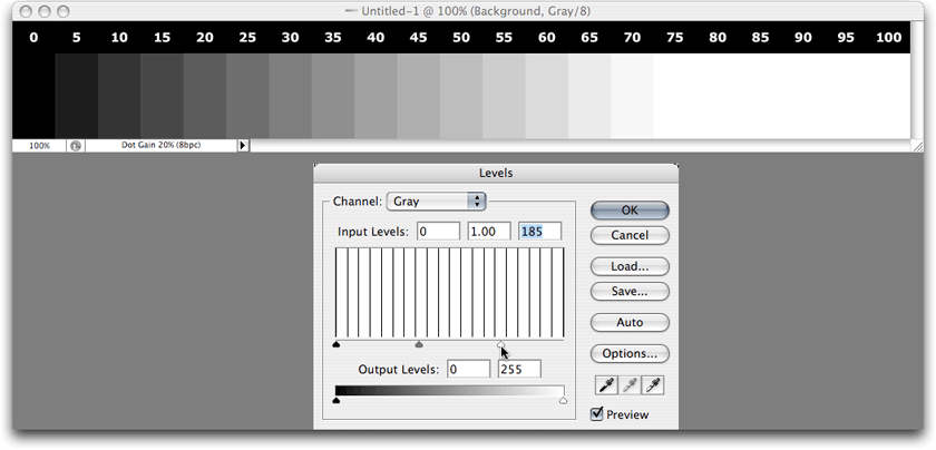
The highlights slider performs a similar, but opposite, function. Every shade at the same point as the slider and brighter (to the right) will be completely white.
Since the majority of tones are usually in the middle, this is the reason why being able to adjust only the midtones while leaving the highlights and shadows alone is frequently the best way to adjust a photo.
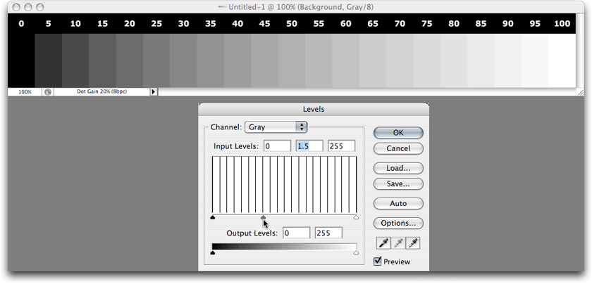
The gray-colored midtones slider defines what shades will be 50% gray.
When using the Levels adjustment, the midtones slider is most often what you want to start with. In the image above, you see that it has been slid to the left. You’ve already learned that the darker shades of a photo are represented toward the left side of the histogram. And you’ve also learned in the above image’s caption that the slider defines what should be 50% gray. Therefore, when this slider is moved to the left, you’re defining a darker shade as 50%. If you compare the above screenshot with the control specimen (the first image up above), you’ll see that all of the shades in the middle have become brighter, but the shadows are still black and the highlights are still white.
So, this enables you to brighten or darken a photo without destroying the highlights and shadows. But what if you want to change the contrast? That’s where the the shadows and highlights sliders come into play. Let’s look again at the histogram of a more typical photograph:
The spike on the right side is representative of a large, bright area in a photograph such as a sky.
The spike for the sky notwithstanding, the histograms of many photos will exhibit a hump-like pattern with very little of the darkest or brightest portions and the most common shades in the middle. You might be thinking that you’d want to set the midtones slider wherever the hump is at its highest. By all means, try it, but look at your photo while you do it. Setting the midtones slider at that point isn’t necessarily the best place to leave that adjustment.
Getting back to contrast, you’ll see that the left side of the histogram falls off to nearly solid black before reaching the far left edge. This means that very little or none of the photo is actually solid black. You can move the shadows slider to the right to come closer to where the darkest shades fall off, but I don’t recommend placing the slider directly beneath where the falloff occurs. The shadow detail will retain better visibility if the slider is a bit left of the falloff point.
Similarly, you can do the same with the highlights, dropping the highlights slider to the left, not quite to where the falloff occurs. However, in this example, dropping the highlights slider would begin to blow out the subtle details in the brightest highlights (represented by that spike).
In the interest of completeness, I’ll describe the remaining two sliders at the bottom of the Levels adjustment window. However, you’ll probably find that these sliders are used extremely infrequently—if at all.
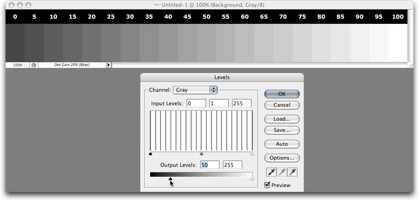
The shadows slider in the lower portion has the opposite effect as the shadows slider in the upper portion.
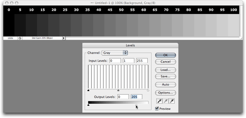
Likewise, the highlights slider in the lower portion has the opposite effect as the highlights slider in the upper portion.
Raising the shadow slider in the Output Levels section will brighten the shadows. If it is raised approximately 20%, then no portion of your photo will have shades darker than 20%. Conversely, dropping the Output Levels’ highlights slider will darken the highlights. Lowering it approximately 20% will mean that no portion of your photo will have shades brighter than 80%.
There’s no denying that using the Levels adjustment is a bit more work than using the Brightness/Contrast adjustment, but once you get comfortable with using Levels, the benefit far outweighs the little bit of extra work.
I used the Levels adjustment for a very long time—even for photos bound for commercial offset printing—before starting to use the Curves adjustment instead. Therefore, you can feel quite confident that if using the Curves adjustment window seems too complicated, staying with the Levels adjustment window is completely fine. Having said that, if you’re adventurous, or simply like to experiment, let’s move on.
The Curves Adjustment Window
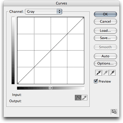
Calling it the Curves adjustment window might at first seem like a misnomer. If it’s called Curves, why are there only straight lines?
Before going any further, I have two suggestions. I’m not telling you that you must do these steps, but I highly recommend doing them.
First, move your mouse around inside of the grid area. You’ll see numbers appear next to the Input and Output lines near the bottom. These numbers correspond to the 0–255 scale often used to represent an amount of red, green, and blue color (RGB)—0 for none and 255 for maximum. For me, it is far easier to think in terms of percentage. If you agree, click the little double triangle in the middle of the gradient bar, just above the Input label. You’ll see both gradient bars reverse so that the whites are in the lower left instead of the blacks. And, if you move your mouse around the grid, you’ll see that the Input and Output values are now represented from 0–100%.
Second, since we’re dealing in percentages, it might make more sense to use a grid in 10% steps instead of 25%. Hold down the option key and click anywhere in the grid.
The Curves adjustment window has now been adjusted to use percentage values and show a tighter grid.
I’ll probably get comments that call me out on something that may be a point of confusion, so let me try to answer such comments in advance. In my images above, you’ll see that I represented black as 0% and white as 100%. However, if you implement my suggestions to the Curves window, it seems to imply that black is 100% and white is 0%.
The fact of the matter is, it really doesn’t matter. It’s all in how you like to think. The Curves adjustment layer, when set to percentage mode, requires me to think that 80% is a dark shade of gray. I accept that. But for most other tasks, my brain works better to think of 80% as a light shade of gray. That’s just how I’m wired. It only takes a reversal of math to switch. For simplicity, I probably should have made the above screenshots for the Levels adjustment window to show black as 100% and white as 0%. But I didn’t, and I’m glad I didn’t because it allowed me to make this point, that you would do well to not permanently lock your thinking on the 0–100% scale only representing black to white or white to black.
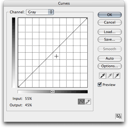
So what is so much better about Curves than Levels? You’ll remember that the Levels adjustment window only offers adjustments to define what part of your photo will be 100%, 50% and 0%. The Curves adjustment window, on the other hand, allows you to make the same definition at any percentage, and to make as many definitions as you need.
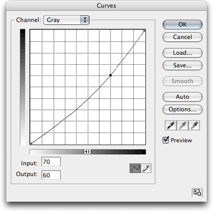
A common Curves adjustment for my photos.
As you can see above, I have adjusted an image by clicking a new control dot on the diagonal line at the 70% mark and lowered it to 60%, as seen in the Output section. For my tastes, brighting the darker shades around 70–80% produces a better brightening than using the 50% midtone slider of the Levels adjustment. Of course, you can always set a control dot at the 50% point in the Curves adjustment window and accomplish the identical function as the Levels window’s midtone slider.
It now becomes clear why this is called the Curves adjustment window. Initially, the diagonal line is linear to evenly represent that every percentage represents the actual number. 0 is 0. 25 is 25. 60 is 60. You get the idea. When a control dot is created and adjusted, all the other percentage values bend toward that control dot to create a smooth blend from one dot to the next.
For photos that are in extremely poor shape—or for having some funky fun with a photo—you can try more extreme curves.
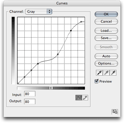
A rather extreme Curves adjustment.
The curve depicted above is in the general neighborhood of an adjustment I made to a photo that needed a lot of help. You can see that I locked the 10, 20, and 30% points so that my highlights wouldn’t change. I then shifted the 60% point a considerable amount. It was this area of shade within the photo that needed a considerable amount of brightening. You’ll also note that I locked 80% in place, but pulled the 100% adjustment away to lighten the blacks.
Believe me, this particular adjustment was anything but ordinary. But looking at this type of adjustment goes to show the high degree of control you can have instead of relying solely on the Brightness/Contrast adjustment.
The most important tip I can leave you with is this: regardless whether you use the Levels or Curves adjustment windows—or even if you bullishly stay with the Brightness/Contrast adjustment—always look at your photo while making the adjustments. It’s easy to pay more attention to the adjustment window than to the photo being adjusted. I’ve even overheard advice to just blindly bump the Levels midtone slider to the left by a certain percent, and your photo will be fine. While it’s true that this universal tip may work much of the time, it won’t always be true. Again, look at your photo while making the adjustment, and don’t always assume your photo even needs a massive amount of adjustment. I can think of numerous times I made such a subtle tweak to the Curves window that most people would never be able to tell the difference. But I could tell the difference, and I liked it. After all, unless I’m doing work for a client, the whole point is to make the photo look like what I want it to look like, right?
Homework Assignment
I think you already know what this month’s homework assignment will be. Dig out the original, unaltered versions of some of your favorite photos. Make copies of them (as always, never work on your original photos—only on copies) and start experimenting with Levels and Curves. Try some extreme adjustments just to see what they do, but don’t forget that very subtle adjustments are most often the key.
Next Month and Beyond
Based on suggestions both from readers and staff, as well as my own whim, I’ve already got a respectable list of tutorials to prepare for upcoming issues of ATPM. In order to keep myself on track, and to help you know what’s coming, I’ll keep a “Coming Soon” list, of sorts, at the bottom of this column from now on. Note that even though the intent is that these will each be covered in successive months, they could rearrange or gain additions at any time.
- Do Not Adjust Your Television Set—but Definitely Adjust Your Photos (Moving Beyond Levels and Curves)
- What Does “Dots Per Inch” Really Mean? (A Tutorial On Resolution)
- Effective Layer Effects
- Conjuring Speech/Thought Bubbles
- Creating Seamless Tiles
- Mask-erades
- Fun With the Automate Menu
- Photomerge
- Fun With Filters
- File Format Fever
If you have an area you’d like me to cover, just speak out. I’m definitely interested in expanding this list with topics that are of interest to you.
![]() Copyright © 2007 Lee Bennett, lbennett@atpm.com.
Copyright © 2007 Lee Bennett, lbennett@atpm.com.
Also in This Series
- File Format Fever · November 2008
- Don’t Reset—Preset! · October 2008
- Don’t Yield—Merge! · September 2008
- What If I Just Left It Alone? · August 2008
- Screen Replacements—When Reality Isn’t Real Enough · July 2008
- No Smoking Gun: Re-tooling Dodge and Burn · May 2008
- Mask-erades · February 2008
- Back in February · November 2007
- I Love Layers · October 2007
- Complete Archive
Reader Comments (3)
Up to now I didn't really realize the difference between Levels and Curves adjustment. It's also very well visualized by using the gray steps.
It's really good to learn the difference between levels and curves as i wasn;t aware.
Thank you!
Add A Comment