Photoshop for the Curious
What If I Just Left It Alone?
Let’s take a little break from the regular tutorials to think about a very simple, yet very important decision for each and every photograph that is a candidate to run through Photoshop: to adjust, or not to adjust. This decision manifests itself in the form of three questions:
- What kind of adjustments are needed on this photo?
- Why are they needed?
- Does it even need any adjustment at all?
I’ve seen plenty of Photoshop tutorials that do a great job of explaining the various adjustment tools available—and I hope the tutorials I’ve offered in Photoshop for the Curious are worthy to join them (wink wink). However, for the purposes of demonstration, a photo with a blatant need for some sort of correction is always used.
Give the Camera Some Credit
The truth is, modern digital cameras tend to capture splendid photos. Even with my small point-and-shoot camera—an Olympus Stylus 720 SW—I routinely snap photos that I don’t feel require a trip through Photoshop. For example:

The only thing I might have done to this photo is a bit of cropping.
Other than possibly (but not necessarily) cropping a bit off the bottom, I was very happy with this photo (and so was the girl’s mother). The flash kicked in even though it was sunny, filling in the harsh shadows. The color looks nice, and details are sharp. When I think about those three questions for deciding what to do to photos, I’m inclined to look at the third question and decide I am going to leave it alone.
Consider how many untold numbers of people take an even greater untold number of digital pictures to a photo lab to get prints made. If most of those photos were in blatant need of a trip through Photoshop, I don’t imagine so many people would be spending all that money on digital cameras and prints. Customers expect great photos right out of their cameras and, often enough, the cameras deliver.
Even still, there will always be some shots that didn’t initially turn out so well, but can be salvaged. So, here’s where I let you in on a not-so-well-kept secret: I have never had any formal training in photo adjustment techniques. Well, OK, I did once have a pro come for some one-on-one training in color management at my office, but that had more to do with adjustments needed for commercial offset printing—not personal photos that never go through the offset printing process. Yet, I’m asked somewhat often how I know what to do to a photo. As a matter of fact, this very question put to me by ATPM’s publisher is exactly what spawned Photoshop for the Curious in the first place.
So, How Do I Know When to Adjust?
The best answer that doesn’t involve registering for Photoshop courses is to start taking a good long look at all sorts of photos with a critical mind and ask yourself things like, “Do I feel like I’m looking at this photo through a pair of orange-tinted [or whatever color] glasses? Does the photo seem dull? Do I like it exactly as it is?”
Admittedly, it’ll take practice. I assure you, when I started using Photoshop, I made a horrid mess out of most color adjustment attempts for a long time. Even today, some photos will stump me and I’ll only work with them to an acceptable outcome rather than ideal.
I hope you’ve surmised by now that there’s no such thing as a simple set of steps that will improve any photo. As long as the monitor being used is reasonably calibrated and you do not have symptoms of color blindness, I really don’t believe there’s a specific skill required other than just taking the time to practice. You can definitely teach yourself, which is exactly what I’ve done over the past 15 years. This is why I’ve always stressed in the past to edit copies of photos and save the originals. If the outcome of your adjustments isn’t to your liking, examine what it is that didn’t work with the result and try again.
Adjust, or Not to Adjust…

Original available-light group photo.
Once again, the goal is just to look at the photo and consider what it needs. This shot was taken with the available incandescent light in the room. Often enough, a digital camera can sense such color shifts and adjust the white balance to compensate, but there are many factors that can sometimes throw off the auto-adjustment. So, in this case, the warm color cast is the biggest concern I have.
As I continue to study the photo, my secondary concerns are that people in the middle are much brighter than the rest due to overhead directional lights. I also don’t like the very prominent table in the foreground, nor the fact that something caused a reflection that appears as a light blob near the bottom of the frame.
Fortunately, a simple crop will take care of those last two problems. Even without cropping, the reflection could be pretty easily removed with the Clone Stamp tool. I must also remember that if I crop too much and if I want to make a print from this photo, a cropped version may not fit the standard sizes used by photo labs and a special-size print would be needed.
Once I’ve considered what the photo needs, I can now address those needs in Photoshop. After cropping, I’ll deal with the brighter lighting in the middle. I could use the Dodge and Burn tools, but I’ll instead make a rough Lasso selection around the bright areas and feather the selection a generous amount. Now, I can use either the Levels or Curves tools to gradually improve the shades in that area to not be so bright. Next, I simply invert the selection and use the Levels or Curves tools to lighten everyone else in the photo.
After I’ve balanced the lighting a bit, it’s time to take care of that bad color cast. A quick trip through the Color Balance palette, followed by a touch of sharpening, and voila:

The same photo after a run through Photoshop.
I could probably spend even more time on the people in the back row since they were in a pretty heavy shadow at the time the photo was taken, but even still, the photo has been improved.
Oh, that whole part about gaining the experience over time by practicing? Here, let me help you along, and consider this one of those little tidbits you pick up as you’re building your experience: I’ve discovered that the Color Balance palette works a lot more predictably if the photo is in CMYK color mode instead of RGB. The only problem with this is that the CMYK color space is smaller than RGB.
Fortunately, this isn’t too often a problem, especially in most of my work. Since many of the photos I work with are bound for offset printing, they have to be in CMYK mode anyway. But, even for photos that won’t go on press, the smaller color space usually isn’t noticeable. If you choose to give this tip a try, make sure to stare at your photo when you change it to CMYK. You might even use the Undo command to toggle back and forth so you can compare the differences. Very bright reds, blues, and greens, will tend to lose some brilliance when converted to CMYK. So, as I’ve been saying, study the photo, and decide for yourself whether or not you’re OK with what you see. If you don’t like it, Undo back to RGB.
Let’s try one more:

Shooting anything up toward the sky almost always throws off a camera’s light meter.
Clearly, my camera metered a bright, albeit overcast, sky. As a result, the sign is too dark. At first, I tried for just a basic brightening of this photo, but long before the sign was to my liking, the sky was completely blown out white. So, I got a little creative with a Curves adjustment:
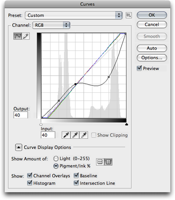
The initial Curves adjustment.
The grey spikes on the left (brighter) side of the histogram represent the sky, and the peaks toward the right are showing the darker sign. So, I created two anchor points in the adjustment curve over the lighter portion to lock it in place, then used a third point to brighten the darker part of the photo.
This was a pretty nice improvement, but I wanted it better. Even though the sign was lighter, the white letters didn’t look right. Remember, I had locked the lighter shades in the first adjustment. To address this, I used the Quick Selection tool (which is a subset of the Magic Wand tool) to create a selection of the sky. I inverted the selection to affect only the sign, then used the Refine Edge command to soften the selection. Finally, I used the Levels adjustment palette to brighten the highlights of the sign.

Yes, it was overcast and rainy this day. (By the way, Lambert’s Cafe is an awesome place to eat if you ever have the opportunity.)
I Reject Your Reality and Substitute My Own
Bringing a photo closer to reality does not necessarily have to be the goal when choosing how to adjust the image.
Let’s go on a virtual field trip. I like to occasionally look through some of the portraits taken by a particular Flickr user. I imagine, judging from her list of equipment, that many of her photos straight out of the camera are fantastic.
However, often her style is to create photos with adjustments that better convey a desired mood. Many of her photos are of models in cheerful poses, and she seems to like to push the color saturation a bit higher to emphasize the mood. For example, this photo shows some vibrant colors in the model’s outfit—probably brighter than real-life perception.
Here’s another photo with an effect that intrigued me. The photographer increased the saturation in the green grass and seems to have reduced saturation in the model’s skin tones. However, I look at this photo and can’t help but think what I might have done to it to come closer to my tastes. One easy fix would have been to erase what I suspect is a clump of leaves hanging out of the top right corner of the frame. I may have also done something about the fact that a light flare from the sun is washing out the model’s face.
Let’s go for one more. It’s pretty obvious the day was overcast and rainy during this photo shoot. The photographer chose to modify the dull, gray tones into green shades. I really liked the effect. Compare it to another photo that I imagine is closer to how the day may have really looked.
Homework Assignment
Try starting a small journal log of the adjustments you make to some of your favorite photos. Be very specific about not only each step you performed to adjust the photo, but why you chose to do that step. Were you trying to get closer to real colors? Were you trying to make it look gloomy? Were you addressing a specific problem with the photo? Did each step accomplish what you intended? When you’re done, make a final comment about how you felt with the end result.
Keep up with this log for a dozen or more photos, then review your past comments. Perhaps you’ll find photos both from early and late in the journal log where you were trying to accomplish a similar goal, but took different approaches to get there. Think about which steps were most satisfactory to you.
![]() Copyright © 2008 Lee Bennett, lbennett@atpm.com.
Copyright © 2008 Lee Bennett, lbennett@atpm.com.
Also in This Series
- File Format Fever · November 2008
- Don’t Reset—Preset! · October 2008
- Don’t Yield—Merge! · September 2008
- What If I Just Left It Alone? · August 2008
- Screen Replacements—When Reality Isn’t Real Enough · July 2008
- No Smoking Gun: Re-tooling Dodge and Burn · May 2008
- Mask-erades · February 2008
- Back in February · November 2007
- I Love Layers · October 2007
- Complete Archive
Reader Comments (0)
Add A Comment