Photoshop for the Curious
Moving Beyond Levels and Curves
Levels and Curves Follow Up
After I turned in last month’s column, I received a comment saying I only described how to use the Levels and Curves adjustments and didn’t really touch on when or why to use them. This troubled me but, after a bit of thought, I realized why I didn’t suggest when or why. It’s not a hard rule or science. I can think of no set of conditions where you must always perform a particular adjustment. Sure, there are plenty of times where a particular adjustment would be preferred by most people. However, at the end of the day, it is completely up to your tastes (or your client’s tastes!) to decide when and why to make adjustments to photos.
The best advice I have to offer is to really look at your photo. Study it. Critique it. Does it really need to be lightened or darkened? When you first look at a photo, is a distracting highlight the thing that catches your eye instead of the main subject? You really are your own best critic, and never let anyone else tell you otherwise.
With that in mind, I will take a risk and say that, more often than not, my photos often get a slight bump lighter in the 70% region (remember, my brain works best when I think of 100% as white but if you like 100% as black, then it’s the 30% region), the red hues are diminished a little bit, then the overall color saturation is kicked up a little. This is not a universal procedure I apply to every single one of my photos. It’s only a common procedure. I tend to like my photos a little bit lighter and a little less red than what most digital cameras capture, and a subtle boost in saturation is often (but not always) a good thing.
You’re welcome to try this series of adjustments and see what you like. But, when using both the Levels and Curves adjustments that were discussed last month and some of the other adjustments we’ll cover this month, I urge you to remember that the end result should be what you like—not what someone else thinks you should like.
Do Not Adjust Your Television Set…
Let’s have a look at the Image ‣ Adjustments menu:
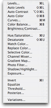
The Adjustments menu. Last month, we covered Levels, Curves, and Brightness/Contrast. The additional Adjustments menu items are on this month’s menu.
In the upper third of the menu, along with Levels, Curves, and Brightness/Contrast, you’ll also see three Auto items plus the Color Balance command. There’s no mysticism to the Auto commands. They really do simply perform an automatic adjustment using either the Levels or Brightness/Contrast interfaces, or a color adjustment using the Color Balance command that I’ll describe below. Go ahead and try them if you wish. If you don’t like the results, just hit the Undo command.
Remember, I said above that adjustments should be done according to your taste. If you like the results from an automatic adjustment, then it’s perfectly acceptable to use the Auto commands, as long as you remember that an automatic adjustment isn’t always the best adjustment. Also remember that I personally would steer away from Auto Contrast for the same reasons not to use the Brightness/Contrast adjustment (go back and read last month’s column if you don’t know why not).
Color Balance
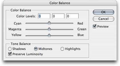
Think of the Color Balance adjustment control as the tint control on your television—on steroids.
I revealed above that many of my photos often receive an adjustment to diminish the red tones. You might have wondered how difficult that is to accomplish. It’s insanely easy. When you open the Color Balance window, you’ll see three sliders. Each slider performs a color shift toward complementary colors: Cyan and Red, Magenta and Green, and Yellow and Blue. As an alternative to saying that I diminish the red tones, it would be equally accurate to say that I increase the cyan tones. By increasing the cyans, I reduce the reds.
Like most all of Photoshop’s adjustment controls, subtle changes are almost always the key. Though the control allows for much more, I seldom go more than 10 levels towards Cyan.
Again, I urge you to study your photo, and this is why it’s important for your monitor to be reasonably calibrated. As you look at the image, does it seem like it has a green cast to it? Just bring up the Color Balance adjustment window and move the slider away from Green and toward Magenta a little bit.
Last month, I suggested that most Levels or Curves adjustments will occur in the midtones region. The same is true for making color adjustments. That’s where your eye sees the most color. Conversely, shadows are generally already black enough and highlights white enough. Adjusting the color in highlights might just serve to make white clouds appear yellow, for example. But maybe that’s the effect you’re going for!
Finally, you’ll almost always want to leave the Preserve Luminosity option checked. When it’s enabled, as you adjust the color sliders, the image will remain at the original luminosity (or brightness, if you prefer). If it’s unchecked, your image can get lighter or darker depending on which colors you are adjusting.
More Adjustments
The remainder of the Adjustments menu is where you can have a bit of fun and make some crazy-looking photos. Some of the items are better left for advanced users, so for those items, I’ll just give a short description of what the command is for.
Hue/Saturation
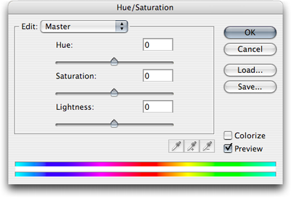
The Hue slider is also like your television’s Tint control—only not on steroids—and the Saturation slider is the Color knob.
This is the panel used to give color saturation a boost. Again, there’s no mysticism to these sliders. Give them a try. The Hue slider will make radical color shifts in your images, so take it easy. The Lightness slider you may generally want to leave alone for the same reasons not to use the Brightness/Contrast adjustment control. For some real fun, click the Colorize checkbox. Your image will look like it was drenched in a single color, and the Hue slider will change that color.
Also note the Master item visible in the pop-up menu. By default, these sliders will affect all the tones in your photo. But suppose you only want to increase the saturation in the sky, but leave the rest of your photo alone. Just select Cyans in that menu, and all the sliders will now only adjust the cyan colors. After choosing to edit something other than Master, you can even click somewhere in the photo to hone in closer on the exact colors you want to adjust. Advanced users will even use the eyedroppers with the + and - symbols to widen or restrict the range of colors on which they want to work.
Desaturate
There’s not much to say here. The Desaturate command is the same as opening the Hue/Saturation window and pulling the Saturation slider all the way to the left.
Match/Replace/Selective Color
Beginning Photoshop users probably won’t have much use for these advanced tools. I certainly don’t use them frequently. In fact, I don’t believe I’ve (yet) had a reason to use Match Color at all.
Replace Color, however, can be handy for performing a Hue/Saturation command on a specific range of colors. Replace Color works almost exactly like the Hue/Saturation adjustment window, except that it includes a preview representation of which colors will be affected.
Selective Color is another tool you can pass on for now. I use it on photos that are bound for a commercial offset press. If you are familiar with the concept of total ink density and are interested in making sure the dark shadows in your photos don’t plug up on the press with too much ink, e-mail me and I’ll describe the procedure.
Channel Mixer
The Channel Mixer is another advanced adjustment destined for an advanced class, but do remember from my earlier tutorial that this is the window where you can make better-looking grayscale photos by clicking the Monochrome checkbox before changing the Image ‣ Mode to grayscale.
Gradient Map
OK, time to have some fun. The Gradient Map adjustment won’t be of much use for making subtle improvements to your photos, but if your goal is to create something kind of trippy, this is definitely a tool you’ll want in your arsenal.
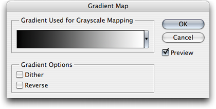
To create wild colors with the Gradient Map, you start with no colors at all—only grayscale.
To understand how the Gradient Map adjustment works, you’ll first need to think of your photo in terms of grayscale. This isn’t to say that you must first convert your photo to grayscale—only to think of it that way. The Gradient Map is going to make adjustments based on each equivalent grayscale shade in your photo. You start with a basic black-to-white gradient selected in the Gradient Map adjustment window. You’ll note that your photo has temporarily changed to grayscale. Now, just remember that the black-to-white gradient in the Gradient Map window corresponds to the same shades in your photo. The shadows are represented on the left side, and the highlights are represented on the right side.
Now, suppose the right side of the gradient were orange instead of white?

Presto chango! Black is now purple, and white is now orange!
You’ll remember the direction of the gradient when we first started. That same gradient now has purple on the left and orange on the right. The corresponding blacks, grays, and whites in the photo now match the gradient color that was chosen with the pop-up menu.
If you clicked the actual gradient instead of the tiny pop-up arrow on the right, the Gradient Editor appeared. This editor is where you can customize the colors and their positions instead of picking one of the default gradient choices.

Surreal-o-Vision!
In the above image, I started with the default chrome gradient and adjusted the color stops in the lower portion to make the colors blend better in the photo. When you click on one of the color stops, you’ll notice small diamond icons between the stops. These allow you to define the 50% point between two color stops. It’s difficult to describe in words. Drag one left and right and watch how the gradient stretches and compresses. You’ll see what I mean.
Photo Filter
The Photo Filter adjustment is perfect if you haven’t invested in a set of lens filters for your camera. It allows you to apply the same effect to your image as if you had a corresponding lens filter attached to your camera. Presents include six common warming and cooling filters (three each) in addition to several other base color presets. The specific color can be fine tuned as well as the perceived density of the filter.

The Sepia preset with about 50–70% density is one of my favorites.
Shadow/Highlight
The Shadow/Highlight adjustment window, in its simple form, is nearly identical to using the Shadow and Highlight sliders in the Levels adjustment window. The difference between the two is that the Levels window lets you see in a histogram where particular shades of color are, and the Shadow/Highlight window lets you make adjustments in specific percentages. As for the advanced version of the Shadow/Highlight adjustment, I’m not ashamed to be honest: these controls are beyond my experience, so we’ll leave them be.
Exposure
If you’re an advanced photographer and are familiar with exposure units, offsets, and gamma settings, here’s where you can tweak those values. Otherwise, feel free to pass on this advanced tool as well.
Invert
If some of the previous commands seemed complicated, here’s one that is most definitely not complicated. There aren’t even any adjustment sliders to deal with. It’s a single-shooter command that will invert the colors (or gray shades) of your image into a negative and vice versa.
Equalize
Equalize is something of an auto-adjustment command. It tends to work less aesthetically than Auto Levels or Auto Contrast. Instead, it goes more by the numbers. It will find the darkest and lightest pixels of your image and make them black and white, respectively. Then, as the name suggests, it will equalize all other colors as evenly as possible. While this will typically increase contrast in your image, it often becomes too dark or too light overall. Sometimes, though, I’ve really liked the results.
Threshold
You might recall when I said that referring to a photograph as black and white is something of a misnomer and that it should really be called a grayscale photo. The Threshold adjustment is one way to make a true black and white image.
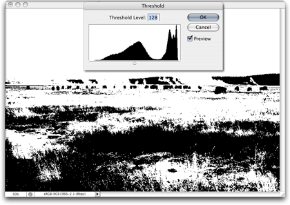
No shades of gray here.
When you access the Threshold adjustment, every pixel of your image will become either solid black or solid white. The “threshold” of whether a pixel becomes black or white depends on the location of the slider. A value of 128 is equivalent to 50%. Everything above (to the right) is white, and everything below (to the left) is black. Moving the slider simply defines where the switch from one to the other occurs.
Posterize
Another fun adjustment—Posterize starts similarly to the Threshold adjustment, but adds in other colors besides black and white—the number of additional colors is chosen in the Posterize window. You don’t have control over which colors are used. They are automatically chosen based on the average color in various regions of the photo. The higher the number of levels, the more natural the colors in your photo will appear.
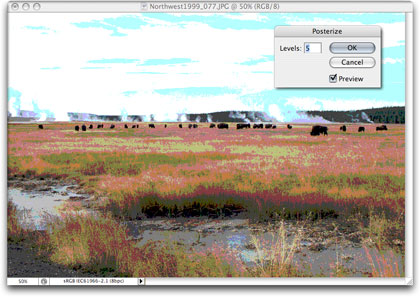
With this setting, the image is represented with only five different colors plus black and white.
Variations
If using the Color Balance and Hue/Saturation adjustments is just too much control for your comfort, try the Variations adjustment instead. With it, you can add or remove various colors in a plain-English interface: More Red, More Yellow, etc.

The Variations adjustment window offers simple and quick color shifts to photos.
Using the Variations adjustment window is probably about as close as you’ll get to satisfying an instant gratification tendency. In the screenshot above, I moved the slider toward Coarse to better show the possible changes to color and brightness. In real life, you’ll probably want to use a more Fine setting.
It should be apparent that any color adjustment in one direction can be reversed by selecting the adjustment in the opposite direction. More Cyan equals less Red, and more Red equals less Cyan, and so on.
As with the Color Balance adjustment, you can make changes to the midtones as well as the shadows and the highlights. Also note the Show Clipping checkbox. It’s good to leave that enabled, as it will reveal when a color has reached a maximum.
Homework Assignment
Your homework for this month is perform color improvements on some of your own photos. You may have a few favorites that you’d like to work on, or you may have some photos that might have been your favorites, but the color isn’t what you had hoped. Even though I said above that, ultimately, you are your own best critic, it still doesn’t hurt to have a friend or family member look at one of your adjusted photos and have them tell you what they think. You might even want to let them compare before and after.
Even though I’m probably sounding like a broken record, I’ll remind you to never work on your original photo file. Make a copy and work on that. Keep your original safe—no matter how much color correction it needs.
If you don’t have any suitable photos to experiment on, you can try this one:
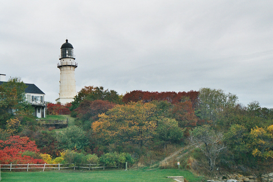
Sample photo for color correction experimentation. This version is the original, scanned from a negative, with no adjustments to levels, curves, or color.
Compare it to the adjusted version offered last month as part of our desktop picture series. See if you can make the original version above look closer to the version that appeared last month.
Topics For Upcoming Months
- What Does “Dots Per Inch” Really Mean? (A Tutorial On Resolution)
- Effective Layer Effects
- Conjuring Speech/Thought Bubbles
- Creating Seamless Tiles
- Mask-erades
- Fun With the Automate Menu
- Photomerge
- Fun With Filters
- File Format Fever
If you have a topic suggestion, please share it. I’m definitely interested in expanding this list with topics that are of interest to you.
![]() Copyright © 2007 Lee Bennett, lbennett@atpm.com.
Copyright © 2007 Lee Bennett, lbennett@atpm.com.
Also in This Series
- File Format Fever · November 2008
- Don’t Reset—Preset! · October 2008
- Don’t Yield—Merge! · September 2008
- What If I Just Left It Alone? · August 2008
- Screen Replacements—When Reality Isn’t Real Enough · July 2008
- No Smoking Gun: Re-tooling Dodge and Burn · May 2008
- Mask-erades · February 2008
- Back in February · November 2007
- I Love Layers · October 2007
- Complete Archive
Reader Comments (9)
I seem to recall a comment from a reader's letter in a UK Camera Magazine, with which the editor agreed. You should not work with jpg files in photoshop as the file degrades with subsequent saves. I now always work with a psd copy until satisfied.
My directive to work on copies of files, however, is not given for the issue of JPG degradation, but rather so that you don't perform some edit/adjustment and come back to that photo at a later date wishing you had the version without that edit. Or, even worse, something goes bad with the photo and it can no longer be opened.
But your point is equally valid, especially since most "original" photo files are JPGs that come out of digital cameras. If you perform some adjustments to a photo and plan to save it as a JPG, that's even more of a reason to be working on a copy. Re-saving a JPG does, indeed, degrade it, although some people mistakenly believe that if an image that remains open on your screen is saved as a JPG, is not closed and then saved again, it degrades. That's not true. The degradation occurs if you save as a JPG, close the image, and then open the JPG you saved.
Wow, speaking of saving, I'd better hang on to a copy of this comment response. It's part of what I'm planning to cover in a future installment: File Format Fever.
Use nondestructive image editing.
When you open your file hit CMD+J and than from layer palette bottom part choose adjustments.
Every adjustment layer can be masked and painted.
You can stack your curves/levels/etc layers in groups, and have real process.
In other words you don`t react with pixels in destructive manner:))
Personally, for most things I do, I'm content with the original file from my digital camera (generally a JPG), and either a TIFF or standard Photoshop format version with my final adjustments.
Is CMD+J (which I use when I need to work on isolated sections of my picture, which I select with the lasso tool and then "send" on a different layer etc.) the same as "duplicate original layer?"
For the pictures that I deem worthy of revisiting some day, I do save as a copy and work on the copy.
Then, I open that copy in Photoshop. I systematically duplicate the original layer (double-click to unlock, name it, then drag the layer onto the layer icon at the bottom of the tool strip) then I "blind" the original layer by turning the eye off. It guarantees that I don't alter anything on the "original layer". And if I need something from the original, such as an overlay, I duplicate that layer again. Or if I need to start over . . . I simply discard the layers I worked on and my original layer is right in front of me again. It saves me time instead of again having to chase the original in the hard-drive, then copy again etc... When I save as a Final Stage, only then do I discard the duplicate "original" layer, to reduce the file size, of course.
And if the original selected layer is affected by any amount of selection (via Lasso or other means), then only the selected portions of that layer will be copied to the new layer.
With nothing selected, Command+J is functionally identical to dragging a layer to the New Layer icon at the bottom of the Layers palette.
Your workflow is sound—always being able to go back to the original. Congrats!
Step one:
Use adjustment layer and activate "Threshold".
Take the slider and drag it to the left and to the point when you can see the darkest part of your image. Move your mouse to this point and holding shift click once.
Then move the slider to the right position (to see the white point) and again shift+click.
Then hit cancel.
Step two:
Activate "Curves" via adjustment layer icon.
In bottom part of curve you will see eyedropper tool for black, middle an white.
Activate black tool end click to crosspoint in the picture then do this for white point.
Now you can start working with color. Or apply basic S-curve for enhancing contrast.
(I hope this will help, sorry for my english.)
Add A Comment