Photoshop for the Curious
Effective Layer Effects
New Toys
Before getting into this particular Photoshop topic, I’m going to take a moment to mention this particular Mac-enthusiast’s latest acquisitions. Most importantly, I’ll now be writing to you from a Santa Rosa–powered, LED-backlit MacBook Pro. But even though that’s most important to me, you won’t really see any difference, will you?
The second acquisition, however, is one you will notice, beginning with this month’s column. I picked up the Adobe CS3 upgrade for my office and, since a Creative Suite license allows for two installations to be activated (the intent being to allow a designer to have CS installed on a desktop machine for primary work and a laptop for travel work—which is exactly the case for me), I get to use CS3 at home. Yes, I’m well aware if I ever stop working at my current place of employment, I’d be legally obligated to deactivate it on my personal computer—and I most certainly would do so.
But the reason for my telling you about this is because, obviously, all future screenshots and descriptions are going to come from a Photoshop CS3 (that’s Photoshop version 10) perspective. While the majority of the palettes are functionally the same (there are a few new ones), the engine for organizing them and methods for collapsing them is completely different—a big improvement, if you ask me.
Suffice to say, I’ll start thinking about a future column to talk about some of the new cool things in Photoshop CS3, especially the new palette engine. Meanwhile, in the short term, I’ll do my best to be mindful of anything I write about that is different in CS3 than it was in CS2.
Nomenclature
Last month, I briefly exposed you to the Layer Styles, which let us create a drop shadow on the speech and thought bubbles. Let me make a little clarification. You might have a bit of cognitive dissonance over the fact that I named this topic “Effective Layer Effects,” but the Photoshop feature we’ll cover this month is actually called Layer Styles. My explanation is simple. I’ve called them Layer Effects for years and have been, as it turns out, wrong. But I’m not the only one and, if you browse online forums covering Photoshop, you’ll find other people who call them Layer Effects, too. The point is, whether you refer to them as Layer Styles or Layer Effects, we’re talking about the exact same thing.
Onward.
In Preparation of Layer Styles
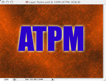
We’ll begin with some plain text that should show off the results of various Layer Styles well. You can, however, apply Layer Styles to any graphic that has transparency on its layer.
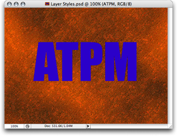
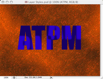
This Photoshop document consists simply of a text layer with the ATPM letters positioned atop a background layer of a texture I randomly chose.
It is important to note that Layer Styles, as the name implies, affect individual layers. That means the image to which you want to apply an effect should be on a layer by itself. In the screenshot above, the ATPM layer is completely transparent except for where the letters themselves are positioned.
To start applying Layer Styles, with the desired layer selected in the Layers palette, you can either directly choose an effect from the Layer ‣ Layer Style menu, or use my preferred method of simply double-clicking the thumbnail in the Layers palette that you want to work on. (Note, if you’re applying a Style to a text layer, you must hold the Option key while double-clicking the thumbnail.)
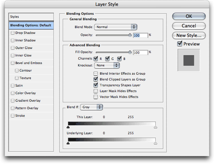
The basic Layer Style palette with no Styles selected.
The default pane of the Layer Style palette is called Blending Options. Many of the options on this pane are somewhat advanced and you can experiment with them later, but you may want to try out the General Blending settings after you’ve applied a Layer Style. Changing the Blend Mode causes the effects to be rendered based on different mathematical formulas, and the Opacity slider allows you to leave the effect fully opaque or any percentage of translucency.
Don’t be frightened by these Layer Styles. Every one of them is quite straightforward, and the best thing is that Layer Styles are nondestructive. That means if you don’t like what you did, you can easily change it or turn it back off.
Drop Shadow
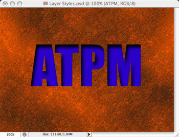
Drop shadows are arguably the most commonly used Layer Style.

Drop Shadows give the illusion of something floating above items on layers underneath.
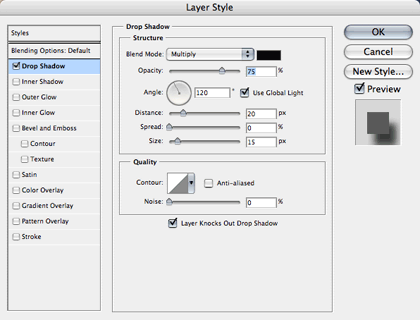
Drop Shadow settings.
As you can see, the Drop Shadow Style creates a dark shade behind the image. You can change the color of the shadow by clicking the black rectangle next to the Blend Mode menu, and even experiment with different Blend Modes. The Opacity slider should be pretty obvious, allowing you to set how dark the shadow will burn into whatever is in the background.
The Angle selector defines the direction that the light that’s creating the shadow is coming from. Each Photoshop document can have one Global Light definition so that you can easily match the light direction used for all your Layer Styles.
The Distance selector defines how many pixels away from center the shadow will be offset.
Think of Spread as sort of a way to burn in the shadow, making it fill out more than it should. Try it, and you’ll see the results.
Finally, the Size selector lets you set how many pixels of blurring to use in the shadow. Setting it to zero produces a hard-edged shadow. The higher the number, the softer the shadow edges.
The items in the Quality section are a bit more advanced. The Contour setting lets you adjust the exact level of shades from 0% to 100%. It works exactly like Curves adjustments on your photos. With the Contour setting, you’re only adjusting the Layer Style.
Unless you deal with commercial offset printing, the Layer Knocks Out Drop Shadow checkbox will probably be of absolutely no consequence to you. Just leave it on.
Inner Shadow
The Inner Shadow Style settings are mostly identical to Drop Shadow. The difference is that the shadow appears within the confines of the graphic instead of on the outside. The result is usually a shadow that makes the object appear to be cut out of whatever background is surrounding it.
The Inner Shadow Style has made the letters look as if they were cut out of the background.
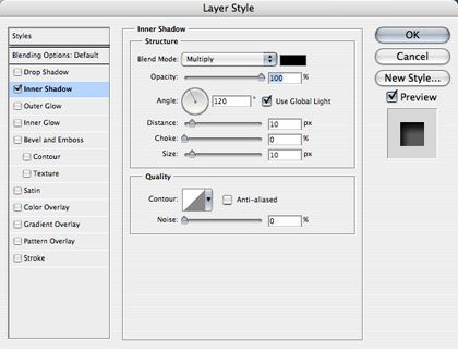
Inner Shadow settings.
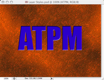
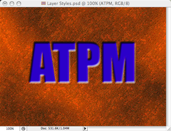
I’m going to briefly get ahead of myself here and demonstrate that Layer Styles can be combined.

The same Inner Shadow Style plus the addition of a Bevel effect.
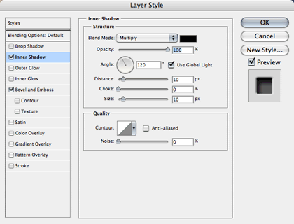
Note both Style checkboxes are enabled. Any or all Styles can be applied to an object.
Cool, eh? The Bevel effect makes the edges of the letters look even more chiseled out by simulating the light source catching the edges. We’ll look at the Bevel and Emboss Style a little later.
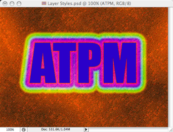
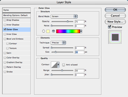
Outer Glow
I said above that Layer Styles were really pretty straightforward. The Outer Glow Style is no exception.
The Outer Glow Style.
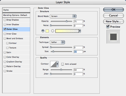
Outer Glow settings.
I really can’t say why the cream color is the default Outer Glow color, but if you want something different, such as white, you can change it by clicking that little yellow square. Or, you can use the gradient color selector instead to create some wild effects.
Funky Outer Glow using gradient colors.
The gradient selector is identical to the one when using the standard Gradient tool Any gradients you may have previously saved are available here.
As with the previous Styles, you can adjust the opacity, spread, and size of the glow. You might like the results of the Precise Technique better than Softer.
Inner Glow
Just like Inner Shadow, the Inner Glow Style works from the inside instead of the outside.
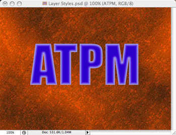
Inner Glow with the edges as the light source.
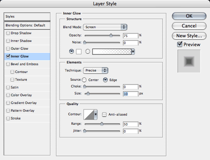
Inner Glow settings.
Inner Glow adds a new adjustment for the light source, Edge and Center. I must advise, however, that I don’t specifically recall this adjustment in Photoshop CS2. If you’re not using CS3 and you don’t see this option, you’ll know why.

Inner Glow with the center as the light source.
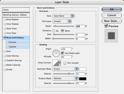
Bevel and Emboss
Here’s the Layer Style I used to accompany the Inner Shadow effect, seen above. There are five different modes to the Bevel and Emboss Style, depicted in the next screenshots.

The Outer Bevel mode is the specific effect used earlier in the Inner Shadow section. Note the Technique selector. Choosing one of the Chisel options instead of Smooth gives an even greater impression that someone physically chiseled out the letters.
Outer Bevel settings.
Inner Bevel.
The Emboss Style is like applying both an Inner Bevel and Outer Bevel simultaneously.

Pillow Emboss with the Direction set to Up makes the edges appear as though they’ve been stamped into the background. Note also that I changed the Technique from Smooth to Chisel Hard.
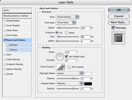
Pillow Emboss settings with Chisel Hard Technique selected.
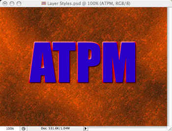
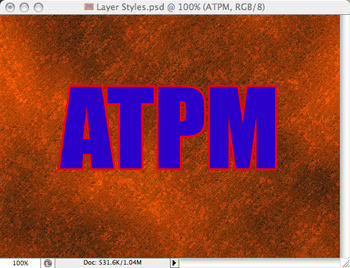
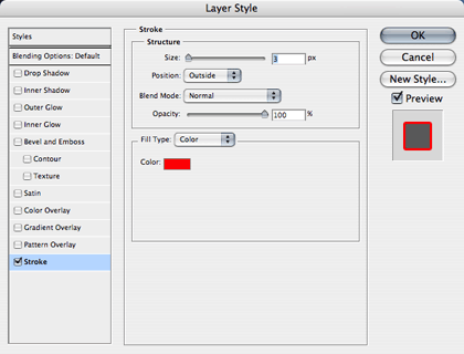
Stroke Emboss applies an emboss effect only to the outline of the object if the Stroke Style is applied.
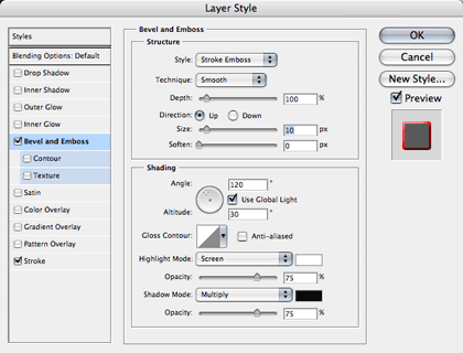
Stroke Emboss settings. The Stroke Style you see enabled is set for a red outline and 3 pixels width.
Satin
Supposedly, the Satin Style is makes the object look like it has a shiny/satin-like quality. Your mileage may vary.
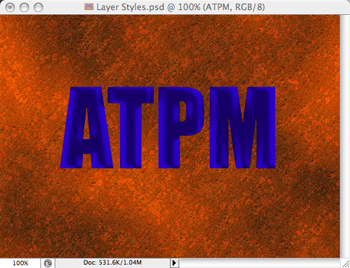
Satin Style.
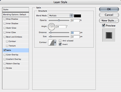
Satin settings. Note that this Style uses, by default, a rounded Contour curve to soften the edges of the highlights.
Increasing the Distance by a large amount reveals exactly what is being done to achieve this effect.
Satin Style with large Distance setting.
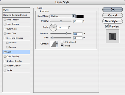
The same Satin Style settings, but with the Distance ran up very high.
As you can see, the original image has been darkened, and the original lighter color has had the edges softened and the letters doubled and spread apart along the angle defined in the Style settings.
Color Overlay
Probably the simplest Layer Style, Color Overlay applies any color with any Blend Mode at any Opacity. Do not pass Go, do not collect $200.

Color Overlay Style.
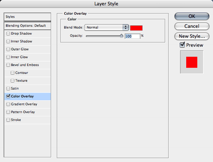
Color Overlay settings.
Gradient Overlay
The Gradient Overlay Style works just like Color Overlay, only that you can now apply gradient colors instead of a single, flat color.

In this Gradient Overlay Style, I chose a preset gradient that is supposed to make an object look like chrome, reflecting back the ground and a blue sky.
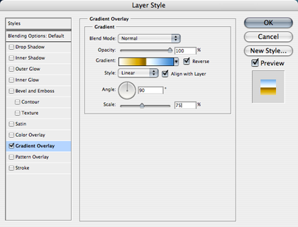
Gradient Overlay settings. Once again, the same Gradient selections are available.
Pattern Overlay
The last overlay uses tiling patterns to overlay instead of colors and gradients.
Pattern Overlay Style.
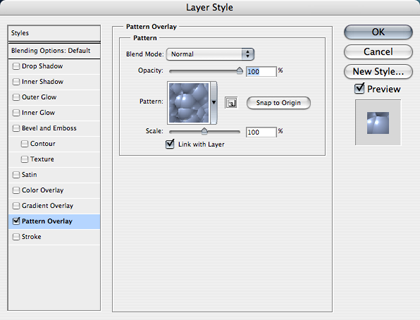
Pattern Overlay settings. From here, you can enlarge or reduce the size of the pattern with the Scale slider. While the Style window is open, you can move your mouse pointer to your image and drag the pattern around to position it exactly where you desire. The Snap to Origin button will return the pattern to its default position.
There are several included patterns, but any image can be saved as a Pattern. One of my upcoming Photoshop for the Curious topics will teach you how you can make almost any graphic tile seamlessly when multiple copies of the image are placed adjacent to each other. This will enable you to create your own patterns that can be saved and used in the Pattern Overlay Layer Style, as well as part of other Photoshop functions.
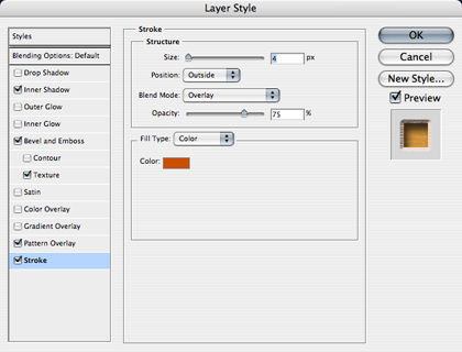
Stroke
You’ve already seen the Stroke Style used in the Stroke Emboss Style discussed above. When Stroke is used by itself, it simply outlines your object.
Stroke Style.
Stroke settings. With the Fill Type selector, you can use a gradient or a pattern instead of a solid color.
Homework Assignment
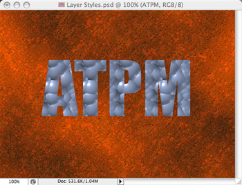
Once you start to get the hang of what each Style can do, you can start combining them and creating some amazing effects. You may have thought that it takes months or even years of graphic design school to create images like this:

My final Layer Styles treatment to the ATPM acronym…
…and I only needed four Styles to do it (plus a Texture setting to the Bevel Style).
In reality, all you have to do is apply a few Layer Styles, monkey around with each Style’s settings, and you’ll quickly come up with some wonderful results. That’s your homework assignment. Crack open that Layer Style palette and get busy.
Final Word
I’d be remiss to not mention one more thing about Layer Styles. We’ve already established that the effects are nondestructive and that you can change the settings on a whim. With this in mind, notice what happens to the object’s line item in the Layers palette.
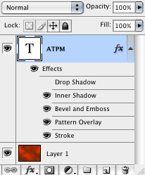
You may have guessed that something that is named Layer Styles would somehow be represented in the Layers palette.
Each Layer Style you enable will appear as an indented item to the layer being affected. In this example, you can see that I had tried a Drop Shadow Style, but later decided I didn’t want to use it and simply clicked the visibility icon (the little eye) to disable it. But any adjustments I made to the Drop Shadow Style settings are remembered if I re-enabled the Style. Alternatively, I could drag the Drop Shadow item to the trash can icon to permanently remove it. As you might deduce, clicking the visibility icon next to Effects (this is why I habitually call them Layer Effects instead of Layer Styles—seems to me Adobe goofed here) will disable all the Styles simultaneously.
But even more cool is that little fx icon on the right side of the layer. Suppose you came up with a composite set of Layer Styles that you really like and you want to apply those Styles to another layer. You don’t have to make note of each Style’s settings and enter them all over again on the new layer. Just hold the Option key and drag the fx icon to the second layer. Voilà, it’s copied. Similarly, if you drag without the Option key, you instead move the Styles to the new layer.
Topics For Upcoming Months
- What Does “Dots Per Inch” Really Mean? (A Tutorial on Resolution)
- Creating Seamless Tiles
- Mask-erades
- Fun With the Automate Menu
- Photomerge
- Fun With Filters
- File Format Fever
If you have a topic suggestion, please share it. I’m definitely interested in expanding this list with topics that are of interest to you.
![]() Copyright © 2007 Lee Bennett, lbennett@atpm.com.
Copyright © 2007 Lee Bennett, lbennett@atpm.com.
Also in This Series
- File Format Fever · November 2008
- Don’t Reset—Preset! · October 2008
- Don’t Yield—Merge! · September 2008
- What If I Just Left It Alone? · August 2008
- Screen Replacements—When Reality Isn’t Real Enough · July 2008
- No Smoking Gun: Re-tooling Dodge and Burn · May 2008
- Mask-erades · February 2008
- Back in February · November 2007
- I Love Layers · October 2007
- Complete Archive
Reader Comments (1)
Add A Comment