Graphics and the Internet
Help, I Can’t Draw!
If you read last month’s column on copyright, you may be forgiven for thinking that, if you can’t draw, then your Web site’s gonna be pretty boring! Don’t worry; this month I’ll be looking at where you can obtain images, buttons, and other graphics for your Web site. There are also lots of links where you can find out more information on the areas covered
Okay, first we’ll take a look at where we can get images from.
- Hire a graphic designer to churn out a few buttons. This may be a bit expensive for your average home page, but if you are designing a page that is unlikely to change often, then it may be worthwhile.
- Buy ready made images or use free images and clip art. You can find many free images on the Internet, as well as many CDs full of photos and clip art in your local computer store. Bear in mind that most clip art CDs will say ‘Windows Only,’ but you will find that the images work fine on your Mac, because they should be in standard formats.
- Use graphic creation software. There are several programs that will create images for you with little or no effort.
Second, let’s look at the different graphics you might find on a Web site. Go on, take a look at a few of your favorite Web sites, particularly ones where you like the layout. You can go now if you like. I’ll still be here when you get back.
Hello, back again. What did you find? Chances are you found graphics for...
- Logos
- Page headings
- Buttons
- Photos
- Cartoons
- Illustrations
- Background images
Throughout this article we will be making a Web site about Sarah Michelle Gellar, of Buffy: The Vampire Slayer fame. We will go through the list above using different methods of obtaining the images.
Logos
If you are designing a site for a client, then nine times out of ten they will already have a logo. However if you are creating a personal Web site, you may need a hand.
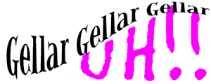
Our Web site is going to be called “Gellar, Gellar, Gellar, Uh!” (after the line in “Summer Lovin’” in Grease), so we need a nice logo. We could just go into GraphicConverter and make a nice logo like this...
![]()
There’s nothing wrong with Tekton Bold, Hot Pink or Graphic Converter, but it’s hardly professional-looking is it? Okay then. It looks a bit rank. Lets try a piece of software called Typestyler from Strider Software. You can download a demo of this from their Web site. It is a fully workable demo for 60 whole days, so you should be able to get a feel for the program in that time.

This logo isn’t much different from our original one really, but this is where Typestyler comes in to its own. Using the Shaper tool we can bend, twist and change the path of our lettering. I’ve used the ‘Vertical Arc Flat Bottom’ library effect to create the text below.

It’s looking a bit better now. By the way, ignore the blue lines. these are to help you adjust the shape. Another effect available is ‘Double Arc Left.’ Here, I’ve made the word ‘Uh!!” fit under the Gellar’s. It looks very nice but it still needs that added extra.
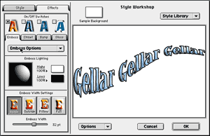
If we open up the Style Workshop menu, we can add more visual effects to our words. We can change colors, add shadows, and add outlines and patterns. Below I have added a black outline, changed the text color to blue, and embossed the text—this gives it a 3D effect.
Okay, so that’s one part of the logo finished. Let’s sort out the ‘Uh!!’ bit. I’ve chosen the font Litterbox for this part. Litterbox is a font that looks like messy handwriting. Buffy: The Vampire Slayer deals with vampires in the TV show (hence the vampire slayer part), so let’s make the ‘Uh!!’ look like it’s been drawn in blood.
The font is fine for this use, as it’s a bit shaky. You couldn’t really use a nice neat font like Geneva or Helvetica for this as blood just doesn’t draw in straight lines. Believe me, I’ve tried.
We’ll change the writing to a nice blood red, and using the ‘Chisel’ tool in the ‘Style Workshop’ menu we’ll give it a bit of body. Perfect: nice and bloody.

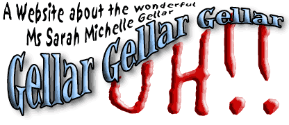
Once these elements are all combined, we can add some finishing touches. I’ve used the font Sand here to give a bit of information about the site.
So here it is...the finished logo. It’s not going to win the international best logo of the year award, but it serves its purpose, and it certainly looks better than the one we made earlier.
Page Headings
 Page headings are another area on your Web page where you might like to use some graphics. You could very easily use plain text for your headings, and it’s perfectly acceptable to do so. However, as this is a graphics column, I don’t think I could get away with leaving it at that.
For our Web site we want to make headings for each of our three sections. These are ‘Home Page,’ ‘Gellar Gallery,’ and ‘Gellar Links.’ I could just use Typestyler again, but let’s try something different. Lets go Web surfing again. Point your browser of choice to CoolText.com.
On the left hand side of the page you can see a list of around twenty different text styles. Click on one that takes your fancy, and you’ll be taken to the text imaging screen.
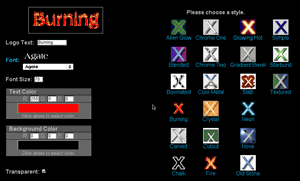
From this screen you can choose what your title is to say and what font, size, and color it will be in. You can also change the style again if you want to.
When you are happy with your selections, press the Process Text button and wait until Cooltext does its work. I must say, at this point, that Cooltext is a very popular utility so at some times it can get very very busy, and therefore very very slow.
When it’s finished, you will then be presented with your finished masterpiece. Here’s what my home page title will look like.

Make sure that you download the image to your hard drive now, as Cooltext will only keep it on its servers for less than an hour.
While we are at Cooltext we can make our Web site buttons too...
Buttons
Buttons can be used to link to other area of the site. It’s a good idea to make your buttons consistent, all over the site. If you use different types of buttons, you will confuse your visitors and they just won’t know what to press.
Cooltext can also make buttons too. Go back to the Cooltext home page and select the buttons option. You are given a choice of several different buttons styles. Once you have made your selection you can edit the text and color as before.
Here are the buttons Cooltext produced for our site.
![]()
You can find a Cooltext FAQ.
Photographs
Photographs can liven up any page, but how can we get hold of some good photographs?
Well, the first option is to take them ourselves. As long as you can press a button, you can take a decent picture. The good thing about most modern cameras is that they are simple and easy to use, and you can get some good results too.
If you are unsure about your photographic skills, a good way to get ahead is to buy or borrow a half-decent camera. Whether you go for traditional or digital, make sure it has basic features such as auto-focus, automatic exposure and automatic flash. For more information about choosing a camera visit Photography Review’s camera section.
If you are using a compact camera, then you will need some film. There are many different film formats on the market, but the main ones for people like you and I will be either 35mm or APS. If you are not sure whether your camera takes 35mm film or APS film, take the camera to the shop you are going to buy your film from.
Camera film is available in different ‘speeds.’ This refers to how quickly the film reacts when exposed to light. Slow speeds take the longest and are suitable for taking pictures in brighter conditions. Faster speeds are more suited at taking pictures in duller conditions. The speed of a film will be followed by the letters ‘ISO’ on the packaging. Rough guide to film speeds:
|
Speed |
Conditions |
|---|---|
|
100 ISO |
Bright Sunlight, Snow. |
|
200 ISO |
Outdoors, average weather. |
|
400 ISO |
Indoors, Overcast, Flash Photography, Moving Subjects. |
For a more in-depth guide to films and photography visit this site.
So, if you have managed to get hold of an easy-to-use camera, then all you need to worry about are your pictures. Plan what you want to photograph beforehand, as you will save yourself time, money, and film.
Once you have snapped away at anything in sight, you will need to transfer the pictures to your Mac. Digital camera owners can look all smug now, knowing they can send it down a wire with relative ease. Those of us with more traditional cameras have two options.
- Scan them in to our Mac.
- Have somebody transfer them on to CD.
If you only have a few pictures, I would scan them. It doesn’t take too long, and the pictures appear almost instantly onto your Mac. However, if you have a lot of pictures to be transferred (or you don’t have a scanner) you can get your pictures put onto a CD. When you bring your film in to the chemist to be developed, ask them to transfer them on to a CD at the same time. It may take a bit longer and be a bit more expensive than just a set of paper prints, but it will save you lots of time and hard disk space. (Money Saving Tip: Although you can get the pictures transferred after you have had the film processed, most processors offer the service cheaper if it is done at the same time as the original processing.)
The other way of obtaining photographs for your Web site is to use somebody else’s photographs. If you need a photo of an aerial view of a volcano, the chances are that you don’t have the resources available to snap this with your Canon AF7. This is where photo libraries come in.
Photo libraries have vast stocks of photos covering a huge variety of subjects, including many that you could never create yourself. Most of them supply images on CD-ROM so that they are ready to use. However, these services are not free. If you wish to use a photo you will need to buy a license to use that image. Once you have bought the license for an image, you can use it as you see fit, as long as you don’t breach the licenser’s conditions. These conditions will normally grant you a non-exclusive right to the image (meaning others can use it too), so don’t be surprised if you find “your” image popping up elsewhere. Visit the PhotoDisc Web site to find out more.
If you are making a non-commercial Web site, then Free Foto has lots of photos, covering a wide range of subjects, which are free to non-profit Web sites.
Cartoons
Some Web sites have an amusing cartoon strip. These can be a big pull to visitors, especially if it is changed regularly. If you would like a cartoon strip, but can’t draw for toffee then you’ve got three options.
- Scan in Dilbert from the newspaper and upload it to your site each day.
- Hire somebody to produce a daily cartoon strip.
- Use the content from another site.
Let’s go through them in order.
- Don’t do this. It’s illegal. Go back to last month’s feature on copyright. Do not pass Go. Do not collect $200.
- A great way of providing original content for your site. A great way of using up lots of cash. Hiring an artist to do any job can be expensive. Unless you know someone who could do this for you on the cheap, then I suggest you check out the Professional Cartoonists Index. I doubt you’ll find one who will do it for free, though most cartoonists will settle for ten Mars Bars and 200 cups of coffee!
- Hmmm. This option sounds as illegal as the first. Well it could be. If you’re just going to take a cartoon of another Web site and upload it to yours, then go back to last month’s feature on copyright. Do not pass Go. Do not collect $200.
However, there are some wonderful sites out there that will let you put their cartoon strip on your Web site, and, not only that, they’ll also update it regularly too. Ah, it’s a wonderful life. Go to the Gibbleguts Web site. Here you can obtain some HTML code, which you can just cut and paste into your homepage. You then have your very own cartoon that’s updated daily. Easy, eh?
Illustrations
If you go to Yahoo! and select Computers and Internet > Graphics > Clip Art or do a search for ‘free clipart’ you’ll find lots of sites offering you lots of pictures, buttons, and other objects that you can use on your Web sites. We want to find a vampire bat for our Buffy: The Vampire Slayer homepage.
Art Today offers a clip art search facility where you can type in ‘Bats’ and it will churn out lots of pictures of bats. You will need to register if you want to use this facility. Registration is free for a limited selection, but if you want access to all of the pictures, you will need to pay up.
We found some bat pictures at Barry’s Clip Art. Barry’s Clip Art requires us to credit the image to its site. Make sure you read the Terms and Conditions of any Web site that offers you a free service. You may find that you will need to give them a link or credit. Some will only let you use the images on a home page or non-profit site. In this case, we are required to use the credit ‘© 1999-(current year), http://www.barrysclipart.com.’
If you are going to use clip art on your Web site, it is a good idea to keep the styles consistent. Try and use clip art from the same author, as this will look more professional than using a variety of different styles that don’t sit well together.
Backgrounds
 We need to find a background for our site, as plain old white can be a bit boring. Go to
Free Tiled Backgrounds that we found by visiting
The Free Site. I chose the background below for our Web site. You may think that it’s a bit small for a background, but when it is displayed in our browsers it will be tiled so that it covers the entire page.
Here’s some hints for choosing backgrounds. Choose one that is subtle and fairly light. The last thing you want is a background that makes your text difficult to read and distracts from the content. Remember it’s a background, not a foreground.
If you are using a tiled background, make sure you use a ‘seamless tile.’ This means that when your image is tiled next to itself, it appears to continue on to the next tile. Here’s an example of a ‘seamless tile’ (right) and a ‘seamed tile’ (left).

You won’t always want a background on your Web page, but the background function can be very useful for menus too. If we take the background tile we had from before and load it into GraphicConverter, we can change it into a menu background.
Once you’ve loaded up GraphicConverter (or any other package), resize the image to the width of your menu. We want our image to be 120 pixels wide so we choose the scale option and enter the required information.
We need to adjust the right-hand margin on the menu bar too; otherwise it will keep repeating itself. We need to add a big enough margin so that it won’t repeat, even on big monitors. We’ll add an extra 1600 pixels. This should be enough.
![]()
In case you are wondering how this will look on the Web page, here is a screen grab below.
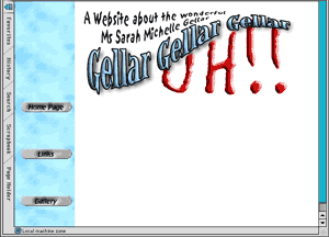
I hope you’ve found this useful. Please remember that if you’re using a free graphics service, such as Cooltext or one of the clip art sites, it is courteous to credit and link back to them. Some sites state that this as part of their terms and conditions, so make sure you read them carefully.
You can take a look at this finished Web page, incorporating the various services shown in this article. It’s not a complete site, and the internal links don’t work, but it should give you an idea of what can be done with little or no graphic skills.
Next month we’ll be looking at JPEGs and compression. If you have any questions or comments about this series then please e-mail me at gosborne@atpm.com.
Also in This Series
- PNG · December 2000
- Seven New Deadly Internet Graphic Sins · November 2000
- Seven Deadly Internet Graphic Sins…or Things That Look Really Bad on Web Pages · October 2000
- The Animated GIF · September 2000
- The GIF File Format · August 2000
- Banner Advertisements · July 2000
- JPEGs and JPEG Compression · June 2000
- Help, I Can’t Draw! · May 2000
- Copyright · April 2000
- Complete Archive
Reader Comments (1)
Add A Comment