About This Particular Outliner
TAO and OmniOutliner Pro
Your ATPO guy here is responding to reader requests this time. The most requested topic I have is to compare our two top traditional power outliners, so here goes.
OmniOutliner Pro and TAO Icons
We have quite a few outliners in our list of power outliners. I think I can recommend any of them depending on how your mind works. But only these two trace their lineage to what many users consider the reference application.
The first commercial, shrink-wrapped outliner of any significance was MORE. If you are unfamiliar with it, you might want to refer to an ATPM piece by Michael Tsai or an earlier ATPO column that mentions it and all the siblings it inspired on the original Mac OS.
TAO is $30 or $34 depending on the payment system used. Blue Beach Systems is the developer, which seems to be one man: Takashi T. Hamada. TAO updates appear every week or so, a result (the developer says) of his background in Linux development. I have gone through six minor updates since starting this column! Bugs are fixed quickly, feedback by e-mail is fast, and the development pace seems rapid.
OmniOutliner Pro is from Omni Group, which also sells OmniGraffle and OmniWeb. OmniOutliner Pro is $70, though a junior version is $40.
We’ll only be talking about the Pro version here, because if you are contrasting the two you are likely a serious user. The Omni Group is a long-time developer, starting with the NeXT platform in 1989. They follow more traditional, longer development cycles with public betas and such. They produce a boxed version as well.
What we’ll be talking about here are TAO 1.1 and OmniOutliner 3. Each was announced as having MORE as its model. Both are Cocoa applications. Both have loyal, even militant, users.
And what we’ll be assuming here is only one of the several usage patterns outliners cover. In the past, we’ve noted that outliners are used for information storage and management; clipboard and scrapbook utilities; and list, to-do, and task management. All of those plus the original use that has outlining as a writing tool.
In what concerns us here, a writer starts with a collection of material and adds structure, or the other way around. Over time, she adds material by writing or borrowing and at the same time adds and changes structure. For people who work this way, an outliner is the center of their creative universe, and the selection of a tool is no trivial matter. It is in essence your writing partner.
Clearly, if you are a writer, this writing mode encompasses and subsumes all the others, depending on how you choose to work and what possibilities the tools empower.
I am sure I will get all sorts of reminders that all the ATPO power outliners can be used for this purpose. Indeed, there are lots of other, non-outliner tools that address this space as well. In fact, I use most of them and for this purpose.
(I spread my work around among outliners in part because I want to stay familiar with them. You just cannot do this by jumping in and out. As I am open to acquiring and learning many applications, I find that certain projects and certain outliners are good fits. But these things are so hard to master that I think nearly every ATPO reader will settle on one main tool.)
So for the remainder of this column, I won’t mention how this or that other power outliner might work better. But there will be one exception. Inspiration has been around for a very long time. It was originally Mac-only but now sells mostly on Windows. It was originally designed to address this usage as a serious writer’s tool, but for the last six or seven years has been repurposed as brainstorming for school kids. It can be bought only in boxed versions from resellers at differing prices. The lowest I found was $59.
Inspiration runs on OS X but never changed its user interface to suit. It has a serviceable built-in mind-mapper. You can find lots of mention of it in my earlier columns and in an ATPM review by Gregory Tetrault. Inspiration is still loved by many writers who e-mail me.
One other piece of introductory chaff before we begin looking in earnest. My last column was on styles. I said that OmniOutliner did not support named styles.
This is incorrect. It does. In fact, when version 3 came out, ATPO made a big deal of its support for named styles. I use that feature nearly every day! My defense is that these columns take a very long time, and I leave all the familiar stuff until the very last moment. The last moment for that column found me stranded overnight at Charles de Gaulle Airport, certainly one of the most inhospitable places in the world. France and all that.
Or maybe you will believe it was a mistake made by a new intern. We’ll fix that bad information with this column.
Some Overview
I love writing ATPO, and this column is a particular joy. That’s because these are really two entirely different approaches to the same problem. The more closely you compare them, the more you will understand how you feel about your needs and work philosophy.
I fully expect you readers to walk away from this column preferring either one in equal proportion.
Here’s the first indicator: Omni Group designs software in a way that I like to think of as the “Mac way.” This designation may be controversial because so few well-trod Mac programs—and especially Apple’s own applications—have this philosophy.
What I mean by this is that the user’s actions come first in terms of design. An outliner is all about interaction, how a user interacts with text (usually mostly text in this use). Designing the “Mac way” means you worry about the interaction first, the space between the words and the mind that is filled with screen display and hand motions. You design outside in, appending features to the interface.
Omni’s applications routinely win design awards because they start with all the user interface niceties at their disposal and create something that seems coherent. In version 3, they had to develop some new interface conventions for styles. When they issue a beta, it is primarily to see how well the interface additions work. It is impossible to envision OmniOutliner as a Windows application.
TAO comes from the other end of the development philosophy spectrum. The idea here is that real writers need power. Power and capability are king. You start with empowering users to do real work. You design your application from the inside out. User interfaces are pretty standard these days. As long as you are not targeting the kiddie or beginner market, you don’t need pretty. What you need is cleanliness, and consistency. Control is primarily something for the keyboard—these users are writers after all.
One can easily envision TAO on other platforms.
It all springs—everything below—from this philosophical difference. It’s something that has been the stuff of religious arguments for decades, and in a way is behind the dual identities of OS X: Aqua and Unix. If you haven’t already frozen your position on this, at least wait until the end of the column.
Here’s a quick feature comparison:
They both support the ordinary outlining functions; have user defined columns; allow toggling between displaying notes in-line and in a separate pane (TAO calls them “comments” like MORE did); OPML import and export; style templates; links to files and URLs.
TAO uniquely has clones; a split pane editor; zooming; internal links; live metadata; and encrypted save.
OmniOutliner uniquely has named styles; very good AppleScript support; live batch find; folded editing; bookmark drawer; clipping service; folded editing; native format as XML; export to Keynote, Word, and dynamic HTML (with collapsible arrows).
Normal Outlining Navigation
Let’s first take a look at the basics, how each supports the creation and movement of headers or section titles. In this area, TAO really shines.
Both outliners have commands to do the basics: enter new items as siblings or children and move them around. The screenshot shows comparative outlining command menus.
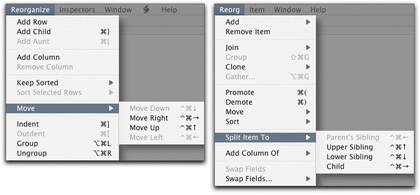
OmniOutliner Menu on the Left, TAO on the Right
The shot should tell you that TAO starts with the notion of outline manipulation. See that “split” submenu? That is handy as all getout for many writers, the kind who just sort of start with a structure and fiddle with it as they go. You can rearrange headers of course, but the ability to split and join them is magic when you need it. Just magic.
TAO and OmniOutliner both have logical keyboard commands for navigation and selection, but TAO has far more. If you don’t like TAO’s you can change every one in the preferences. TAO’s command set really is more advantageous for the person who likes to stick to the keyboard.
I myself relate to the structure as a graphic convention and like to grab things and noodle around with them. So the user interface for dragging and reorganizing is important to me. I have always liked OmniOutliner’s drag interface. It seems to coincide with Mac conventions well. It is very clear what is selected and where it is going.
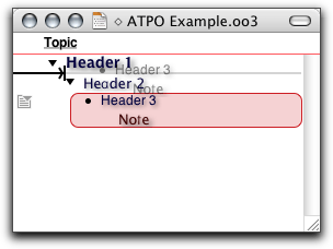
OmniOutliner Drag
If you are a mouse person rather than a keyboard one. OmniOutliner allows you to “split” much more flexibly than TAO. Just select a text block from any header or note (!) and drag it anywhere to make a new header. In TAO, you can only drag text blocks into another text block.
TAO’s feedback, indeed its whole approach to screen presence, is decidedly un-Mac-like. But everything is there for what turns out to be a useful reason. In the shot below is the drag feedback.
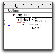
TAO Drag
Not as colorful, is it? It is a no nonsense sort of attitude that pervades the application in all areas except one, the comically irrelevant palettes. Here’s the palette that matches the Reorg menu.
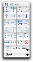
TAO’s Reorganization Palette
I cannot imagine anyone resorting to this mess when direct drag, menus, and keyboard commands are available.
Both OmniOutliner and TAO have a “group” command that takes selected headers and moves them under a new header.
Something else about TAO’s selection feedback. The author is obsessed with metadata. There are all sorts of fields you can display that tell you things about your outline and its components like how many letters and words it has, and when they were created and modified. When you select a header, a box appears to tell you things about what you selected. See the grey box in the lower right.
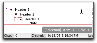
TAO’s Selection Feedback
We won’t mention all the metadata fields and display options in TAO. But they are numerous, and I am sure for every one of them there are users who believe that information essential.
Both outliners have an ordinary hoist function. That’s where a header and its children, if selected, are the only elements of the outline that are visible. Both allow notes to be displayed inline or individually below. The inline display is nearly essential if you are a writer. The outline headers become your section titles and the notes the section contents. Seeing them inline allows you to see the structure and content more like it really is. TAO allows the non-inline view to be at the bottom or the right.
A word about notes. TAO deals with notes like MORE did, even calling them comments. They are a sort of metadata added to the headers. OmniOutliner treats them as if they were part of the document, with their own collapse widget. In TAO, there is a small box to indicate that a note is attached to a header, but you cannot click on that little box to open the note. There is a menu item but no default key command. Very unhandy.
TAO has about eight more of these little indicators following the MORE convention. They tell you whether a header is cloned, marked, has a stylesheet, is linked to or from, is locked, and/or is bookmarked.
TAO is the only Mac outliner I can recall that continues to use the MORE convention of having a “root.” That means that any outline can have only one level 1 header.
One more thing in the basic outlining department. OmniOutliner supports folding. This is a different type of collapsing, where multiline entries, whether headers or notes, are reduced to just their first line. ATPO really likes this. The main value of an outline to a writer is that you can step back and see the structure of a complex document, then zoom in on a section to see or add detail.
The high-level view is hard to see when you have full paragraphs of note text. Folding helps a huge a amount if this is something you need.
Clones and Hyperlinks
You can already see that there will be no clear winner between these two. It is purely a matter of what you need and how you work. But there is one area of outlining capability where TAO is supreme. For some reason, Omni Group decided not to implement clones and internal hyperlinks. Remember, this is version 3 we are talking about.
A clone is a copy of a header, very similar to aliases in the Finder. The difference is that when you make a clone, you are making an identical twin. Change one and the other changes. Delete one and the other remains.
Hyperlinks are common among ATPO power outliners, but OmniOutliner doesn’t support them. TAO’s links aren’t as robust as in other power outliners. You can only link from a header to another header. But the provision for doing this with a mouse is elegant.
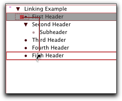
TAO’s Linking
No one will champion outlining as useful structure more than I. But outlines don’t lend themselves well to real life. Sometimes you need something in more than one place. Sometimes you need to relate two blocks or locations in a way other that hierarchically. Links and clones are the best way around this limit.
OmniOutliner is hugely deficient in this area, but it does have something interesting, something very like iTunes’ “smart folders.” You can set a “batch find” search string and find all the instances of that string in the outline. They appear in a list in the utility drawer with as much context as you want (just drag the drawer wider) and the parent header below. These results update in real time as you change the outline.
You cannot save batch finds, nor have more than one batch find active.
Scripting
If OmniOutliner is embarrassed about clones and links, TAO must be about its complete lack of AppleScriptability. It has none. Power outliners need scriptability, and that’s a major lack. NoteTaker and Hog Bay Notebook have AppleScriptability.
Beach Systems says scripting is supposed to appear in version 1.2. Until then, it is nearly as big a hole as OmniOutliner’s lack of clones and links.
Columns
Columns are for metadata. Nearly every power outliner has some columns, but these two are the only ones that support user-defined columns. Columns are something that appeared in the second generation of outliners, and they can be incredibly useful.
What you need is the ability to add columns, specify their type (date, number, values from a pop-up list), show and hide them, sort by them, and add values where appropriate.
OmniOutliner’s first version had columns, and its current implementation supports all of these.
You can define columns that are of type: number, styled text, date, time duration, checkbox, and pop-up list. Numbers and dates can have their format specified. Numbers and durations can be summed, or displayed as the maximum or average. You can sort and search on any of these. Checkboxes have their own “summing” function. Sums can be hidden (calculated but not shown).
You can readily drag columns around. Columns are among the nicest things in OmniOutliner and lend themselves to all sorts of uses. Since columns can have styled text, you can use these as notes of notes. (There’s still no ability to have a column type be an outline.)
TAO’s support for columns is recent. It supports the very same types and functions. Actually, it has more column types because certain computed metadata is managed and displayed as columns: date created, modified, word and character counts, line number, paragraph number, level, and something I don’t understand yet: “tag.”
I should note that TAO has a lot of these things that appear without documentation, and may appear in a partial implementation, and it is up to the user to figure them out. For instance, there is an “invisible” attribute that you can assign to a header. It turns the disclosure triangle grey. The help says there is a command to hide/show invisibles, but it hasn’t appeared.
TAO has no summing of columns, and its sorting is less amazing than OmniOutliner’s. With OmniOutliner you can select any column, even the one with the outline, and sort on the values in it. (The main outline can have any of the types of the other columns.) In TAO, you can only sort the first column using some canned sorts (descending, date created, and so on).
Editing Tools
Since we are talking about writing, you have to consider how powerful the environment is for actual writing. TAO’s strongest supporters tout this as well as the outlining commands as TAO’s core strengths.
TAO has a splittable editor, which is extremely handy in any editor but particularly so in an outlining environment where re-organization is an assumed need. The editor can “zoom,” which in TAO parlance means “full screen mode.” We’ve already mentioned TAO’s remarkable tracking of metadata. The screenshot shows the full TAO window (without those vexing palettes). You can see the split editor here, a link, lots of columns, and metadata reports in the bar at the bottom.
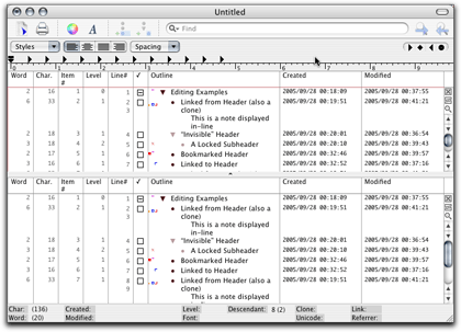
TAO’s Editing Environment
TAO has some other cool stuff. It has a “map” window that appeared recently with no mention. It is a little view of the entire document with a highlight where your cursor is located. You might not think this very useful, and I didn’t at first. But it is more than a locator of where you are, you can navigate in a coarse way by clicking in the map. I have no clue what the bars on the left are.
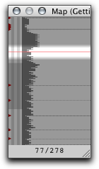
TAO’s Map Pane
TAO also allows saving in an encrypted form. It is weak encryption, nothing to keep the NSA busy for long. But it is strong enough to keep snoops out of the stuff you don’t want exposed.
OmniOutliner has its own editing joys. One we should have mentioned already is that it just looks and feels friendly. It invites. The user interface—except for the style interface—is clean and intuitive: writer-friendly.
The very best thing is that if you are a writer you need to worry about steps further in the food chain. OmniOutliner has special facilities for exporting to Keynote, but what writers will like is how it exports to Word.
Outliner documents have a structure: header level so-and-so with possible notes under headers. Word documents—well-formed ones—have a similar structure: Heading 1 and so on with “body text” under headings. OmniOutliner documents export to well-formed Word documents so that Word’s outlining view sees the same structure. You can literally start document creation in OmniOutliner and finish it in Word’s outline view with the same structure and—big applause—styles. Not styles with names, the names don’t convey, alas, so structure at the formatting level is lost. (This is what I meant by real named styles in my previous column.)
But all the appearance is still there.
And if you have a workflow built on XML, OmniOutliner’s native file format is XML now. So you can write your own transforms however you like.
Also, if you are a writer who likes to take full advantage of your machine, OmniOutliner can speak your text and record voice recordings in the outline. OmniOutliner supports a clipping service.
The Bottom Line
As you can see, it is not a matter here of features or power. There’s a different philosophy behind these two great outliners. If ATPO does nothing else, I hope the comparison of philosophies helps readers think a bit about who they are, and how the might work to live in and expand that world.
I use them both, in fact I use essentially all the ATPO power outliners. But it is incredibly hard work and induces schizophrenia. I’m pretty sure the best thing is to discover who you are and settle into one of the power outliners in depth, then fly.
Also in This Series
- A Progress Report · February 2008
- Some Perspectives on the Worldwide Developers Conference · July 2007
- Writing Environments, Plus Two New Outliners · November 2006
- Examining New Business Models · September 2006
- Outlining Interface Futures · July 2006
- Outlining Workflows and ConceptDraw · May 2006
- Dossier and Outliner Web Interaction · March 2006
- Two New Outliners: Mori and iKnow & Manage · February 2006
- Styles Revisited, Video Features, and a Proposal · December 2005
- Complete Archive
Reader Comments (24)
Thanks for another great column and for your comparative review of OO and Tao. Your responsiveness to requests is much appreciated.
I look forward to the next installment.
Thanks again,
Jeff
I read your column fairly often as I go about trying to find the perfect tool to manage my life. The outliner concept is good, but I need more; contacts, email, to do list, schedule, time keeping, and of course, a good journal. I've looked at about everything you've suggested, so far the best I've got is Formation. I saw you mention that since it doesn't actually allow for outlining, it was out of scope for ATPO. Would you consider a column on Formation and others of its type?
Keep up the good work.
One comment: you can split and join items in OO: it's as simple as CTRL + RETURN (ENTER) or CTRL + DELETE. I think one of the problems that OO has is that it has a lot more functionality than its simple interface readily reveals. (Unless I completely missed what split and join you were discussing.)
And on the subject of clones being a substantial lack in OO: YES! And I think you put it very nicely: life is not like an outline.
I hope someone from Omni reads your piece and is prompted to rethink the lack of clones -- DT's replicant -- in OO.
While, there are simple splits and joins in OO, they are basically single item merging and splitting. TAO's approach is a little more robust. Split is still limited to a single item (obviously), but the split portion can be placed as a child, sibling, prior sibling, or parent's sibling -- with a single keystroke.
Joins are different. You can select fifteen notes, press the join keystroke, and they will all be merged together with the last selection as the target, in one of two modes, with a space, or with newlines between them. There is also a third option with no default keystroke, to merge with no delimeter. So you can work on a section of your article with items-as-paragraphs, and once you have the bulk of the editing and ordering done, merge it all into an item-as-section. Thought is also given to comments. Merged items have their comments merged, too, using same the selected delimeter.
Joins are prohibited in OO if both items have a note, or if the source item has a note. Oddly, if the source has no note, but the target does, it will allow a merge. If you use a lot of notes, joining in OO would be a pain.
OO is also limited to adjoining items for functions. TAO is limited to free selection of multiple items, at any point in the tree. OO is more focused on strict list ordering, ignoring level structure, while TAO is more aware of level structure. For example, in OO, if you have item A with three children, and a sibling item B with two children, if you do a join in OO from B, it will automatically demote the item, and all of its children, tacking it onto the last child of A.
In TAO, this would not happen unless you specifically chose the last child of A. If you select A and B and join them, their children will combine and become siblings of each other. Everything stays in the same structure.
You -can- do this is OO, but it requires first collapsing A, moving B under A, if necessary, and then joining from B. The children will then be merged. Note the emphasis on strict visual order as opposed to underlying structure.
So here is where we get to the philosophy fork. OO does what seems right for how the outline currently -appears-, while TAO does what seems right for how the document is actually -structured-. OO's emphasis on adjoinment, and differing behaviour depending on collapse states versus TAO's emphasis on specific item selection prior to executing a command. OO feels more like a word processor, TAO, more like an outline.
Thanks for this series, which has made me think more interesting thoughts about how I research and write than anything I've read in a long time.
Where white is the title of the note and the gray leading is the indents?
Very nice if that is it.
Dave
By the way, it'd be great if there was a forum dedicated to discussing Ted's columns (if there isn't one already).
Surely we will be devoting time to Mori. Hog Bay has always been impressive.
Some time back, I bought the domain outliners.org to host a community of some sort. I think we need one. Dave Winer allows discussion on outliners.com, but it is Windows-centric and focuses on PIMs.
If anyone wants to host a community, I'm game to participate.
--Ted Goranson
Any one else have similar thoughts?
Give me a break. Anything you can do in a Mac application you can do on Windows. Granted, it may be more difficult, but it can be done. Spare me the drama.
"Not styles with names, the names donâ??t convey, alas, so structure at the formatting level is lost. (This is what I meant by real named styles in my previous column.)"
What exactly would be lost?
(Why can't serious queries use real names?)
If you look at OO, you'll see extreme exploitation of Apple's User Interface conventions. Most of these are superior to their counterparts in the Windows world and because they are so close to what Apple intends and supports, it is easy to learn and use.
But putting that same application in the Windows world would be a disaster. Users would be permanently adrift; the dissonance would be killing. I didn't mean that it would be impossible to make something look and behave sorta kinda like OO on Windows. Only that it is impossible to imagine any one doing so and expecting people to use it.
Best, Ted Goranson
Er. What would be lost is what I said would be lost. OO has named styles. Say I named a style "Randomguy" in OO and exported it to Word. Word has named styles too. I could name a style "Randomguy" there too. Those names are an important element of the structure in either application. Going from OO to Word preserves the appearance of the style, but not the fact that a named style is associated with that appearance, nor the name.
Clear?
Best, Ted
Any suggestions?
I have an approximately 1000 page outline in MORE 3.1 that is fast and reliable. It take literally hours to import into these modern programs. If I run MORE 3.1 under Basilisk II emulation on my Toshiba R100 at 1/4 processor speed it takes seconds to load. Same with Classic on my G4 933 Tower with 1 gig of RAM.
On the Windows side, ECCO Professional is similarly fast, though my outlines are not nearly so large in that program.
MORI can only handle one line of text per outline item (which scrolls off the edge of the outline). This is unacceptable for an outliner.
TAO is promising but has a continually changing and awkward interface. (Why is the Gather dialog OK button not accessible from the keyboard?)
Omni Outliner does not have clones. They responded to my feature request by saying, "Unfortunately due to the complexity of cloning we weren't abel to add it to Outliner 3", but they are apparently considering it.
What has happened to programming? I recently set up a Quadra 605 computer for the 12 year old daughter of some friends of mine who is working on her first novel. MS Word 4 and MORE 3.1 work great under System 7.1. Try and run a modern outliner on my wife's Dual G5 and it can't even handle a decent sized project.
This is progress? MORE 3.1 is the greatest program ever written, bar none, and I feel like I'll be cobbling together emulators forever.
I also wanted to thank you for the great columns :)
Peter.
much love!
I've had OOP for years, but from what I've seen chances are that I'll use Neo more and more.
Current version is 2.0 beta 3
Have been working with it for months.
Add A Comment