About This Particular Outliner
Outlining and Styles, Part 2
Desktop Publishing and Readability
When I mention styles, you probably think I mean the stuff of page layout, the visual magic that makes a page attractive and readable. I don’t mean that at all in this column, but let’s not ingloriously abandon that notion without comment. It is worth books in its own right; some of these books describe principles that all writers should know. The problem is that at a certain point, several philosophies of design converge and battle for your allegiance. Working out which ones to adopt is a worthwhile exercise.
Font selection and careful design have great power, power to enhance what you’re trying to communicate. So please don’t avoid the incidental message that your work flow for published items should end with the capability to do this as well as you can.
Screen Appearance
But this column is about working on the screen, well before you produce something for others.
In a previous column, I’ve noted some things about font design: nearly all the meaning of words is conveyed in the top half of the line. Nearly all the readability is in the bottom half. You can think of the top as the melody and the bottom as the rhythm.
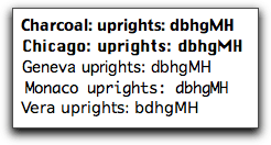
A huge amount of effort has gone into type design using effects you should know. All type these days is based on readability metrics derived for the printed page. Some fonts are optimized for screen viewing, but their design heritage still comes from the old rules developed for the printed page. Chicago, Charcoal, Geneva, Monaco, and Vera are all examples of this approach. Chances are that you use one of them for much of your screen work.
But there is a growing understanding of cognitive principles for screen fonts, and you may see a new generation of designs for screen use within a year. They’d be used by people who want the very best readability and functionality on screen. This would send WYSIWYG writing to the dustbin.
Good practice for many will be to use one set of fonts and styles for writing and another for publishing. The needs are just different. Some unfamiliar needs for screen styles will be covered below,
Apple sponsored the first efforts at antialiasing fonts (a notion first developed at MIT’s Media Lab in the eighties). It is my opinion that with some attention to selecting the right font and size, Apple’s antialiasing algorithms do far better than what Microsoft offers in ClearType. What we are talking about in this case are fonts not specifically designed for screen display.
A problem is that Apple keeps tweaking the antialiasing routines. They are different depending on your hardware and operating system, and different folks react differently, with far greater variance of preference than with printed fonts. That means that the result of one person’s research isn’t portable to another. Also, once you exhaustively test all your fonts to determine the best one for you and your equipment, you’ll have to start all over again with a major operating system update.
Guess what? Not all applications render text the same way even using the same settings. As it happens, applications that use straight Quartz text rendering give you colors in the sub-pixels instead of mere grayscale (if the Font Smoothing option is set to LCD in System Preferences). In effect, colors allows for millions more perceptual options, and Apple knows how to leverage them.
But some applications just don’t use color, even though they clearly use Quartz. OmniOutliner renders text using grays, for instance, although the text in its dialogs has colors. OmniGraffle antialiases text with gray pixels unless it is actively being edited. Pages and Keynote both render with gray, as does InDesign. Even programs that use colored sub-pixels switch to gray when shadowed text is used. (In Keynote you can even control the color of the shadow.) The ATPM staff has come up with some credible theories for why this is, but we won’t go into the details here.
I suggest experimenting a lot, starting your with a san-serif “humanist” font. Humanist fonts flare out in spots, which flies in the face of pre-antialiased screen font design. The old model was to have strong, straight uprights. Apple’s (but not Microsoft’s) antialiasing routines do very well with subtle flares producing a more liquid feel. It makes words more readable because the letters (with well kerned fonts) form more subtly identifiable assemblies.
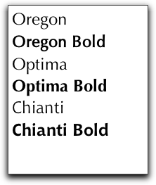
Humanist Examples
On my machine, I use near-blacks instead of the default black for the text color. If you have a setup and application that already uses colored sub-pixels, the use of color as the base has wonderful effects on the sub-pixel coloring routines. And this is amplified when the flare serif effect comes into play.
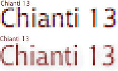
This image shows many of the effects we just discussed. The two examples have the same everything (font, size, color) but are rendered radically different. The top example is from TextEdit; the bottom is from Pages.
Have fun experimenting.
One more aside: in some respects we still haven’t reached the height of the old operating system regarding font display, and we may not again in my lifetime. For a brief period, we had TrueType GX fonts and display technology. GX fonts were scriptable to an amazing degree, using an obscure language.
The most common scripts were to detect context and swap characters; for instance, you might have one type of “Y” in the middle of a word and another at the end. But you could do a lot more, including all sorts of animated effects. You could, for instance, add iridescence in the flare-serif of a drop cap, so subtle that you couldn’t see it, but only feel it.
We ran experiments that tracked eye movement and slightly changed a word’s display as it was read, actually just before it was read. GX fonts made this possible.
Styles as Metadata
Now on to our real topic. For our purposes here, to “style” text means to assign an attribute to a block of text, to mark it with meaning. The visual display of styles in some way is a separate issue—related of course.
If you are an outline user, you already have accepted the notion of one sort of attribute: the assigning of a text block as a “child” of another. You probably also are familiar with the assigning of attributes to the containers of text blocks, attributes like “high priority” or “this was written on such and such a date.”
OmniOutliner allows assignment of tags through columns. Most of our power outliners have tagging or marking strategies for containers as well. Some like NoteBook use “stickers,” which are graphical tags. But just about all of them let you mark or tag containers.
Together with linking and nesting we have the meat and potatoes of relating containers.
In this column, we look at attributes assigned to text blocks that are within containers, the type of text block that can be selected by a cursor drag, for instance.
You already use two styles frequently: emphasis and links.
The most mundane style is for emphasis. There’s no reason we should be limited to 300-year-old print technology for the emphasis palette: bold, italic, underlined, quoted, or punctuated. Why should I use the same style for laughter that I do for question emphasis? It might not change the way you write, but now that I have let you know the barrier wasn’t really there, you feel better, right?
The real reason we’re interested is that styles are a good way to mark text blocks with the intent of adding metadata. Outlining is all about structure. All our power outliners assume the structure stops at the envelope of the note or section. But why?
Making a hyperlink is a matter of adding metadata, metadata that says:
Spring from this text block to this place here. Don’t bother to show me the destination until I get there, but show me that this is a link by underlining and turning blue.
Putting a text block in quotes is also a matter of adding metadata. Some day, Spotlight might even recognize text marked in this way (and others).
Highlighting a text block adds an attribute, one that some of our power outliners recognize as such.
Let’s review what we can do today and then speculate on what we should demand in the future.
ATPO Power Outliners and Styling
The high watermark for named styles in existing Mac text-oriented programs was the old Nisus Writer, which only runs in Classic and is still sold at the original, now-too-high price.
You could set named styles easily enough, and any inline graphic (even graphical text) could have a style applied as well.
But the cool thing was that it had an amazingly powerful scripting language that recognized styles. So you could write a macro that said something like:
Find all the text styled with “mild bold” that is in paragraphs marked “done” and that don’t have dates in them, select them all, mark them with style “OK” (which may modify visibility differently), and make a copy of only those paragraphs in a new document with the following new styles…
I wrote the most extraordinarily complex style management and outliner system using Nisus and its macro system as a base. There’s nothing like it on Mac OS X, certainly not Nisus Writer Express.
If we had something like this today, we could splice on all sorts of cool analyses that used facilities like we mention in the comment on DEVONthink below.
Clearly, the ideal minimal behavior would be that when we assign a style, the application recognizes it and helps us do something about it. We should be able to see the style or not at our option.
In this section, we’ll review what the existing state of support is from our ATPO power outliner list, running through it in alphabetical order.
No outliner does a good enough job, but we’ll show you what you can do today, then suggest capabilities for the future.
Circus Ponies NoteBook
NoteBook supports text styles in two ways.
One way concerns “favorites.” The simplest way for this to be supported is for the outliner to let use the built-in Favorites list in Apple’s font panel, which all good application citizens do.
NoteBook uses a system service to go one better (but not much better). Instead of forcing you to go through Apple’s font panel, you can work with similar capabilities via built-in style management. You use Format menu commands to determine your styles in a document. You can alternatively use the font panel, but NoteBook provides better access to kerning control and alternative characters like ligatures through the menus.
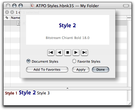
Once you create a style, you open the Style Sheet shown in the screenshot.
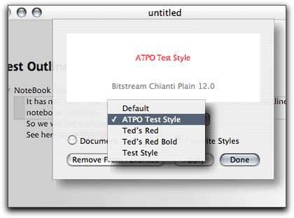
Circus Ponies NoteBook Style Sheet
Then by clicking the next or previous buttons, you browse through every style you’ve set. If you hit one that you’d like to save in the application’s memory, click Favorite Styles and enter a name for it. You can save “ruler” information such as justification in the style.
It’s nice, but there’s no way to apply these favorites without going through the sheet again.
Much more interesting is the support for highlighting. You can set six different highlight colors and easily highlight text blocks. NoteBook automatically builds an index of all highlighted text collected by color. That’s very nice, since you don’t even have to think about it: go there and find it.
But more powerful is the Super-Find search feature.
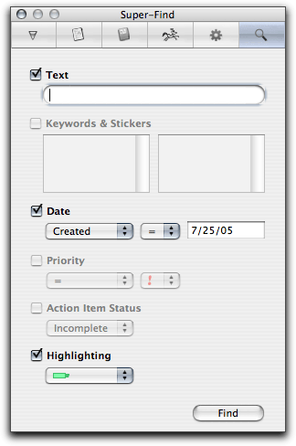
Circus Ponies NoteBook Super-Find
You cannot do Boolean queries like finding stuff that has “this or that” or “this but not that.” It is just an “and” search. But the ability to search on factors that mix cell and text metadata is a powerful idea. The report page where the results are shown is particularly elegant.
I think that with a little noise from users, Circus Ponies will beef this up to include making highlighting invisible, allowing highlight types to be named, and adding Boolean searches and regular expressions (which is a complete way to search for text patterns).
Hog Bay Notebook
Hog Bay Notebook has a lot of things to recommend it, but support for styles is not one of them.
The only thing that could be said of HBN is that it has the same Favorites sheet as Circus Ponies NoteBook, as provided by the system. Each page is saved internally as an RTF document that you could (if you want) open and edit in another application with styles intact. That’s a big advantage.
Hog Bay Notebook Style Sheet
Hog Bay Software is highly attuned to user feedback. I bet it would consider better style support if asked. HBN has a pretty sophisticated “assemble” feature that “flattens” an internally hyperlinked outline with clones into a linear document. This is effectively a translation. Wouldn’t it be cool if that translation operated on styles in a user-settable way?
(Hog Bay, incidentally, is the only power outliner that mentions the competition by name and features in its documentation. The next version may change the name.)
NoteTaker
NoteTaker has a favorite style selector, like some of the other power outliners. But its selection is in the menus. That matters because any menu item can have a key command associated with it.
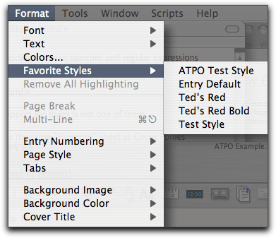
NoteTaker Style Menu
In NoteTaker, you highlight text by Command-dragging text blocks. Colors are easily set or changed; there is no small selection as with, say Finder labels.
NoteTaker has a feature like Circus Ponies’ Super-Find. It is called Highlight and Summarize but doesn’t search for marked or styled text. NoteTaker’s AppleScript support is pretty good, but scripts cannot “see” styles or highlights.
Of all the power outliners, NoteTaker seems to be adding major features the fastest. Users should get on AquaMinds’ case because they are behind the curve on style support. They should start with making things visible to scripters who can add their own features.
OmniOutliner
OmniOutliner has a complex system for setting and managing styles. It is mainly applicable to header styles. Header styles aren’t of much interest to us in this column. The idea with header styles is that you set a style that is adopted for all headers of a particular level. If you demote a header then it takes on the style of the lower level. TAO and Inspiration also have settings for this.
In the OmniOutliner world, you use the same controls to override the defaults for both headers and notes. The user interface makes sense, but it is hard to grasp at first because it is unlike anything you have seen. The screenshot shows the major elements: a style inspector where you can see and set attributes for the selected header or text, a similar display in the lower left that shows info about the documents’ styles, and a toggled overlay on the right that gives some indication of what is applied where so far as headers.
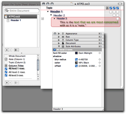
OmniOutliner Header Styles
Another screenshot shows the “note” area, which is what we really care about. Things are much weaker there.
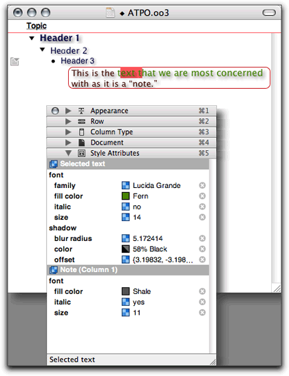
OmniOutliner Note Styles
You can cut and paste styles, which is very nice, but there is no system to name styles. For instance, you cannot set up a style as “mild bold,” which would take whatever the style was and lighten the color a bit and darken the shadow, both based on what was there.
OmniOutliner has terrific AppleScript support, but scripts cannot see styles, so you can’t do anything with them. I’m willing to bet that with enough requests, Omni Group will give us named styles in the note field and the ability of AppleScripts to see and modify them.
Tao
Tao is a purist’s outliner with the best developed facility for outline manipulation among our power outliners. It has a “style sheet” feature that sets default styles for the outline. And among its many palettes is the one shown below.
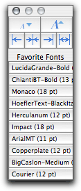
Tao Favorites Palette
You can store ten Favorite Fonts on this palette, no more and no fewer. You use this palette by selecting text in notes or headers then clicking the button you want. It isn’t quite named fonts, since you cannot assign names. The descriptions, as you can see, don’t include information other than font name and size. And you cannot see the whole line.
I think Tao is positioning itself as a writer’s tool. In that case, the support for named styles that retain their identity on export to Word and Pages certainly is in the future. But remind Blue Beach Systems, won’t you?
Tinderbox
Tinderbox allows text to be marked in an indirect way. You can select a text block and assign a link to it. Tinderbox links are named, and you can create any number of custom-named links. Links can overlap, and text blocks can have any number of links assigned.
All links, regardless of name, look the same appearance-wise; they turn a color set in the preferences. The default is blue. You can use these links as a style marker, with only the blue visible indicator, at least in the text view. Each link type does have a color assignment that shows in the map view. It is handy in that view but not helpful for our topic here.
The good thing about these “styles” is that they are scriptable to some extent. Tinderbox has agents and rules that are little scripts. You can do the obvious: collect all notes that have a link type (and perhaps other attributes in a complex combination) and do something useful with them, perhaps gather them all in a clone (which Tinderbox calls an agent).
I’ll bet that with a little reminder, Eastgate will give us the ability to have typed links that have assignable text attributes.
The screenshot shows the Tinderbox link type selector.
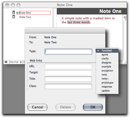
Tinderbox Link Type Selector
Stuff That Would Be Cool
Well, that’s the rather dismal state of affairs in our power outliner community so far as style awareness and management. But then again, our computing platform is still young as are all these applications.
I believe the future in this regard is up to the intellectual marketplace. But we have something the Windows users don’t, a vital competitive environment in that intellectual economy and a more sophisticated user base. My contribution is to suggest a few things you might consider demanding.
We need to have support for arbitrary styles in notes.
Styles should be nameable and inherit properties or attributes from previously applied styles, for instance you might have an “emphasize” style that lightens and emboldens what was there. They should be overlappable so that multiple character styles can be applied to the same text block or overlapping text blocks.
Styles should have assignable appearances that are easily turned off or viewed independently. Some styles should be “invisible” or conditional text. Invisible means it is as though the marked text wasn’t there unless made visible. Conditional means that the marked text only appears under certain conditions. This is often used in technical manuals, which cite commands that exist in different languages.
Many OS X applications already have language “styles” so you can mix different languages, even right-to-left and left-to-right languages, in the same paragraph. These should be integrated into the general style management system so that behaviors can be controlled under different conditions.
Styles must be visible to all the appropriate application services. This includes search of course, but could include indexing, bookmarking, linking, and gathering. Styles should also be visible to system services, for instance Spotlight. Scripts and Automator actions need to see, reason about, and change styles.
A standard specification of styles should be built into whatever XML standard the industry comes up with to complement the sparse OPML. Named styles should convey to common workflow targets like Word, InDesign, and Pages.
Styles should be typeable and capable of holding metadata. The typeable notion means that in addition to inheritance trees (like our embolden example), styles can have different behavior specified in the trees. An simple example might be a class of draft or editing styles that behave differently than “permanent” ones.
The metadata concept is a little different. Some common metadata for a style might be when it was applied and by whom, and in the case of multiple styles in what order. A more advanced notion concerns the class of tags a reader remarked on in a comment to our last column concerning quantitative data analysis (QDA). QDA allows assigned and computed information to be added to text so that associated text can be linked in some way. QDA is one example of a larger class of techniques that analyze text, add information, possibly make inferences, and may alter the text as a result.
This is often done by maintaining a separate metadata file that points to locations in the target text. It is much, much better to attach the relevant metadata directly to the text block as an attribute or annotation of the style. Suppose, for instance, that we had a DEVONthink-like service that scanned a collection of text and assigned weights to text blocks based on desired affinities. Word already does this in a simple sense when it identifies and styles what it thinks are grammatical errors. Imagine if the DEVON-like service deposited this affinity data on top of the text blocks as it did different things. Suppose it wasn’t a DEVON-like thing but something that actually teased out meaning and suggested a “gather” operation for collection of clones in a location.
For instance, “scan this document and collect linked copies of all the hate speech in an appendix.”
Other types of metadata would be functions. Simple functions would be links of the type we have today and others that are not common, like transclusion or metaclusion, which we mentioned in an earlier column. Or it could be scripts or actions that would do something. An extremely simple action might be a date script. If a date in the note has this style and it is in a paragraph or cell with certain words that denote an event like a meeting then it triggers an alarm one hour before the time in the marked text.
Naturally there are a gazillion ideas clever people could come up with around this idea.
We need to have a relationship between layers and styles. I’ve already mentioned one simple style layer notion, the notion of several parallel texts on top of each other in several languages. When you want a tech manual with some text in French, only that layer is visible.
But layers can be enormously helpful in other ways. In program code, uses are obvious, but we focus here on writer’s tools. Word has a layered style concept in its Track Changes feature. When I had layers, I used them for source notes layered on draft text, layered on rewritten text. Illustrators have had layers for years. They are natural for text editing if you have robust style support.
You might think it silly, but consider styles that control animated behavior in display.
Consider styles that convey selfish behavior on the text block so that it would use harvested metadata to better place itself in context to convey the idea it contains.
Think about the future. Think Different.
The ATPO Tracker
NoteTaker
If you haven’t looked at NoteTaker recently, give it a revisit. It used to be the conventional wisdom that Circus Ponies NoteBook was the one with the elegant interface, and its competitor NoteTaker was the clunky one, albeit with more features.
That’s changed. NoteTaker has piled on even more features recently, some not available elsewhere. I suppose we’ll have to have a detailed look at some of our power outliners soon, including NoteTaker.
Along the way of adding features, AquaMinds started using their own product to deliver some of their documentation. But what we’ll mention here are two user interface–related items that appeared in recent updates: a good drag strategy and great links.
NoteTaker is a coherent collection of pages, each of which is a discrete outline. These are stacked one on top of another, so that if you are viewing one you can’t see another. A strategy of stacking has lots of advantages, which include several types of integration across outlines. But it is annoying not to use “the Mac way” to distribute pages and views all over the place. So the question is how to handle problems like navigation and dragging from one outline to another.
NoteTaker and NoteBook use the metaphor of tabs for pages and sections. These are optional and tailorable. Clicking on one takes you to that page or section divider (which contains a table of contents for that section). Now NoteTaker tabs are spring-loaded; drag a selection to a tab, hover a bit, and it opens that page. Then you can continue your drag to wherever you wish.
Along the way, you are dragging a small image of the dragged material. Very nice. The screenshot shows a three-level structure grabbed from a page in Section 1. Our target page in Section 3 didn’t have its own tab, so we dragged to the Section 3 divider. It popped up the contents page, which you see in the shot. We’ll then continue the drag to the “Page 3–2” entry which will pop up that page. We’ll then drop the structure wherever we want on that page. One motion to target.
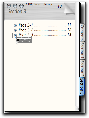
NoteTaker Drag
Regular readers may recall my account of a legacy outliner called Palimpsest. It was a wonderful program with links that were even better than Tinderbox’s in some ways. You could specify a link with a trackable named type, make it two-way or make it a sort of halfway where it pops up an annotation window, rather like a note.
Tinderbox supports the first. NoteTaker now supports the latter two. An annotation can be a text note or a spoken recording. All annotations are collected in a special section, so you could consider them hyperlinked endnotes if you wish.
A link can trigger a URL or an AppleScript, or you can link to an entry in Apple’s Address Book.
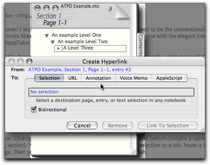
NoteTaker Links
This is well thought out, and all these disparate linking functions are handled consistently. You can’t create a link by dragging as in Tinderbox, but it is a job well done nonetheless.
DEVONthink Pro
After what seems like a two-year delay, DEVONtechnologies released their DEVONthink Pro version. Almost. The current version is in beta as I write this, but it seems extremely stable.
ATPO has always included DEVONthink in its list of power outliners, but that’s not because it is a particularly good outliner. It is a knowledgebase—to outlining as Tiger’s Spotlight technology is to the Finder. Spotlight has a lot of buzz at the moment, so the appearance of DEVONthink Pro gives an opportunity to reflect on search technology in information managers.
First a description. DEVONthink now has three versions with possibly a fourth to come. They all have the same design. At the core is a document database. I don’t know the proprietary technology they use, but it handles huge databases well. Onto that are grafted three services—that’s my term.
The first is an import and indexing service. This is still the most capable of any of our ATPO power outliners in terms of the number of document types it handles. Also, you can initiate the importing or pasting by an impressive variety of ways. It indexes PDFs that have text layers (which nearly all do). Excel and some QuickTime formats don’t work yet.
The second service is why the thing exists: a combination of associative search technologies using techniques loosely called “artificial intelligence.” This also sets the thing apart from other commercial programs available to the Mac. It appears to index by word and build “fuzzy sets” from combinations of words. That means that when you search by a couple words, you’ll get the documents that have those words, as you would with Google and Spotlight. But if you open a document and click the See Also button, something unique happens. DEVON takes all the patterns in the current document and looks for matches in every document in the database. Then it produces a ranked list of all the documents with similar word patterns. Alternatively, you could have clicked a Suggest button and it would have given a ranked listing of all the “groups” to which you might assign the document. This is cool stuff, and the bigger the database and the messier, the better this fuzzy search works.
That notion of “group” brings us to the third service that is bolted on. It’s an outliner. Groups are what ATPO calls “headers,” but in this case the outline view shows them as folders because they can only contain.
The screenshot shows an experiment with a very technical database. The See Also ranking is in the drawer on the right. The outline of groups is on the left.
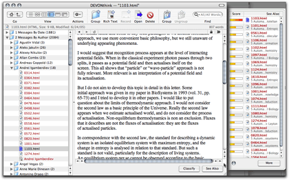
DEVONthink Pro
This outliner “service” was the last of the three to appear. It is pretty mature in some ways. It necessarily supports clones, since a document can be in many groups. These are true clones in the sense that they are equal pointers to the same document; eliminating any one pointer doesn’t disturb the other. That’s in contrast to the Finder where a document seems to be in only one “place,” and has pointers as aliases spread around. Killing the original leaves the aliases pointing to dead air.
DEVON supports links from text blocks to documents and groups within the database, “wiki” type links where any phrase links to a group with that phrase as its name, and links to files and URLs. This latest version adds a lot of niceties; the most important to ATPO are AppleScriptability and the ability to export.
DEVONthink in the past has been easy to get stuff into and work with, but hell to get structured document groups out. That contrasted it to Tinderbox, in which it is easy to build structure and get things out, but difficult to get things in.
Now you can export DEVONthink files to HTML, OPML, and OmniOutliner. Good deal.
Now to the controversy. Many ATPO readers use outlines as a part of a workflow or reference resource. The idea is that over time you may add stuff, but you are also modifying what you have and restructuring it to make it better. This is the use that the collected conventions of outlining support the best.
The Finder is an outliner—has been for the longest time. That’s how most of us use it and why most Finder-related tools evolved as they have. With iTunes, Apple made smart folders a key element of what has become an interface standard. (Smart folders have been a part of the Unix world for twenty years, and Microsoft, IBM, Taligent, and Apple toyed with them long ago. Only recently has Apple added them as a mainstream addition to the Finder outlining paradigm.) Tinderbox is entirely consonant with this notion that when you add structure, it matters.
Spotlight at the moment is a potential disaster both functionally and in terms of what it implies when the usually insightful Steve Jobs says the Finder could be replaced. The idea, I suppose, is that the structure will appear only when you want it and then in as much detail as you want. Why sort your laundry if a robot will hand you a red sock when you need it?
Because it doesn’t work, that’s why. There’s more to documents than looking for words; you need to look for meaning. For a search engine to work well, it would need to know what a document says or infers, or denies. And—more importantly—it would need to know what you need, even if you can’t express it or logically work it out.
DEVONthink’s value for me is that it has a tremendous tool to suggest structure by its fuzzy associations that I can then use to build groups. The trick is, then, how do I take advantage of that new structure I’ve added?
And this is where I think DEVONthink has a long way to go. It won’t tell me what its search algorithms are or how they are weighted. I’m someone—admittedly an atypical user—who could understand that and wish to tinker with the settings. In fact, I believe that the settings could be exposed in such a way that many users would understand the controls.
Since I can’t understand nor control how it associates, I will always mistrust it. And I’ll want to build or purchase my own modules. I’m pretty sure DEVONthink is set up do this; DEVON has a new investor that does intelligence work who will likely be adding its own modules, almost certainly based on n-grams.
(About n-grams: Since you’re not actually indexing the meaning of words, why bother to index the whole word? After all, there are vastly fewer combinations of two or three letters than there are whole words in all languages. As it turns out, you can get just as good patterns with these as with whole words, but with vastly fewer resources, and allowing incredibly more efficient pattern matching techniques. The spy guys like this because they could be dealing with tens of millions of unindexed items at a whack.)
Incidentally, DEVONthink’s likely competitor will be a company backed by In-Q-Tel (the CIA-linked venture capital fund) that claims not only to index words but also the “meaning” of them. (Disclaimer: I was on the panel that helped set up In-Q-Tel and am an outspoken critic of how it turned out.) Whatever they can actually do, I guarantee it is less than the hype.
Back to my heartburn with DEVONthink. After I add structure by links and gathering things in groups, I want the search engine to heavily weight that new structure. DEVON says it does, but my experiments show otherwise.
Worse, I can’t export all the structure, which means I can’t use it in my workflow. If I select OPML or OmniOutliner export, I can export the nesting structure I’ve built, but all links are lost. If I select HTML export, all the links are there but not the tediously performed grouping!
DEVONthink is way ahead of Spotlight, which I find totally useless. It is clearly the best we have so far, but it still has a way to go.
Tinderbox
Tinderbox is now at version 2.5. The latest version, as always, has a long list of new stuff which you can review on the site. Three features are worth mentioning in the tracker context.
The first is trivial in a way but makes me feel warm. ATPO may have been influential in getting Eastgate to change their System 7–style disclosure triangles to modern, antialiased ones. Who says we haven’t got clout?
Tinderbox Arrows
More directly useful is what they did to header styles in the last upgrade a couple of months back. As we mentioned above, they now have header styles that are individually controllable, manually or by a script.
They introduced “rules” last time around. They’ve always had these in association with what they call “agents.” Agents find notes according to criteria you specify, collect them in new outline entries, and additionally transform the notes according to a wide variety of possibilities. Rules allow such transformations without the necessity of collecting.
Rules have turned out to be popular, but it slows things down to have hundreds of scripts constantly working on perhaps tens of thousands of entities. Now you can set a priority so that some of these scripts trigger less frequently. Makes all the difference.
What else? Tinderbox now imports OPML! This is good for the obvious reason: now you can get stuff into it from your other tools, for instance NovaMind. But as we mentioned before in our XML column, OPML doesn’t transmit all the structure from any of our power outliners.
I think this puts Tinderbox on a path to being able to leverage what Dave Winer is now cooking up with OPML. He has something called Instant Outlining, which is something like an entry-level “transclusion,” which we’ve described before. Transclusion is a simple notion that a part of a document can consist of content imported live from another document to which it is hot-linked.
If instant outlining works as described, the master document will be a Web-published outline where the content is from many different sources. New sources can start at any level and interpolate content between existing children. We’ll see. Half of his stuff becomes important parts of the landscape, both as tools and impediments to doing things more powerfully, depending on your notions of what’s possible.
![]() Copyright © 2005 Ted Goranson, tgoranson@atpm.com. Ted Goranson is
an older guy living in Virginia Beach. He is a writer and
consultant always open to and currently looking for opportunities.
Copyright © 2005 Ted Goranson, tgoranson@atpm.com. Ted Goranson is
an older guy living in Virginia Beach. He is a writer and
consultant always open to and currently looking for opportunities.
Also in This Series
- A Progress Report · February 2008
- Some Perspectives on the Worldwide Developers Conference · July 2007
- Writing Environments, Plus Two New Outliners · November 2006
- Examining New Business Models · September 2006
- Outlining Interface Futures · July 2006
- Outlining Workflows and ConceptDraw · May 2006
- Dossier and Outliner Web Interaction · March 2006
- Two New Outliners: Mori and iKnow & Manage · February 2006
- Styles Revisited, Video Features, and a Proposal · December 2005
- Complete Archive
Reader Comments (14)
"Worse, I canâ??t export all the structure, which means I canâ??t use it in my workflow. "
In fact you can export selected documents, groups and even the whole database as documents that can be read by other applications (like text editors, pdf readers, etc.), in other words: you can reverse the import process, add what you have created in the database, and export the whole stuff with all metadata included!
You are right about OO and named styles. Sorry. I'll probably show a corrected screenshot next column.
Maria--
Sure you can export documents from DT, but what I mentioned in the column was the structure. If I add structure, I'll want to pass that structure on down the workflow.
Best, Ted
Wow, I just read through the comments from your last column in which I wrote about the = sign, and you (Ted) actually know a ton about the equals sign, its history, and you BOUGHT the HOUSE?!? That is so cool! Sorry to seem like a groupie, but that's awesome. The blending you describe (graph-meets-text) is a wonderful area to explore, and this column does more of it. (Blending is a term by Fauconnier and Turner and is both ubiquitous and shockingly original, and everyone should know more about it as a driver of human thinking...)
Now, about this column, a comment I have that hasn't been addressed yet. I use simple outliners and store things if at all possible in simple text. I know, I know, I lose a lot of information that way. But... when programs change, formats shift, data moves, I lose the information anyway due to inaccessibility. That's a big problem to me, having moved computing platforms, had hard drive crashes before I backed up, etc. XML is beautiful in that it leaves text as the core of the data, and you can get at the data still. I am not a fan of closed data structures, as you can imagine.
So my question is this: how does one keep the data and its markup separate - readable without the markup, yet meaningful, as well?
As with so many of these thoughts, I can't put into words what I am trying to say. I want my data safe, forever, and I want the relations between my data safe, and I want the emergent structure that I would never have seen on my own to be recreatable. How does one do that? When I don't know what will emerge, what can I do to allow the greatest possible emergent behavior?
Sorry to be so confusing, but it's an idea I struggle with. Any help is appreciated!
mc
Fantastic series, by the way, enjoying every one of them.
Have you had a chance to look at Tao's just released implementation of columns?
Laurence
I am toying with the idea of having the next few columns focus on a single outliner. OmniOutliner would be next because of my screwup here. Next would be Tao.
What do you think? These would be easier for me to do, so would likely be more frequent.
Best, Ted
If you do, consider putting NovaMind early in the queue. In a previous ATPO, you suggested that you might give NovaMind a focused treatment like you did earlier to Tinderbox. As a new user of NovaMind, I have absolutely no stake in your choice of outliners to review.
In addition to OO and Tao, a review of the brand new DEVONthink Pro would also be good since it is much more than the DEVONthink Personal you've already covered in earlier columns. Perhaps since OO and Tao seem to be in the same category, primarily for long documents, you could do a comparative review of them as you did earlier for Notebook and NoteTaker. Side-by-side comparative reviews are so much more useful than single product reviews, albeit not as easy to do. But it could be done as a 2-parter stretched out over 2 months.
Then perhaps a comparative of DEVONthink Pro and its top competitor in that category?
The Mac ouliner landscape is much richer now than it was when you started your column!
Keep up the great work.
Cheers,
Jeff
When I try to drag and drop a single entry or a group of entries off a page onto a Tab, the entries refuse to go that far! My cursor gets to the tab, but the entry is left on the page.
What are you doing that I can't seem to find in the manual??
Much thanks,
Actually, you cannot do a conventional drag, where the original is moved. You can only do a copy-drag. Try holding down the option key. This tricked me as well.
Best, Ted
OTOH, your suggestion of single app reviews could also work well, esp. as you could then follow up with small comparison to bridge the separate articles, to get the best of both.
Keep up the great work, cheers.
-Bob
http://www.bobafifi.com
Add A Comment