Customizing The Mac OS X User Interface
Part II: Desktop Pictures
The images we choose to place on our desktop environments are very often a direct reflection of our individual personalities; it’s easy to spot the nature lover, the dedicated parent, the Apple zealot, and more as we pass by their workstations. I can still clearly see the desktop of a kid who was on his last leg with the printing company where I work. His desktop picture said it all—“The end is near…” spray-painted in bright blue over an image of a dirty brick wall.
Sources for images to use as desktop pictures are just as varied:
- The default desktop pictures that accompany every install of Mac OS X, and earlier incarnations of the Macintosh operating system, provide a nice mix of quality images.
- Hundreds of Web sites, with a wide range of computer-generated and photographic images, dedicate themselves to the cause of desktop pictures.
- Digital cameras have opened up a wonderful way for us to display our personal photography as desktop pictures.
The scope of this article isn’t to try to define what makes the perfect desktop picture on a personal level; each of us must decide that for ourselves. However, if you’ve got the desire to share your creative works with others, via a personal Web site or other outlet, then you should consider a few things as you prepare your images.
Image Size
Monitors have grown to monstrous proportions over the past few years. If the native resolution of your monitor is 1024 x 768 pixels or smaller you may not reach a very wide audience. Think big! Create your works oversized and scale them down for your personal use; 1600 x 1200 pixels is a good place to start, but that still won’t cover the larger monitors, up to 2560 x 1600 pixels, that are currently in use.
Picture Quality
Images that are pixelated, have visible JPEG compression, or are of poor photographic quality are big turn-offs.
- Pixelation is usually the result of enlarging a small image to a larger size.
- Don’t be overly generous with JPEG compression. A nice, clean image that is free of artifacts gives end users a greater appreciation for your creations as they display them on their desktops.
- Raw photographs from your digital camera may need a little tweaking. Try iPhoto’s “Enhance” button, or, in Photoshop (or Photoshop Elements) use the Image menu to Adjust Image > Auto Levels; using these methods can give a little more bounce and contrast to the colors and contrast, but they do produce some undesirable results from time to time. If your photo is a little on the blurry side try applying some Photoshop filter effects to help it out; Brush Strokes can be particularly effective in cleaning up blurred images while adding artistic flair at the same time—play with the sliders to achieve the best results.

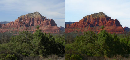
The left image pictured above (click to enlarge) is photo I took in Sedona, Arizona. It’s a long-range telephoto shot, so it looks somewhat grainy as a desktop. The painted effect on the right (click to enlarge) was created with Photoshop’s Plastic Wrap filter and some creative layer blending.
Text Elements
This is one of those things that is subjective in nature, thus it becomes difficult to give good advice for. Used sparingly, and as an overall part of your design, text elements can be very effective in a desktop picture. On the other hand, text can also do horrendous things to an otherwise excellent desktop creation. If you choose to add a copyright line or Web site address to your works keep them small and discreet—in the area under the menu bar or a lower corner is perfect. The middle of the screen is a big no-no.
• • •
That covers the basics! Beyond that, be creative and have fun with your desktop pictures. If others discover and enjoy your creations, that’s icing on the cake.
Here’s a small list of some of my favorite desktop pictures Web sites that I frequently visit and download from:
- Blatte’s Backgrounds
- Blue Sky Heart Graphics
- Caedes.net
- Mad Spaniard
- Pixelgirl Presents
- ResExcellence
And shameless plugs for the ATPM desktop pictures archive and for my personal desktop pictures Web site, Rampant Mac.
Also in This Series
- Part III, Appearance Themes · June 2005
- Part II: Desktop Pictures · April 2005
- Part I: Icons · February 2005
Reader Comments (0)
Add A Comment