Customizing The Mac OS X User Interface
Part III, Appearance Themes
One of the big gripes regarding the user interface in Mac OS X is that with each OS release, Aqua has become inconsistent and too varied in its appearance. Panther gave us the much debated and despised brushed metal Finder; Tiger has adopted yet another variation of Aqua with a plasticized, unified toolbar in the System Preferences and Mail 2.0.
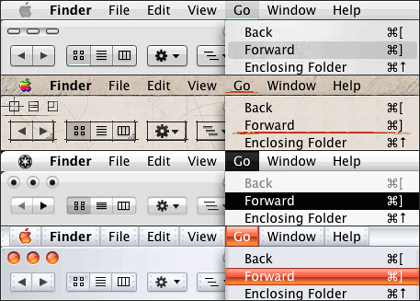
So what can users do to overcome these UI distractions? We can give Aqua a makeover using third-party appearance themes. The Macintosh theme community is blessed with a number of dedicated and outstanding artist/developers whose works allow us to change our user interface with the click of button!

A nice selection of Themes: Siro 2.0, mes20050506, KaminoV2, Aluminum Alloy 1.7
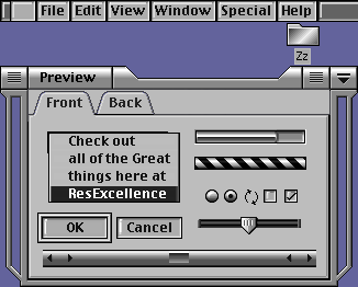
Apple first introduced appearance themes in Mac OS 8.5, but never supported their use. The final candidate shipped with Apple Platinum; the Apple developed themes Hi-Tech, Gizmo, and Drawing Board were withheld from the general public. Lucky for us, creative third-party developers stepped up to the plate and gave us a variety of themes to toy with.

DSG Theme
As we stepped into Mac OS X, third-party developers were putting their modification skills to work as early as the public beta release, and they’ve been going strong ever since.
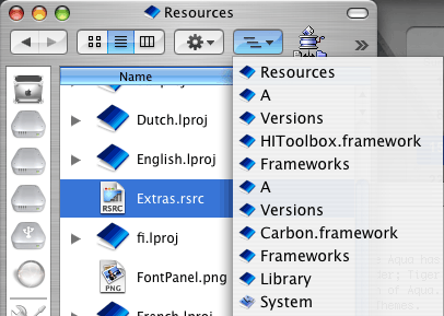
Switching out theme files early on required one to manually backup and copy the Extras.rsrc and Finder.rsrc, a simple task (if one knows where to look) and still my personal favorite method of test driving themes, even though it’s been a long time since there’s been an opportunity to do so. The easiest way to find the path for the Extras.rsrc and Finder.rsrc is to launch the Terminal and paste in the following command.
locate Extras.rsrc
You should see the following result, or one quite similar:
/System/Library/Frameworks/Carbon.framework/Versions/A/Frameworks/ HIToolbox.framework/Versions/A/Resources/Extras.rsrc
Copy and paste the results (without “Extras.rsrc” on the end) into the dialog box of the “Go to Folder…” command in the Go menu. The directory is owned by the system so you can’t make any modifications to it without changing permissions. Our recommendation is to just take a look around the folder, and don’t mess around with the files unless you’ve backed them up and know what to do if something goes wrong.

Locate the Extras.rsrc
Later on we were able to use third party applications that did the work of switching out system resources for us. Those programs did a nice job of making the switch, but they were also somewhat dangerous to use. Switching out system resources is an inherently risky task; the average user may not be aware of the pitfalls, such as using a theme file for an older OS release on a newer version—a recipe for disaster if there ever was one.
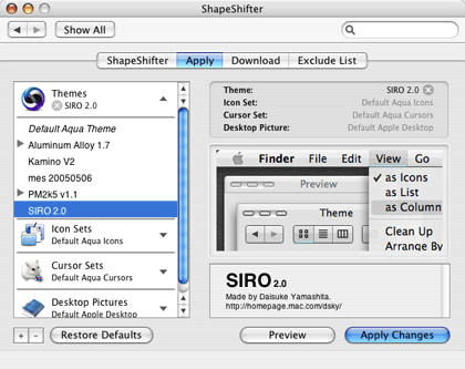
2003 ushered in the modern era of appearance themes when Unsanity released ShapeShifter, a preference pane that applies themes by directing Mac OS X to load and overlay the graphics in theme files (guiKits) on top of the system resources. This revolutionary idea brought appearance themes to the masses and is by far the safest method to date for changing the Mac OS X user interface.
ShapeShifter lets you apply appearance themes, desktop pictures, and system icons as separate entities, so you can pick and choose what to use from any installed guiKit. And, if you’ve downloaded and purchased Mighty Mouse, you can also change the system cursors from within ShapeShifter!

ShapeShifter
Where can you find appearance themes for Mac OS X and earlier? Stop by the ResExcellence theme archive to get started—there are plenty of links to third-party theme developers that we encourage you to explore and enjoy! If you’d like to try your hand at creating themes, download a copy of ThemePark by Jason Harris at Geekspiff.
Also in This Series
- Part III, Appearance Themes · June 2005
- Part II: Desktop Pictures · April 2005
- Part I: Icons · February 2005
Reader Comments (18)
I mean how can I change (like in Win98) the "white" background color by a softer color like... blue... or... black background with green text color.
Thanks.
"The sad thing is that themes can only be applied with ONE program at this time; ShapeShifter. There used to be several options, mostly free. Not that ShapeShifter will break the bank by any stretch... But now that everyone releases only a .guikit version, you're locked in and have to pay to play. Nevermind that most themes are really pretty much unusable for all day use."
You can also use ThemeChanger which is a free alternative to ShapeShifter. You can find ThemeChanger here: . In my limited experience the program works well.
That said, what I have seen in the Mac alterations has not swayed me that anyone has improved on the original.
Sorry.... I think Apple got it right the first time.... Though I'm sad the brushed metal look was dropped in Tiger! Drat!
I have actually a speed INCREASE since using shapeShifter with a them without transperancy.
I will probably buy this program, It's working great.
Michael, I'm sorry to be the one to tell you, but Tiger HAS brushed metal. I think you should buy the OS before you dis it.
Is there any software out there that just effets this feature in OS X? I am currently trying out SetAlphaValue. It allows main window to be full, and any secondary non-used windows to be 35% transparent. Kinda cool, I would like to expand this concept to the toolbar. I think Tinkertools allows me to make the Dock transparent.
I hate to pay the $20 for shapeshifter...
Add A Comment