About This Particular Outliner
Outlining Task Managers, Part 3
In our previous columns we looked at to-do list managers that use outlining and mentioned a few things about the process. We wrap up the topic this month with a look at the “heavy duty” task managers available. For those new to ATPO, we aren’t doing reviews here. Instead, we look at the products’ underlying philosophies through the lens of how they use outlining.
If you adopt one of these programs, you’d better like the way it feels, because you are going to be spending a lot of time with it. It’ll be an anchor application, like your mail, browser, and writing applications. That underlying philosophy will likely be important. For example, in past columns we discovered that Tinderbox focuses on note containers and relationships among sets of them; that’s in contrast to OmniOutliner, which bends toward allowing one to see the entire “document.” When we looked at the superficially similar NoteBook and NoteTaker in one column, we discovered fundamental differences. NoteBook is more of an outliner focused on user interface elegance, while NoteTaker is more of an information manager focused on power and features.
In the case of to-do list managers, we left out lots of good ones because we only looked at those that employed outlining. We don’t have that problem this month because essentially all full featured task managers use outlining in their core presentation, that of task and subtask listings.
I’ll admit to getting a great deal out of these columns myself, dear reader. In a way, ATPO helps me sort out my own thoughts on these applications, work I likely wouldn’t do if there weren’t an eager readership. In this case, I discovered one of these newer task managers that has stuck to me. It shouldn’t matter to you which one because your world will differ. Check them all out, then see what the Windows world has to offer and congratulate yourself once again for choosing the Mac. I’ll say it again: the Mac is the platform for advances in outlining—think of it as iTunes for the music of your life.
As before, we’ll focus on these in turn from the least to most expensive. Unlike the last column, we won’t display the same task in different applications, because these things differ quite a bit.
Formation ($29)
Wow, what a great value.
Formation uses outlining in a more fundamental way than just as a means to display a task hierarchy. It uses the outline to shift among various types of information: contacts, calendar, and so on. It clearly copies the user interface of the much admired and under appreciated outliner Arrange (also called WebArranger), which we discussed in our column on legacy outliners.
It has a “shelf” in the middle left that contains information types that you select when building an outline of various tasks. Each information type has a different template for how the display on the right is laid out. You enter “items” in the upper right. Contents of the items where appropriate appear in the lower right, for instance notes for items or contact details for the contact list. An inspector in the lower left displays and sets preferences for the items, greatly improving the original Arrange layout.
The contact list draws from and syncs to the system Address Book; you can message directly from Formation. There’s a freeform “scrapbook” and a rather nice “media browser” that you can use to link to task-relevant folders.

Formation
Types of items link primarily through columns in items, for instance the due date shown in the screenshot also will show in various calendar-oriented views. The outlining function (as with Arrange) only goes one topic deep and will frustrate those familiar with writing outliners.
If you liked Arrange, you’ll like this too, as it is adopting and extending a pretty sophisticated user interface model. But it is clearly a 1.0 product and it is missing some of the things that made Arrange special. We are missing the ability to have items in an outline (ouch!), and Arrange’s complex and powerful type recursion isn’t there (see the ATPO column for an example). That means that though you can have a lot of relevant stuff under topics, they aren’t linked as closely as other paradigms allow.
iTask (65 Euros, About $80)
Here’s a completely different approach, just now coming out of beta. It still has some things that aren’t quite right in terms of refresh and display. iTask (formerly known as eTask) is based on a familiar interface convention. The outline in this case is an outline of tasks and subtasks, and it is related at the primary level to a Gantt chart.
This notion has been around for years with the Windows-only Microsoft Project, which seems to be in the process of retooling (and combining with Visio) as an enterprise tool rather than a desktop tool as part of Office. Schedule and LeadingProject, described below, are in this same class. Unlike those, iTask has a very complete setup guide that walks you through all the steps you take in defining your project.
The notion is to anchor everything to a task breakdown, like many of our to-do lists. From that base, you add information that is primarily to track and manage tasks rather than actually do them.
These types of programs have well-established feature sets, something that follows from Microsoft dominance. I’m not qualified to compare all the nits of these features, but it seems that more than all the basics are supported: different Gantt formats, calendar, network and resource views, and a huge number of information fields and columns.
I’m going to steal a screenshot from their Web site for the example because a bogus one wouldn’t be nearly as complex. We’ll just have to live with the German. But you can see the Gantt part over to the right: the length and location of bars on the timeline shows when tasks start and stop. The vertical lines show when a task is linked to or dependent on another. The percent completed is shown in the coloring of the bar and the column on the left. That column sums completions among subtasks using rather sophisticated means based on subtask difficulty and importance.

iTask
As with many of the applications listed here, iTask features integration with the system Address Book. In this case, you can select an existing entries as human resources for tasks. But you cannot edit or add to Address Book from iTask.
This is a strictly Aqua application and compares well in usability (and cost) to the old guys. But note: this is task tracking only, albeit complete. I think the fact that we have these appearing for OS X is an indicator that the market is betting on Macs entering the business enterprise in a big way.
ActionItems ($99)
I have to admit that although I’m a Mac enthusiast, I think Apple’s supplied productivity suite is sort of bland. I have alternatives to Mail, Safari, Address Book, and iCal that are each better in their own space. The fact that Apple’s stuff works together would mean something if there were some power features included.
That’s what ActionItems supplies. It splices onto those (plus iChat) existing, already integrated applications, and gives us something we can actually use to manage work. It has features for managing distributed collaborative workforces, like Near-Time Flow. But where Flow is oriented toward collaborative publishing, ActionItems is about supporting coordinated work. We’ll have to gloss over the collaboration features here as that’s not our focus. You’ll just have to imagine the instant messaging and e-mail integration.
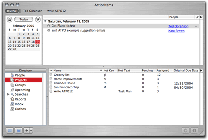
ActionItems presents a multi-pane window. The top section can be toggled between a task outline like all the task outlines mentioned here, and a “journal” which is a different outline associated with a day. Journal outlines can usefully be more freeform.

ActionItems Journal Outline
Down in the bottom half are lots of different items, called a directory. Here are listed certain items and resources associated with a project and which may be related to a task. The “people” category is closely tied to Address Book, and has an indicator for on-line status. The in- and outboxes are tied to Mail.
This is quite different than anything we have seen yet. All the “source” data is in applications elsewhere on your disk: what ActionItems provides are the two, interwoven outline views. In a sense, it is a task-oriented Finder outline.

ActionItems Task Outline
Daylite ($149)
And yet again we have a completely different approach.
This might seem a bit odd, inserting this application into a survey of task managers. It is a “contact manager,” which is a mature class of application. Contact managers are for salespeople and the utility is obvious: keeping track of sales and potential sales. In this context, “tasks” have a very limited meaning, namely tasks associated with making a sale. I’d rather set myself on fire than do sales: the tasks I manage have to do with building my house, writing documents (like ATPO, but books as well), improving my infrastructure (which you might call “metatasks”) and running fairly complex research and prototyping projects with small teams.
So just for a moment, I’m asking you to forget that this is targeted as a contact manager. It is built on a robust database product, OpenBase, and is intended to keep all your contact, calendar, to-do lists, and notes in one database. (StickyBrain also uses OpenBase.)
Just as there are advantages to ActionItem’s approach, so too are there advantages to having everything in a heavy-duty database. One of these is that you can build all sorts of custom relationships. Another is that you can rely on the database mechanisms for sharing and harmonizing things with distributed collaborators.
Daylite’s user interface is very Mac-like in appearance, but you simply cannot fathom it without referring to the very complete (300-page) PDF manual. (There are tutorial movies and a user forum as well.) That’s good, because it has the toughest learning curve of the applications we survey here.
It’s difficult to give an illustrative screenshot because there are so many possible panes. You set “window view” templates with different combinations of panes. The one I’ve chosen to show has the project outline on the left and an information pane on the right. It is the most natural view for an outline-savvy user.
Several projects can be listed. Each has the fixed four main categories. The task category can have nested tasks, as usual in task managers. Contacts are selected from Daylite’s built-in contact manager, and events from its calendar, but both sync with their system counterparts. A project is built of many components: tasks, roles, notes, events, and such which are “linked” to one another. The complexity and power come from the fact that nearly anything can be linked to anything else. That’s why you potentially need so many displays.
You’ll note that I linked one task in two locations in the outline.

Daylite’s Task Outline
It has a mail-merge with OmniGraffle! (as well as Word/Excel).
I’ve listed Daylite as an outlining task manager, which is the way I see it. But if you are considering contact managers apart from outlining, it competes with OD4Contact, CRM4Mac, and Entourage.
Merlin (145 Euros, About $195)
So far, we’ve seen four outlining task managers with four radically different approaches. Merlin combines two of these approaches. Its main view is an outline of tasks and subtasks with an attached Gantt chart like iTask and the applications that follow below. But it also has the annotations and linkages among elements like Daylite.
Merlin will sync to iCal, send messages from Mail, and work directly with the Address Book (it does not maintain its own address book). And it also imports OmniOutliner outlines and NovaMind mindmaps. Merlin produces a very impressive “Web site” project report. It supports all the same linkages among elements as Daylite, at least so far as the normal linkages that I need. I get the impression that Daylite might allow more in this regard.
Where Merlin excels is in the many types of element variables you can specify, especially in the area of risk management. For example, if you are a subcontractor on the new high-altitude spy plane (and who isn’t?) you will need to maintain and report on a risk management scheme that is unique to that one project. In theory this is no problem; you should be able to specify your own methods. Tools for radical tailoring are not yet included.
Merlin includes tons of examples, but the idea is that for many projects—not just the facetious example—your competitive advantage is in the business practices you have developed. Rather than neuter those practices to fit your program management software (which Microsoft’s product forces), it is better to adapt the project management software to suit your own practices.
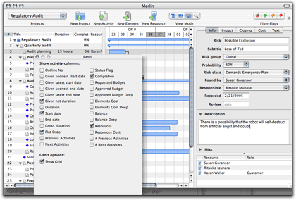
The screenshot in this case has in the background an illustrative outline and chart, taken from the “audit project” template. Over on the right is an information/inspector pane showing one of the risk specification panels.

Merlin
LeadingProject ($249 download; $299 boxed)
The ATPO Tracker has mentioned this before as ConceptDraw Project. I’ve remarked on the ambition of the Ukranian developer to create a complete cross-platform suite of enterprise tools, from mindmapping to project management to PowerPoint-type presentation. Since they compete with Microsoft on their home turf, they interact with Microsoft Office and Project applications well.
They’ve rebranded ConceptDraw Project as LeadingProject, but it retains its position in their suite: you can brainstorm in their rather good mindmapping application and present in their slideshow/report application. This cross-platform flexibility means that no OS X application is tapped; no Address Book, iCal, or Mail.
iTask, Merlin, LeadingProject, and Schedule (below) all use the same outlining paradigm: the outline is an outline of tasks and subtasks to which a Gantt chart is attached. In the latter three cases, a column view is possible as well.

LeadingProject
Schedule ($290)
I used this baby fifteen years ago when it was a Mac-only application from a small shop. I think it has changed hands a couple times since then, and development has slowed to nearly nothing. But there’s no question that it is the oldest application displayed here. As with LeadingProject, this is essentially a Gantt chart program, without the extra “element inspectors” that some of the others have, supporting factors like risk management.
As with LeadingProject, it ignores the OS X Address Book and iCal. It syncs to a Palm version and supports handy links to documents that are associated with the task. (But file linking and embedding is much better in the Windows edition.)
Naturally, anything from the dim past that hasn’t had a radical user interface update will just feel old. And that’s annoying as can be, especially in the outlining controls, which are clunky.
But maturity has a couple advantages I’d like to highlight. The first is that this is the only task manager we’ve mentioned that is AppleScriptable. It also has its own internal macros and element-to-element rules.
The second unique feature is the variety of styles you can use in designing all of the elements of the chart. It is remarkable how much information you can graphically display with subtle nuances in color, shape, font, and so on. In this, Schedule is far superior to any of the others in the information in the chart itself. You can pretty much create any pre-Aqua style or marker, meaning transparency and shadows are out.
To a non-trivial degree, you can combine these: scripting and styles. A project preference also sets font styles by level.
In ATPO, we celebrate outlining because you can get a lot of structural bang for the interface buck. But we need to be on the lookout for graphical means to extend the paradigm. We already have mindmaps, which don’t add much structurally. And we have Tinderbox’s novel map view, which at least displays links (crudely) and has cool zooming.
This notion of packing huge amounts of information in scriptable Gantt chart styles (possibly with rules) has lots of promise. In fact it is something our little research group is working on as a hook for virtual enterprise collaboration.
Maybe with a little user pull, the new Gantt charters iTask and Merlin can develop in this direction.

Schedule
The ATPO Tracker
SuperNotecard
The cross-platform Java outliner formerly known as Miss Lonelynotes has been updated and renamed as SuperNotecard. You’ll recall that it has some predetermined attributes, which it leverages to provide support to writers, primarily fiction writers. This update enhances some character profiling, adds a few much needed interface improvements (though it still takes getting used to and otherwise needs work), and now supports OPML import and export. If you are an author—especially of fiction—and think you may resonate to the index card metaphor, check it out. It links attributes by color coding.
ShadowPlan
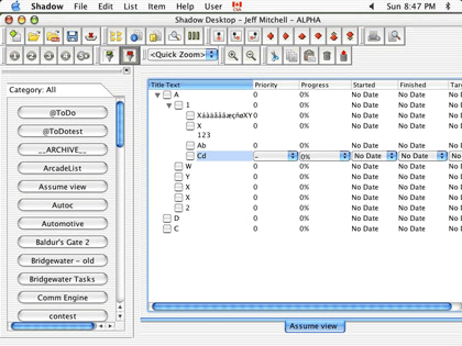
I’ve been advised that I used a screenshot of an obsolete beta for the upcoming Mac version of this popular Palm outliner. Sorry about that. Below is a later screenshot from the developer in which a whole lot of improvement is apparent.

LeadingProject
hnb
A reader beat me to the punch by mentioning hnb in a letter last month. hnb stands for “hierarchical notebook,” and is an open-source project. This will be unlike any outliner you have used because it is command-line-based; you access it through Terminal (usually in your Utilities folder).
But first you have to “make” it. Download and install the free Apple Xcode tools, which install conventionally. Then download the hnb source package and uncompress it. In the terminal, navigate to the folder and type “make”.
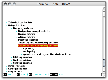
Once that’s done, you simply type “hnb” in the terminal. The first time you do so, a tutorial which looks like this, appears:

hnb
You’ll have no menus and no graphical user interface. But it has terrific and logical keyboard controls and spell checking.
Why would you consider such a thing with all the cool stuff on the ATPO Tracker? Because it can be used on any platform (except OS 9) and because it is the smallest, fastest outliner you’re likely to encounter. But mostly because it saves natively as XML that is based on a clean Document Type Definition (DTD). (It also imports/exports OPML.)
It means that for free, you can maintain an outline that is accessible and manipulatable in all sorts of ways using the XML tricks we’ll discuss in the next column. That column, by the way, will tell you what a “DTD” is, how we got stuck with them, and why they are useful.
• • •
Next up on ATPO is a column on XML exchange in an outliner workflow. I can use all the help on this I can get, so if you have some insights or suggestions, please send them.
Also in This Series
- A Progress Report · February 2008
- Some Perspectives on the Worldwide Developers Conference · July 2007
- Writing Environments, Plus Two New Outliners · November 2006
- Examining New Business Models · September 2006
- Outlining Interface Futures · July 2006
- Outlining Workflows and ConceptDraw · May 2006
- Dossier and Outliner Web Interaction · March 2006
- Two New Outliners: Mori and iKnow & Manage · February 2006
- Styles Revisited, Video Features, and a Proposal · December 2005
- Complete Archive
Reader Comments (11)
I've tried each of these apps over the last few months, and while each of them are promising and cover certain niches, I really like DayLite and Merlin the most; they're the most robust of the lot in my opinion. I bought DayLite and am considering buying Merlin. Daylight has adopted a plug-in approach and is encouraging developers to create plug-ins to it which bodes well for its rapid growth as a platform. They have a handful of plug-ins available already, including one that integrates with Apple's Mail and a third party plug-in that integrates DayLite with Parliant's PhoneValet telephony app.
Like many of your readers, I also use DEVONthink (and am waiting for their upcoming Professional version), OmniOutliner, and am looking into the promising Flow and ActionItems apps. So I'm looking forward to your upcoming column on workflow integration to help tie them together.
A request is that you cover how well various apps conform to the XML and OPML open standards formats for data longevity and portability. To state the obvious, this seems to be the essential glue to creating a viable workflow system. In fact, a larger systems approach is the main criteria for how I'm evaluating individual apps for functional fit, for they don't just stand on their own as separate isolated feature-set islands, but form integral parts of a larger information management system.
You can't just say that! Your attention to detail makes me value your opinion highly, so which one was it?
And of course thanks again for a great article.
Currently I mainly use DayLite, Near-Time Flow (1.5 EA), and OMNI Graffle Pro, but have tried many of the programs mentioned here. Each program has its strengths. I really like Tinderbox's approach and graphical displays of the information, and DevonThink's management/preview of a variety of files has been quite useful since I have hundreds of PDF files for part of one project. Unfortunately there's not one program to cover all my needs. For now Flow seems to offer a good balance between my need to store different files in an organized manner, a simple text editor with options to make specific information easily accessible (e.g., using markers, colors, styles), and more.
By the way, Near-Time now also has Current, which seems to be like Flow but without the collaboration features:
http://www.near-time.com/PRODUCTS/compare.htm
Years ago I used Idea Keeper from Plum Island Software, but unfortunately development seems to have stopped years ago. It was pretty good.
http://db.tidbits.com/getbits.acgi?tbart=05931
Thanks again for the wealth of information provided!
Sorry. I promised myself early in the game that I wouldn't promote my own usage patterns to readers. If you don't have respect for your readers, you shouldn't be writing.
One of the tenets of ATPO is that outlining is a technique, not a product. Another is that ATPO readers are clever individuals worthy of finding environments that fit their unique minds. What I use is pretty irrelevant, and I hope ATPO helps readers find good fits for how their imagination is shaped.
I want to write about XML transfer, workflows and scripting. Beyond that, reader interest may wane. In a final column, perhaps I'll get personal about my own environment.
Best, Ted
Don't you dare write a final ATPM column.
I think the extra trouble of "make install" and adding the "no-cpp" line is unnecessary if you have the most recent system and Xcode tools.
Just try a simple "make" like we said in the column. For problems beyond that just message me privately.
Best, Ted
Thanks for yet another extremely useful contribution!
Mike
You are amazing! We need you on-goingly. I'm wondering if you would consider broadening your cope to address Tools For Thought. I'm trying to conceptualize the pieces of that puzzle and some of them are: capture, search, storage and retrieval, writing, annotation, organization and presentation. Outliners seem mostly in the organization piece of this with writing, annotation (highlighting or adding comments to something) close behind. And then some retrieval and storage and search and capture. In that order.
As a user, I have to not only decide what outliner I want for times I want to outline something, but also where to keep my web clippings and where to write stuff. When to export to a writing program. It's complicated. When and whether to use which search engine, PubSub, or DEVONagent for finding stuff on the Web. It goes on.
I know that anything you do on this will be interesting and well-done
Thanks, Janet -- Tech Ronin
Add A Comment