About This Particular Outliner
Announcing the FORE/1 Outliner
Regular ATPO readers probably know I worked with NSA, followed by a lengthy involvement with ARPA (now DARPA). One of the labs I worked with during these decades has developed an advanced outliner for their own use, and will now release it for free. This month, ATPO reviews some of the key features of this application named FORE/1.
The lab in question is one of those that still officially “doesn’t exist,” which makes open source licensing a little problematic. So they intend to just release the outliner through the major peer-to-peer file sharing networks as a “free” product including source code. They think it may actually spread faster by that channel anyway. Because they must keep their identity secret, they have retained the firm SAIC to act as spokespeople. Sri Golubula of the McLain office of the Suffolk, Virginia office of SAIC gave us a detailed overview of the product, which we report here.
Architecture
(This section is a little more technical than we like to get in ATPO. Some ATPO readers may want to skip a couple paragraphs about the how and go directly to the what. Just look for the “User Interface” header below.)
FORE/1 is based on the notion of cells like NoteTaker and NoteBook. This notion goes beyond the two traditional types of outline header and paragraph text. Like Tinderbox each cell has any number of attributes. Each cell has a position in an outline.
FORE/1 is novel in extending that notion to agents. Each cell has at least one agent that controls the display, but many agents are possible, including agents that move about. Agents can modify the display, change and generate the existence, type, and contents of cells; and arrange cells in the outline structure.
FORE/1 agents are based on functions, coded using the functional language Haskell, which for five years has been maintained as an open source project largely via courtesy of Microsoft Cambridge Lab. This approach—radically different from normal programming practice—allows the agents to be loosely coupled, stateless, and distributed. (This summer, Microsoft will be introducing a .Net version of the FORE/1 agents in F#.)
Execution of functions in this structured context allows the most advanced state-of-the-art concept modeling, said Golubula, but some of these capabilities have been removed from the lab version of the application for open distribution. (The version that allows distributed outlines/outlining, including assistance by remote agents, is called “FORE/n,” pronounced “foreign.”) We’ll mention one or two of these impressive capabilities when we review the features.
Golubula noted additional novel elements of the architecture:
-
“FORE/1 is essentially an outliner GUI for Emacs. Leveraging the existing capabilities of Emacs allows us to take advantage of the stable code of thousands of person-years of coding and even more of review. It is the most complex and capable single application in existence,” he said.
During the three months I have been using it, there was no time when the I needed to “drop back” into Emacs or even be aware that it was running. FORE/1 used the stock Emacs supplied in Panther as a background process, invisibly installing the necessary extensions (which include OSAXen—AppleScript extensions—in Emacs Lisp).
-
There are essentially two applications: the outliner itself, which is written wholly in AppleScript; and the agent space, which is written in Haskell. The source code for both is completely visible and editable in the outliner. The user interface is created in FaceSpan using a free runtime component, which Golubula says was a tough call. They could have done it using AppleScript Studio, which is free. That would have allowed anyone to edit the entire application, including interface widgets. But AppleScript Studio is difficult to use, even for small changes.
AppleScript Studio brings AppleScript to Cocoa, while FaceSpan is more rooted in AppleScript, simply adding interface elements. This way, a novice can more readily tweak anything at all except adding new interface widgets; for that you’ll need to purchase FaceSpan at $150, or more likely send a request to the developers through Golubula.
-
The structure of the Haskell functions is based on a novel application of group theory to information, a formalism that allows the history of each cell to be presented internally in terms of a mathematical “shape.” This representation allows unexpected bindings among cells but more importantly allows higher level abstractions to guide writing and associations. Golubula avoided mentioning the lab’s application, but the demo cells contained unstructured and structured text, unstructured and structured media as both input and presentation drivers, and similarly structured (literate) and unstructured code as content and the application.
-
FORE/1 was developed and primarily fielded on Mac OS X. That’s because the lab extended the OS X kernel (xnu) to allow cell functions to control the Power architecture (the basis of the G4/G5) at a very fine level for FORE/n. Something like that was always planned when the lab in question helped fund the Mach project on which OS X is based.
However, Golubula stressed that the IBM/Apple Taligent partnership resulted in code developed for the similar NuKernel that IBM is using to extend the Linux kernel to support similar functionality on IBM’s high-end workstations.
-
IBM is interested in adopting the KDE desktop for its next generation Linux enterprise desktop. It is already committed to speeding progress on KWord as a replacement for the popular FrameMaker which Adobe is abandoning. KDE employs a component embedding technology, KParts which is an updating of OpenDoc, a technology jointly created by IBM and Apple. Apple’s forthcoming “Tigress” employs a modified version of Kparts for its interdocument services.
Because FORE/1 uses KParts, it can embed in KOffice—or any other KDE application—like the KDE Web browser on which Apple’s Safari is based. All of the KDE applications are coming to OS X/Tigress as a cross-platform competitor to Microsoft Office, with FORE/1 as the outliner component directly competing with Microsoft’s Notebook in its Office suite.
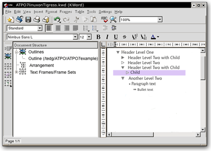
FORE/1 Outline Embedded in KWord
The overall architecture is showed in the following slide that Golubula supplied. Only the elements in the darker boxes are provided in this release. The novel visualization modules are having some classified technology removed and will be available later. They employ concept lattices, hyperstereograms, a novel input/manipulation device based on string figures (cat’s cradle), and the soft logic of Thomas Harriot.
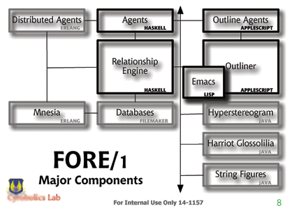
FORE/1 Architecture
User Interface
Detoured readers can rejoin us here; after all, what matters is what you can do and how comfortable you feel. So in this ATPO installment, we’ll review the user interface, which is the very best I’ve seen for an outliner. In future columns—if there is interest, perhaps in the “mind-mapping” column—we’ll look at some of the extraordinary things the agents and graphical visualizers can do.
At first glance, the outliner is fairly ordinary looking. It comes with all the advanced features hidden; in this mode you use it just like you do OmniOutliner.
There are some differences. The text can be translucently shadowed (which makes an amazing difference), the drag indicator is like we described for NoteBook in ATPM 10.02, but like NoteTaker (and unlike NoteBook and OmniOutliner) you can copy cells by Option-dragging.
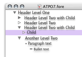
Simple Outliner View
You’ll note that it uses an ACTA-like triangle convention. A hollow triangle denotes a cell with no child. There are two primary cell attributes: headers (denoted by triangles) and paragraph text (denoted by bullets and multiple bullets). When exported to Word or applications that accept Word format, these have the appropriate named paragraph styles.
The bullet-labeled cells are effectively outlines within outlines. When exported, they become bulleted lists within the document.
Even in this simple mode, FORE/1 rocks. Each cell can be rich text as shown, an HTML/XHTML item (including a table which essentially gives outliner columns), a number/date, a QuickTime element, or a list or pop-up item. With Apple’s KParts (code named “slide”), publish and subscribe returns! Each cell can contain any document, terminal, spreadsheet, or even other outliners!
Each such external item can be embedded in the outline or referenced from another file or URL, using agents we’ll describe later. Or it can be the result of a structured query to a database. In fact, each reference is a kind of direct link of the type normally used in hypertext. Predefined direct links are mirrored clone, directional clone (a change in the parent changes the child, a change in the child breaks the link), reversed clone, and copy. All of these extend to links inside the outline, across outlines, URLs (including mirrored clones via FTP), and to certain file types of other applications.
FORE/1 supports the normal type of hoisting, where you can “lift” a branch so that only it displays. But you can go the other way as well, “Finder dehoist.” That’s right, you can go on beyond zebra and walk on up the Finder outline. And get this: you can promote or drag an outline header to a Finder header. In this case, that part of the outline becomes a new outline file.
You can drag among open outlines or between panes of the split window of the same outline. Bulleted paragraphs are included in this as well. So we have three levels of outline in a single pane: the outline of files in the Finder, the outlined structure of one of those files, and the bulleted outline within that file. Any element in one can move to the other.
There’s a “horizontal hoist” that I will get to in a moment.
Dragging a selection (which can be discontinuous) to the Finder creates a new document with that nested content according to the last-used nesting rules. Dragging from the Finder or any element in another application’s document opens a dialog asking what type of clone or reference you wish.
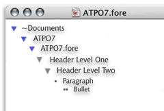
Finder Dehoist
Almost everyone will use this free outliner in this “simple” mode, where it can serve as a notebook/scrapbook and/or the ultimate writer’s outliner.
The designers were rather obsessive about having every operation controllable by the keyboard and through the outliner window alone. As a result, the menus as delivered do not have all the commands, but that is user-tailorable: the menus can be created and extensively edited like Frontier’s. Keystrokes are equally fluid, including the ability to have context-sensitive keystrokes and to have compound sequences like Control-S, then B. This feature is decidedly un-Mac-like (but quite Unix-like).
There also is the requisite toolbar, but you won’t really need it once you learn a couple of things.
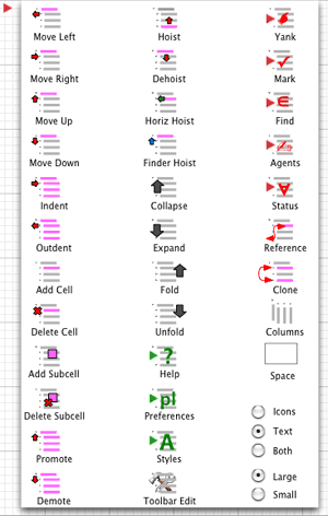
Toolbar Editor
You’ll notice that everything you need is in or on the window. And I mean everything. For instance, look at how the preferences are displayed and set. As an outline! Skip over for a moment how you get to that preference outline (by “horizontal hoist”). You’ll also appreciate that all the controls are optimized for a one-button mouse. More than that, all the developers work on PowerBooks.
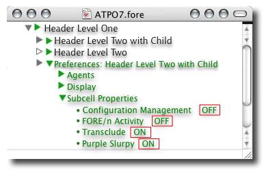
Preference Outline
The Advanced User Interface
Now it is time to introduce you to the full-blown user interface that you can access by toggling a preference in the “as-delivered” mode. In the screenshots that follow, we’ll briefly touch on how each element works. In doing so, we’ll stick mostly to ordinary black rich text to make the use of the controls clearer, except for the next screenshot. The screenshot shows all the widgets we’ll review. Each widget obviously has a purpose; most convey meaning with some change in color or shape, and most have hover pop-ups in addition to their own contextual menus.
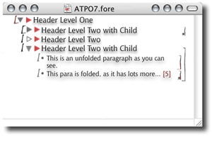
All the Supplied Widgets
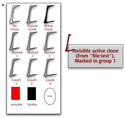
There are three controls on the left: the State Widget, The Outline Flippy, and the Attribute Flippy.
The State Widget
The first one designates the “condition” of the header. A header can be an original or a clone parent, sibling or child with several conditions. A header can be “marked” with one of the default markers. There is a “yank” stack into which marked cells can be yanked similar to a multi-clipboard. If you have a set of marked headers, you can yank that state to the stack, pushing the list of previously marked ones down a spot. The default is that 15 marked sets are saved.
The default markers are three types of “mark.” You can mark manually, by one of several “finds,” or through an agent. Also noted are three types of “invisible” (that are set by default to be progressive), and three types of “conditional headers” that are displayed or marked when certain conditions apply. Those conditions could be simple: “on 18 Jan remind me to buy a birthday present,” or complex “if these three links elsewhere were followed in sequence, make this section visible as part of the narrative and activate its links.” But any number of any types of markers can be defined.
The order in which you mark cells is remembered, so that you can specify that they be collected in some manner that accounts for such things as: when marked, created, or changed, level in hierarchy (and whether parents are marked or changed), and so on.
The character also displays whether the header is involved in a clone or reference dependency as described above. The widget displays some information about these states and can be tailored to use all sorts of arcane symbols if you wish. The screenshot below shows how I have my codes set up, using a shortcut of color and shape, depending on the pop-up for details.
Hovering over this widget displays a pop-up with detailed information about the state. Control-clicking shows a contextual menu that lets you change the state as it is set up. Clicking on the widget opens an outline that lets you control the state in more detail and change the rules, behavior, and display we’ve been describing.
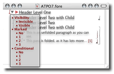
State Control Outline
To the left of this widget is the drag zone. Grab here to mark or drag to a different location or outline document. The behavior of the drag zone is also tailorable. Control-clicking in this zone opens an annotation window that can be any of the cell types. My own style of annotation is to reference a branch of the invisible part of the outline reserved for to-dos and annotations.
The Outline and Attribute Triangles
Next over is the ordinary flippy triangle that pretty much every Mac outliner uses except NoteTaker. Unless you say otherwise, it behaves in the ordinary way (by collapsing or expanding all children). It is hollow if there are no children, behavior that makes great sense and differs from the Finder. The collapse behavior is controlled by the sliders on the right, which we’ll describe in a moment. Those sliders can make the triangle control several types of outline collapse or different modes of folding. If you activate more than the basic behavior, clicking will give you the default behavior.
The contextual menu will let you select the paragraph type for the header, which in the normal case will be the choice between “header” and “paragraph text.” You can override the CSS specifications here by using ordinary Mac formatting commands or apply any of an unlimited number of named paragraph styles you define.
And to the right we have a similar flippy triangle that is pink. Expanding it automatically collapses the “content” outline under the header and opens an “attribute” outline. This outline displays and controls all the links and attributes of the header. As with all the widgets, it conveys some information by its appearance, shows details in a hover pop-up, activates by clicking, and is tailorable by Control-clicking.
The attributes and links are much like Tinderbox’s implementation and are used in a similar manner. But links can have state, and can be of the same types as the clones (two-way, mirrored, referenced, and so on). In fact, the cloning/referencing mechanism is itself a type of link. Agents are specified here. That’s beyond us to describe, except to say that essentially any scripting language can be used that you wish and any scripting editor can be used, like BBEdit, ScriptDebugger, and Affrus.
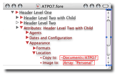
Attribute Outline
In-line Links
Headers cells are treated as monolithic units in everything we’ve described so far. But any selection within a cell can be assigned the same properties in place, becoming a sort of subcell in the outline (but not displayed that way). This is denoted by the same bracket-like widgets we described at the left of the header—flippy triangles. In this case, they surround the text or cell object that is referenced in the link or attribute. Links, clones, and references are all possible of the types we described as supplied, or any exotic variety you can dream up. Multiple link markers can be applied to any element, even overlapping. Clicking either bracket gives the behavior specified, often a “go to” link.
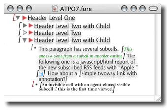
In-line Link/Attribute Marker
Folding Sliders and Feedback
Way over on the right are two vertical markers like we described that Mathematica uses. The inner line demarks the scope of outline collapsing; normally this is all the children under a header. To the right is the scope of an independent folding command. Folding can be defined over any scope with simple rules. You can adjust that scope by dragging the line down and up. The key rule is that if you drag to an Aunt below, that Aunt’s sister above is included.
You can toggle (on a cell basis if you wish) whether the flippy triangle controls outline collapsing or folding as you specify. In either case, you have feedback on the number of lines and cells collapsed or folded, similar to that we noted in jEdit. The defaults (shown here) are that grey denotes collapsed matter, with pink showing folded stuff.
Way over on the right of the window is the split pane control that gives you two views of the same outline if you don’t want to open two windows. This is very handy for seeing the outline and its attributes at once.
Horizontal Hoist
The outline described so far is the outline of the content and a parallel outline of attributes and agents. But you can shift the view to outlines of editable preferences and even the code for both the outliner in AppleScript and agent environment in Haskell. Be careful with this extreme tailorability. There is no protection from making damaging changes, and I suspect that most users won’t tinker with the code, instead using enhancements from others. But make copies frequently if you are tweaking the code: you literally edit the application within itself and the changes take place immediately after saving.
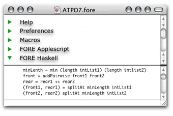
Horizontal Hoist
Button Commands and Status Pop-ups
Notice those three buttons in the upper right that look exactly like the Apple-supplied ones in the upper left? That’s the setup I use instead of the toolbar. It’s a darn sight cleaner even if we do step on a few rules. The button on the far right is the “gestures” button. The graphic displays of the outline—which we’ll cover in a different column—include a view that is manipulatable by certain motions. I like those motions (symmetry operations on concept lattices) and apply them to the outline when in outline view.
I use CocoaSuite, with the start on this button substituting for holding down a modifier key. But most on the team (far more radical than I) have transmuted their PowerBooks with MacNTouch and use cat’s cradle-derived gestures. Prefab gestures for both are included in the download.
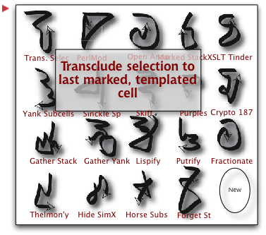
Gestures Editor
Moving left, the nest titlebar button is the “horizontal hoist” shifter. Hitting that shifts among the “regular” outline view, the preferences outline, the pretty good help outline (isn’t it scandalous how few outliners use themselves for their help?), the AppleScript code, and the Haskell code. Option-click this button and you get the Finder hoist, which we’ve called “dehoist”; and “vertical hoist,” which zooms in as far as cells with cells or bullet outlines within triangle outlines—and it zooms out into the Finder outline if you wish.
The remaining button on the far left is the drag shelf. You can drag a collection of cells there (or have an agent place them there) and drag them out at your leisure, even to another document. Its very handy. I have this set so that it is a third “yank stack,” parallel to that fed by cut/paste and “gather and mark” cells; you can move these stacks among themselves of course or set any of them to be the same.
At the very bottom of the window, sharing space with the scroll bar, is a tailorable status area. This is set up in the screenshot as indicating certain features of the cells. Clicking on one indicator gives some quick options that you would otherwise have to open the attribute outline to see or change. The ones in this screenshot are from left to right: whether the selection is a cell or a subcell, its age, its stylename, its clone/reference status, its type (RTF, HTML, etc.), its nested relatives (subcells, children, multiple sources).
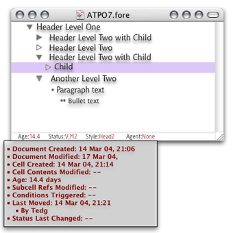
Status Pop-ups
Other Stuff
We’ve skipped over some features. FORE/1 can be embedded in Path Finder as the preview editor, which gives a different sort of Finder outline integration. It works well with all the content in a database; I use FileMaker 7. Because FORE/1 uses XML, you can shift your outlines back and forth with Tinderbox without losing anything. Much information from either application’s scheme is inaccessible from the other application. You can publish via OPML (which erases much of the cool information), through Tinderbox (or any layout application that accepts XML, like FrameMaker, KWord, or InDesign), or any of the new KDE-derived Apple “iOffice” (code named “Jeholodens”) applications.
FORE/1 indexes by n-grams (usually two-, three-, and four-letter sequences) in addition to words. The two together with any tagging and modeling that exists have all sorts of advantages in actually guessing at the meaning of words. So when you do searches, you can get results according to the “semantic distance.” A new mailing list and wiki have been set up to advance this technology.
Like Tinderbox and FileMaker, you might consider FORE/1 an open-ended development platform. You may be hesitant because you think you will need to “set it up” in your own way before accessing its power in ways that you can leverage. Recognizing this fear, SAIC is tasked to adjust behaviors so that FORE/1 emulates three of the legacy outliners we surveyed last month. That will provide a ready entry point for the non-power user.
Negatives
The outliner has several weaknesses. Because it is implemented in AppleScript, it is slower than a normal application. I have used it for a few months on my 1 GHz PowerBook with no problems, but I fear that older machines or huge outlines will produce annoying delays. There is no snipping service, as the Cyrobolics Lab used their own AppleScripts for input. Surely someone will add snipping management soon because it will be so easy.
You can display way cool HTML in cells, including tables, layers, and the whole bag. But you cannot edit the HTML in FORE/1, other than changing text. You need to use a separate application for that.
The export to other applications is extremely flexible because the native representation is XML. The schema used is included in the download. All program-to-program and program-to-Web translation is done by XSL translations. This is not something a casual user will create. Two-way translation to Word, KWord, FrameMaker, and InDesign is included, plus two blog templates. But you’ll have to tweak them if you have specific layouts in mind, and this is non-trivial.
And as noted, for the time being you’ll have to export to another application for graphical display and manipulation of relationships and links. Even more basic: printing is pretty hosed up from FORE/1. You’ll have to use a layout application for that too. Named styles will convey though.
You should also be warned that the original developers feel obsessive about certain things. For instance, they believe in multiple windows; if someone insists on adding tabs to their creation, they are likely to sneak into your house at night, eat your food, and paint your furniture ugly colors. And they can do it too, under the current administration. Even though we have been friends for decades, I’m still afraid; there is nothing more dangerous than a spooky outliner who’s been offended.
Department of Corrections, Apologies, and Additions
By now we hope you have discerned that FORE/1 actually stands for 04/01 (April First) and is a hoax. At least the actual existence of the application is—and some of the background we mentioned. I apologize for any damage done to your expectations. Maybe we should make it, or get the Cyrobolics folks to release it.
If there is interest, I’ll describe what the fictional Cyrobolics geniuses have concocted for graphical concept mapping when we survey the products you can actually get that do “mind—mapping.”
This column was originally intended to survey features of Windows outliners that OS X users don’t have. The idea was to prompt enlightened users to spur OS X developers to improve their own particular outliners. But amazingly, after significant effort, we found nothing worth bothering you about. What makes this so annoying is that most Windows outline developers do not have much description on their Web site, nor in the documentation. You actually have to work with each one to discover its capabilities, so it was as much work as last month’s column with no result.
There are some interesting Windows products, but all of them (excepting perhaps Skwyrul Pro) are disturbingly ugly and clunky in their user interface. NoteMap is a simple outliner that has an imperfect round-trip export/import relationship with Word. No one on the Mac supports Word round-trip. This matters because stuff like InDesign and Quark understand Word, and many writers like to work in phases, shifting from their work back and forth from outline to layout views, like you could do in FORE/1.
Lacking anything interesting to say on outliner features from other platforms, I decided to describe an ideal outliner of sorts to goose up the dialog you should be having with all these clever Mac developers—the ones that support your creativity.
• • •
We have a new outliner! Zengobi, Inc recently shipped version 1 of Curio. The feature set of this first version is targeted toward “concept discovery,” but it is intended to grow to general-purpose brainstorming. What makes this notable is that it is a completely new take on outlining, sort of a cross between OneNote for Windows and Apple’s Keynote. This vision has gas, and is worth following.
Also in This Series
- A Progress Report · February 2008
- Some Perspectives on the Worldwide Developers Conference · July 2007
- Writing Environments, Plus Two New Outliners · November 2006
- Examining New Business Models · September 2006
- Outlining Interface Futures · July 2006
- Outlining Workflows and ConceptDraw · May 2006
- Dossier and Outliner Web Interaction · March 2006
- Two New Outliners: Mori and iKnow & Manage · February 2006
- Styles Revisited, Video Features, and a Proposal · December 2005
- Complete Archive
Reader Comments (6)
Nonetheless, an interesting collection of features... I've been interested to follow your outlining series; while I generally use OmniOutliner, I've played with many alternatives, and have been trying out Curio... the developers are quite responsive, and it's promising.
I've been harbouring the hope that Omni might surprise us with a version 3, out of the blue, but it looks like they might have their hands full with OmniGraffle, and OmniWeb, at the moment.
While there are quite a few options, I'd agree that it'd be nice to see some more innovative ideas, and solutions, after all is that what OS X is all about!? : )
Thanks again for the articles.
As an outliner junkie desperately in need of a support group, your column makes my month.
Oh well, at least I didn't waste the money I just spent on Tinderbox.
The glaring failing of NoteMap for me is that it limits you to nine hierarchical levels. A power outliner with only nine levels? Absurd.
But NoteMap has become one of the two leading Windows outliners because of it ease of use, and in its interface it reminds me of a Mac application. Most users look for ease, apparently finding Word's outliner powerful enough. Notemap achieves ease of use. The people who like it are the ones who would have used Acta 25 years ago, and like Acta it is a pure outliner. No body text or metadata.
The mainstream Windows and Mac outlining traditions are closely related. So don't expect to find tremendous differences in the mainstream. Where they differ is in the recent infusion of Next thinking one the Mac--resulting in NoteBook and NoteTaker--there's nothing close on Windows; and in the influence of a lingering DOS undercurrent tradition on PCs.
What I mean by a DOS tradition isn't the persistence of programs that haven't been ported to Windows, although they exist, but rather the structure that tradition infuses in the proted products. When people think of outlining, they usually think of what outlines capture, the structure of a document or its equivalent. But it is also important to note what they leave out, and the benefits to be obtained from omission. It is this side of outlining that the more structured DOS tradition emphasizes--the realization that outlining serves not only to capture what's important but to screen out distractions. The upshot of this tradition are two popular Windows outliners, the half-ported but highly respected MindMax and the polished but minimalist BrainStorm. These outliners keep only two levels of hierarchy visible all or most of the time you are actually working in the outline. They embody the DOS-inspired insight that outlining is powerful because it is recursive, and to leverage recursion you have to rely solely on the relationships within and between two levels, iterated as many times as necessary. I don't think you will find that on the Mac. But perhaps you wouldn't want to.
Add A Comment