Software Review
iWeb ’09: Review From the Edge

Developer: Apple
Price: Included on new Macs. A component of the $79 iLife ’09.
Requirements: Mac OS X 10.5.6. Universal. Requirements for other iLife components vary.
Recommended: MobileMe Subscription for page hosting ($99 per year).
Trial: None
The focus of this review is the iWeb component of Apple’s iLife ’09 application suite. To review the product I created a test site to gauge how easily and effectively a Mac user could use iWeb to tell a personal story or highlight an important life event.
To illustrate iWeb’s features and the usefulness of its widgets and add-ins, the four-page test site is designed to make use of iWeb’s features and functionality using MobileMe to host the content. Apple states that iWeb can be used to create pages to be hosted on other servers and with other hosting services. However, it’s clear iWeb ’09 is a complement to Apple’s MobileMe subscription service. Mac users with a MobileMe account can setup a Web presence on the me.com server with little effort, and the process is fairly intuitive. Configuring MobileMe site publishing takes only a moment via iWeb’s New Site selection under the File menu.
Santa Clarita, CA
For this review I chose Santa Clarita, CA and its unique geography as the subject of the site. Please visit the test site to view the pages.

Review Site Home Page
Santa Clarita is my current area of residence. The city is situated at the northern edge of America’s largest metropolitan area and near the edge of where the Pacific and North American tectonic plates collide, a massive transform fault stretching for hundreds of miles in a northwesterly direction and known globally as the great San Andreas Fault.
Santa Clarita was incorporated as a city as recently as 1987, yet its history is rooted in the original Spanish and Mexican land grants, and it was the site of one of the first known California gold strikes in the early 1840s. For decades, the area has served as a popular backdrop or setting for motion pictures and television shows.

Vasquez Rocks
The area’s unique topography provides for an interesting photo study to incorporate into an iWeb review site. Vasquez Rocks and its dramatic rock formations are located not far from the city’s boundaries in an unincorporated area of Los Angeles County called Agua Dulce (“Sweet Water”) that may soon be annexed by this fast-growing city.
Photos from our weekend hiking trips to Vasquez Rocks are featured in an accompanying MobileMe gallery and are used throughout the test site. Select photos from Vasquez Rocks can also be found in the desktop pictures section of the April issue of ATPM.
Getting Started
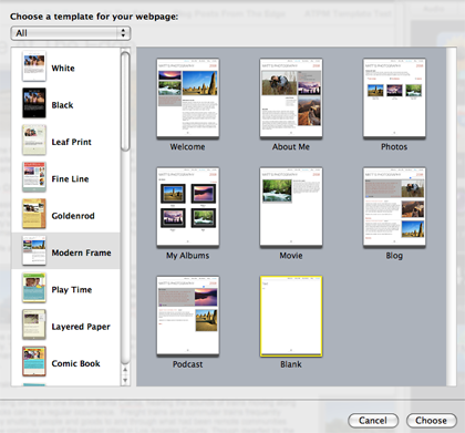
To create an iWeb-based site you must select a theme from among the abundant choices Apple makes available. For this review I used the Modern Frame theme throughout the test site.

Template Selection
Working with iWeb’s page templates is similar to working with Pages, Apple’s word processing component of iWork. In creating the test site and in projects in which I have incorporated iWeb and MobileMe into the mix, I’ve often used Pages and iWeb interchangeably for creating styled text and as common tools for developing page elements for print and the Web.
Amateur photographers will be pleased to know that iWeb makes photo libraries available inside its photo portal from both iPhoto and Aperture libraries. Photos can be added with drag-and-drop ease.

Photos Menu
Integration with the other components of iLife ’09 and other Apple software solutions is where iWeb demonstrates its strengths and unique usability. Multimedia elements can be added quickly and easily to help you tell a story, announce an event, or showcase photos and homespun movies.
iWeb depends heavily on page elements from text and photo boxes to JavaScript created by the product. iWeb does not conform to convention of creating HTML page headers with metadata for search engine indexing, nor does it have the means to provide alternative text for photos and graphics. This makes iWeb less suitable for the building of commercial Web sites and diminishes page accessibility. iWeb is designed for personal Web sites only. To see the drawbacks of iWeb’s JavaScript dependency, you need only visit the test site with JavaScript turned off in your browser preferences.
In iWeb’s structured world, movies belong on a movies template page, podcasts on a podcasts template page, etc. After becoming familiar with iWeb and in an effort to streamline page making, I made use of the “blank” page available from the template choices. To work around iWeb’s structured template environment, the Insert menu comes in handy. Using the toolbar and the features available from the Insert menu, work can be done quickly, and in my case more effectively, with the “blank” template page than through modifying or removing elements on a pre-designed page.
I created a page called ATPM Template Test to demonstrate that by using the blank template and different positioning of the text and other content boxes, a page can be created with a decidedly different appearance and content structure. Please visit the review site to see and compare the pages.
iWeb suffers from what I’ll call “template tedium.” An iWeb blog page, for example, reintroduces the template text and graphics on every added blog entry. In the case of the Modern Template, the default template example from “Matt’s Photography” reappears whenever a new entry is added. This works against ease-of-use and makes adding entries a chore. Removing these template elements takes needless time and becomes quite tiresome. While helpful as a starting point for those unfamiliar with the product and its uses, the pre-formatted templates soon become more of an annoyance than an aid.
iWeb Authoring Tools
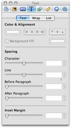
The Inspector
Similar to Apple’s Pages and Numbers productivity products, iWeb offers an inspector to assist with content placement and control. From precision placement of content boxes and management of hyperlinks to text wrapping and blog formatting, the inspector provides the user with the means to conveniently manage the placement and appearance of content. Once familiar with iWeb, the inspector is where I did much of the page formatting work.

Inspector
The Toolbar
Reversing the placement from Pages and Numbers, iWeb offers an icon-based set of tools running horizontally at the bottom of the user’s window. Among its features, the toolbar allows you to quickly to add page features, adjust text, and make adjustments to photos. For users seeking to move beyond the templates and work fluidly with iWeb, both the inspector and the toolbar are effective tools for creating and designing pages.
Widget Wonderland
Inside the site authoring window, iWeb offers a number of nifty widgets and the means to easily add photos and movie snippets from your iLife collection. Used creatively, the widgets and multimedia add-ins can add much to the site. In developing the test site for this review, I made use of the MobileMe Gallery, Countdown, Google AdSense, and Google Map widgets to add content and depth to the pages.

Widgets
Google AdSense
The Google AdSense widget is an enticing feature to add to your Web site. Visions of easy and fast-flowing money from the clicks of thousands of happy surfers visiting your site are easy to conjure. But think again. The folks at Google have built an industrial empire selling and serving up ads. But ad revenue requires site traffic. For most amateur Web authors, a quick fortune from Google ad placements is most likely not in the proverbial cards. Still, adding a few well-positioned ads might create some chump change over time.
Signing up with Google as a site partner is fairly easy. The AdSense widget offers a variety of ad sizes and configurations. The ad content is essentially beyond the user’s direct control, with the ads “sensing” content on the pages. This is among the reasons the ads on the test site will vary in subject from page to page. From local real estate to discounts offers for iLife ’09, the ads will change depending on page content.
Google Maps
Vasquez Rocks and its interesting formations span beyond the limits of a local street address. To pinpoint the area, we used a Google map and geographic coordinates to center the location. Google maps are almost as ubiquitous on the Web as Google ads, and they provide a helpful complement to an iWeb-based site focused on a geographic spot or event location.
MobileMe Gallery
The widget I found most eye-catching is the one for the MobileMe Gallery. The widget creates a portal to a personal photo collection hosted on the MobileMe server via the user’s MobileMe account. The image in the portal on the iWeb page changes periodically, enticing the visitor to explore the entire photo gallery to view more images. Placement of the MobileMe Gallery widget can be found under the Widget Wonderland heading on the At The Edge page of the test site.

Vasquez Rocks Gallery
Again, while iWeb can be used to create pages for hosting on other servers, it’s obvious the product is designed to complement a MobileMe subscription. Amateur photographers and movie makers with site hosting arrangements can make use of iWeb for creating content with iWeb’s structural controls for display on personal domains including MobileMe or other content hosting services.
Movies, Music and More
iWeb’s widgets and add-ins aren’t limited to the ones used on the test site. Adding music from one’s iTunes library or home movie snippets in iMovie is relatively easy. It’s a matter of designing the content into the pages by dragging and dropping the selection from the associated content into the page, whether that be a song in the user’s iTunes library or a movie in the user’s iMovie library.
iWeb’s Blog Page Feature
If there’s one feature in iWeb that’s not up to snuff, it’s the blog page feature. Plain and simple, it’s not designed for heavy use of the kind for which most active bloggers use a blog product or service today. iWeb’s blogging component is best suited for occasional use as a means of updating site visitors about an event, or in my case, as a chronicle of site-building for this review. It’s the one feature of iWeb that keeps me from ranking the product as “Excellent” for ATPM readers. The early-mentioned template tedium, encountered with each new entry, is another major drawback of the blog component. Duplicating existing blog entries and changing the content for new entries is an awkward workaround for the template blog entry problem.

Blog Template
Conclusion
iWeb provides an easy-to-use structure and format for a Mac user desiring to tell a story or highlight an important life event. It integrates well with other iLife ’09 components and is a complement to MobileMe. The included templates are a quick-start means to setting up a personal Web presence, and the widgets and other add-ins provide you with the tools to add depth, richness, and a bit of flair to a personal Web site.
Strengths: Easy-to-use, integrates seamlessly with other iLife ’09 components and MobileMe.
Weaknesses: For personal Web sites only, high JavaScript dependency, tedious templates.
Reader Comments (3)
I have been using iWeb for some time on my Educational Technology Site: Intended Consequences. www.snipurl.com/ic
Although I think the blogging feature is lacking on some of the things you mention, it has forced me to become a much more careful writer. My blog entries, for the most part, or pretty long, and I have now passed over 200 entries.
I think you also failed to mention the ability to embed podcasts into your site. I now have over 150 podcasts as well, and iWeb automatically sens them to iTunes as well.
Thanks
Tim Holt
El Paso
www.snipurl.com/ic
I'm a little new to iWeb.
Add A Comment