MacMuser
Wonky Web Sites
How come if I go to a Web site and it doesn’t work in my browser when millions of others sites do, it’s my fault for the failure?
That was basically the response I got from new home selling site House Simple here. On my Mac’s screen, the site looks like the image below. I reported it to their team and was told:
This is happening because you have increased the text size on your browser and this throws the design out. There’s little we can do to stop this as it does the same on all sites with HTML text on it.

House Simple
Whose Mac Is It Anyway?
Now excuse me, but I thought that I was in control of my computer and in any case I had only set the display to Verdana 13pt so I can actually see the darned 23″ screen at arm’s length. If their Web monkeys had used CSS they would have overridden my settings, and what about all the other gazillion sites I visit? Perhaps House Simple’s precious design (which, let’s face it, is nothing very wonderful) should be rethought?
But They’re Not the Only One
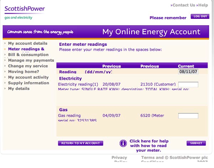
House Simple is not the only company who tell me it’s my fault their Web site doesn’t work. Scottish Power put us through all manner of hoops to run our online account, as shown below. All requests for a change go unheeded.

Scottish Power
Why do these sites insist on turning off the toolbar? It’s my browser, on my computer, if I want to see the toolbar I blinking well will. Especially as in Safari it shows the progress of the page loading.
Listen
Some companies listen, eventually. HSBC changed their online banking Web site, and it ceased to work on Macs. On contacting their Web team, I spoke to the actual programmer who fixed the glitch within an hour and telephoned to get me to check that it worked.
Do-It-Yourself chain B&Q re-designed their site a while ago, and it refused point blank to work on our Macs. We reported this to their team who ignored us completely. As we dabble in a bit of property development, we have spent many thousands of pounds at B&Q’s site. Their delivery trucks have worn a pair of grooves in our drive, so when we stopped buying from them it was noticed. A nice lady rang to inquire why.
We explained the problem, which she promised to look into, but nothing happened for months. Eventually the Web designers changed and someone who knew their job fixed the problem. But hard luck, B&Q, because we’ve found different suppliers.
Also in This Series
- What Trick, What Device, What Starting-Hole… · May 2012
- Do Androids Dream? · April 2012
- Our Macs Are Under Attack · March 2012
- The Best and Worst Christmas Presents · February 2012
- The Best Use for a Kindle · January 2012
- It’s Got No Blinking Light · January 2012
- Box-Shifting Causes Migration · December 2011
- The Best Thing About the iPhone 4S and How to Cope in Clink · December 2011
- Death of a Salesman · November 2011
- Complete Archive

Reader Comments (1)
There's little we can do to stop this as it does the same on all sites with HTML text on it.
Well, regarding the House Simple website, that's simply not true. I mean, for one thing they're mostly using pixels. Browsers will interpret pixels in different ways. It's much better to use percentages.
Although I have been using Dan Cederholm's recommendation of using keywords and percentages, there are others who opt for something called the 62.5% method.
So, it was at best clumsy to blame HTML. To be honest, I can't believe that the people responsible for the direct involvement of this website could have said that.
And you know something else? I quite like their website. There are aspects of it that are a bit over-the-top, or perhaps a bit on the naive side, but it really isn't all that bad.
Btw, I had to increase my text size in my advanced preferences to 15 before I too started to see the same results as you reported.
Add A Comment