Software Review
NetNewsWire 3.0

Developer: NewsGator Technologies
Price: $30
Requirements: Mac OS X 10.4
Universal: Yes
Trial: Fully-featured (30 days)
As products age, the nature of the changes seen in subsequent product releases evolves. Early in a product’s life, the revisions often bring large changes as developers look to fully flesh out exactly what it is they are offering. This is doubly so in young, rapidly changing markets. Later in a product’s life, though, the revisions tend to be smaller. Changes in mature products are often aimed at polishing the product and increasing usability instead of radically redefining the product.
The evolution of NetNewsWire follows this pattern, almost to the letter. As our previous reviews demonstrate, versions 1.0 and 2.0 saw many major changes. Features were added, removed, and spun out into new products while Ranchero Software and, later, NewsGator Technologies, determined what NetNewsWire would become. Market and technology changes in the syndication space forced the application’s development in certain directions. With NetNewsWire 3.0, though, it’s clear that NetNewsWire has entered the mature phase of its life.
That being the case, I will focus primarily on the changes to NetNewsWire since our last review.
Appearances
Whenever you use an updated a piece of software, changes to the user interface are among the first thing that you notice. When launching NetNewsWire 3.0 for the first time, the most obvious changes can clearly be tied back to applications like iTunes and Mail. The subscription list has taken on the same blue background as the source lists in the aforementioned applications. NetNewsWire has also inherited another of iTunes’ features, Cover Art. In NetNewsWire, the Cover Art widget shows a snapshot of the home page for the selected feed or article.
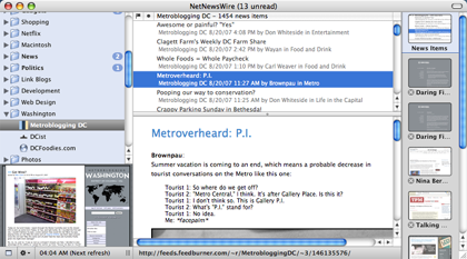
NetNewsWire 3.0’s user interface features several refinements over previous versions.
Although displaying Cover Art cuts into the vertical space you could use for displaying subscriptions (and may be the difference between whether or not your subscription list needs to scroll), it provides several benefits. If you’re viewing a folder of subscriptions, glancing at the Cover Art can quickly tell you the source of the selected article. Furthermore, Cover Art somewhat rectifies the complaint that, by reading feeds, you miss out on the overall design of the Web site. That’s not to say that the Cover Art view is perfect, however. I know that the Cover Art image for a Web site does get updated, but I cannot figure out what triggers the update. As far as I can tell, there is no way for a user request a refresh. This comes into play because I’ve seen problems with the display. In one case, one feed was displaying the cover art for another feed. In other cases, feeds were displaying blank images (either all white or all black) in place of the Web site snapshot.
Another addition which appears similar to an iTunes feature is Full Screen mode. As you would expect, given the name, activating Full Screen mode hides the menu bar and enlarges the main window to take up the whole screen, allowing for undisturbed feed reading. To further minimize distractions, you can also hide portions of the user interface. NetNewsWire 2.0 allowed you to hide the tab bar when it wasn’t in use, but new in 3.0 is the ability to hide the subscription list. Both the tab bar and the subscription list can be explicitly hidden at any time, but both also support automatic hiding. Automatically hiding the tab bar works as you would expect. Automatically hiding the subscription list essentially makes the subscription list part of the News Items tab—your subscriptions are visible when viewing the News Items tab and hidden when viewing a Web page.
Automatically hiding subscriptions works well with another of NetNewsWire’s new features, vertical tabs. The new tabs have additional functionality compared to the more-familiar horizontal tabs (which are still available). The vertical tabs can display a thumbnail of their Web page and can be dragged-and-dropped. The drag-and-drop feature can be used to re-arrange the tab order within NetNewsWire or to drag the URL to another application. Neither of these features is available when using the horizontal tabs.
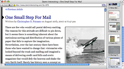
Hiding subscriptions while browsing the Web opens up horizontal space, which can be used to display NetNewsWire’s new vertical tabs.
There are a few other differences between the two tab types. The width of the side tab gutter is fixed, so you will only ever see the first word or two of the Web page title. For instance, the two Daring Fireball articles I have open in tabs currently display their name as “Daring Fi….” With only a few tabs open, the horizontal tabs would display more of the titles, though the difference would be lost as you opened more tabs. In either case, NetNewsWire could stand to inherit some of Safari’s smarts when dealing with tab titles. Conversely, if you choose not to display the page thumbnails, the side tab gutter can display many more tabs before running out of screen real-estate. Furthermore, the side tag gutter uses a scroll bar when tabs extend off the screen, as opposed to the pop-up menu used with the horizontal tabs.
The style of tab you prefer will probably depend heavily on your personal taste. I like the look and functionality of the new tabs, but I feel that they make the News Items interface a bit cramped. However, this is likely due to using the Widescreen View on a 1280×584 display. I suspect I’d have no such complaints on a larger screen.
In keeping with the theme of “Evolution, Not Revolution,” NetNewsWire includes a number of smaller tweaks that pay dividends. The New Subscription sheet now includes a pop-up menu for choosing a folder for the subscription, which eliminates the frustration of having to re-organize your subscriptions after adding a new feed. Another such tweak is the addition of browser-style Back and Forward options for articles. I consider the Back button the more important of the two, as you now have the ability to jump back to the previous article when you accidentally continue on to the next unread item.
To further focus the news reading experience, NetNewsWire now allows you to hide your already-read items.
The new version of NetNewsWire also includes a user interface for the Attention Score feature introduced in version 2.1. The Attention Score attempts to provide a numerical value for how much you use a feed. In version 2.1, the score could be used to sort your subscription list. The new user interface in version 3.0 is called the Attention Report, which attempts to show how much you interact with each feed. Ostensibly, you can use this report to unsubscribe from feeds you tend to ignore. However, a feed’s Attention Score is based on clicks, items flagged, items e-mails, and items posted to your Weblog or del.icio.us. My experience is that this algorithm systematically over-weights subscriptions that do not provide full text within the feed. The full-text feeds that I read religiously have some of the lowest Attention Scores, since I never need to click through to the original Web site.
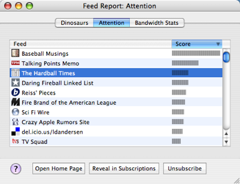
The Attention Report attempts to show you your most popular feeds.
Syncing
Syncing received a bit of an overhaul with the NetNewsWire 2.1 release. This is understandable, since this was the first release following NetNewsWire’s acquisition by NewsGator Technologies. The 2.1 release introduced syncing with NewsGator, which gave users the ability to work with their subscriptions on a variety of platforms, including Windows PCs, the iPhone, Blackberries, and Windows Mobile devices. Additionally, this form of multi-platform syncing was superior to the Bloglines integration introduced in version 2.0. Whereas the Bloglines integration required you to manage feeds using the Bloglines interface, NewsGator syncing lets you manage feeds from within NetNewsWire and have changes propagated to all your synced platforms. From a user perspective, it offered the functionality of .Mac or FTP syncing combined with Bloglines cross-aggregator support.
Support for NewsGator syncing has also improved with NetNewsWire 3.0. The primary difference is speed—syncing with the NewsGator service is now much faster than in previous releases. The first time I tried the new version, I was literally in awe of how fast my feeds were downloading. The other place where this speed boost is noticeable is when quitting the application. NetNewsWire attempts to perform a sync when you quit. That way, any changes made in NetNewsWire since you last synced will be propagated out to NewsGator. Under the 2.1 releases, this sync would take several minutes. Sometimes, it was long enough to abort shutdown or logout attempts. That is no longer the case with NetNewsWire 3.0. I haven’t timed this process, but I think it is safe to say that this final sync takes under a minute to complete.
Another NewsGator feature supported by NetNewsWire 3.0 is Clippings, which are essentially the NewsGator version of Flagged Items. You add an item to your Clippings and it gets saved until you remove it from your Clippings. Unlike Flagged Items, your Clippings are synced. Also, you can have subfolders within your Clippings, and you can share your Clippings via RSS. Previously, I subscribed to my own Clippings feed and used this feature to save items I found while using NewsGator Online. Once I was done with the particular clipping, though, I’d have to log back into NewsGator Online to delete the Clipping. Now that NetNewsWire has full Clipping support, though, I can manage the process without switching out of the application.
Personally, I feel like there is a bit of overlap between Clippings and Flagged Items, and I wish there were some way to merge the two. I realize I could always add all of the items I’ve flagged into my Clippings folder and hide the Flagged Items Subscription, but as far as I can tell there is no Clippings equivalent to either the Flag column or one-key (‘f’) flagging.
Although NewsGator syncing is now the primary form of syncing supported in NetNewsWire, Bloglines, .Mac, and FTP support still remain, though I do not believe any new features are planned for these options.
Plays Well With Others
NetNewsWire first introduced the idea of integrating with external applications in version 2.0, with the Post to Weblog feature. This integration was augmented in version 2.1 with addition of the Post to del.icio.us and Mail Link/Mail Contents commands.
NetNewsWire 3.0 continues this trend of integrating with external application with the addition of several new features. The first two are Send To… commands. Send To VoodooPad creates a new page in an open VoodooPad document. If you have multiple documents open, VoodooPad asks which document should contain the newly-added page. Unfortunately, though, the command fails silently if you have no VoodooPad documents open. This is more of a VoodooPad issue than a NetNewsWire issue, but it reflects poorly on the feature when you select a menu item and nothing appears to happen.
The second Send To… command is the Send To Twitterrific command. Unlike the Send To VoodooPad command, Send To Twitterrific creates a brief note in Twitterrific containing the article name and URL so you can share what you are reading with your Twitter followers.
For the most part, integration with external applications is focused on sharing or storing the articles you are reading. NetNewsWire’s support for microformats, though, is something entirely different. Microformats are a way of marking up content to provide additional meaning. When viewing Web pages, NetNewsWire detects two types of microformats—contacts and events. If either of these microformats is present on a page, NetNewsWire displays the appropriate badge and allows you to import the contacts or events into Address Book and iCal, respectively.

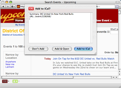
By recognizing microformats on Web pages, NetNewsWire is able to add an event to iCal.
Outside of NetNewsWire, you can now use Spotlight to search your News Items. Nobody is claiming that Spotlight is without rough edges, but this feature means that you can now run searches on your archive without tying up the application.
Follow-Up
In the NetNewsWire 2.0 review, I raised several points that I’d like to follow up on now that NetNewsWire 3.0 is available. In discussing the differences between the Traditional, Widescreen, and Combined Views, I commented that Combined View did not feel as fast as the other views. In version 3.0, both the performance and the user interface are much improved. I’ve noticed little to no lag when cycling through articles within a folder or subscription. Occasionally, when switching to a different group or subscription, there will be a lag in updating the screen with new content. I’ve also seen some random crashes while using this view, which I consider a real issue. Using the Hide Read Items feature seems to alleviate some of these issues, perhaps by decreasing the complexity of the view displayed. This is not an option if you need to reference an already-read read article, though. Performance issues aside, I can’t recommend using this view given the stability concerns.
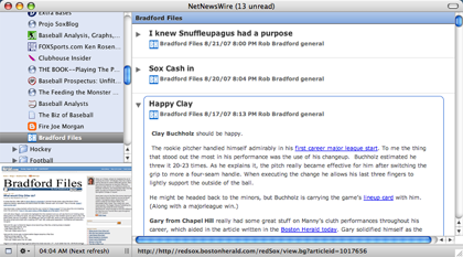
The appearance of the Combined View has been modified to increase usability.
In the previous review, I also expressed surprise at the fact that I couldn’t specify a podcast genre on a feed-by-feed basis. That remains the case, but it appears to be something of a standard to apply the Podcast genre to all podcasts. At least, this is what iTunes does when subscribing to a podcast.
As has been the case with previous releases of NetNewsWire, a feature present in a past release has been removed from the new version of NetNewsWire. In this case, said feature is the subscription Sharing feature.
Aging Gracefully
Having spent a significant amount of time using the latest version, I feel like NetNewsWire 3.0 benefitted from the relative stability in the syndication market. As far as I know, there were no major technological shifts that the application needed to support in this release. There was no post-acquisition work that needed to be done to bring NetNewsWire under the NewsGator umbrella. As a result, this release of NetNewsWire feels highly polished, focusing on usability improvements over radical reengineering.
The only major problems I’ve encountered with this release are the performance and crashing issues with the Combined View, which is what prevents me from giving NetNewsWire our highest ranking. Although I have yet to lose any data to a crash, I’m not comfortable with the idea of working in a scenario that has such known failure states.
Given that NetNewsWire 3.0 is a free upgrade for anybody with an active NewsGator Online Premium Package, I do not see any reason to avoid this release, unless you rely on the Combined View. If you fall into that latter group, you should hold out until an update addresses the issue. As far as I know, anybody who purchased NetNewsWire prior to its acquisition by NewsGator should still be within the period of the complimentary Premium Package they received as a NetNewsWire owner.
Those who do not qualify for the free upgrade but want a powerful RSS and Atom reader for the Mac should seriously consider NetNewsWire, particularly if you ever see a need or desire to access your feeds on multiple platforms. I truly feel that this is the best feed reading application I have used and well worth the money.
Reader Comments (3)
Sure NNW has a lot of nice features, however one thing that it does not have is tags.
Yes, there is a flagging feature but it is not really sufficient to organize items. If something is flagged, since there is only one kind of flag (the red one), there is no way to tell why it was flagged in the first place. Many aggregators have this feature done exactly the same way, and I think it's next to useless.
Also, there are clippings, which are marginally more useful for sorting the news, however they impose a directory structure and even though you can put one item into two folders (to get a labeling of sorts) it's clearly not the way clippings meant to be used.
And if you think about it, it's hard to understand why tagging isn't there, because it's all over the web nowadays. In fact, the NNW itself allows you to subscribe to "tags", which means that author is very well aware of this wonderful feature, which is available in, you know, other software.
That being said, I'm going to buy it when the trial is over, because everything else is just not it for me.
BTW, Google Reader has had per-item tagging (using words, as the previous poster wanted in NNW) for a long time. It also supports per-item starring/flagging, as most newsreaders do.
You can export your OPML file from your reader and import it into Google Reader - Quick and painless.
I've been using NNW all the way up to 2.1 and generally really like it. I still work on a relatively slow Mac at home and don't have time to upgrade to a slower version, so either I keep using this version, wait for a better update, or try something completely different - so I'm opting for the later.
Thanks very much for the review, you probably saved me a lot of pain and suffering.
Add A Comment