Quick Tips in Design
Part 2: Using Color
Color is all around us, and it’s probably for that reason that most people don’t think much about it. Many people haven’t had to think about color since their days in grade school when they made projects out of colored construction paper and watercolor paintings to bring home to their parents.
Fortunately for us, techniques for using color have been broken down almost into a science. Hundreds of years and generations of artists and designers have explored color and how it can be used to achieve a specific desired result. There are literally dozens of books about color and how to use it, and there are many ways to apply color technique.
Primary and Secondary Colors
You may remember someone (probably in grade school) teaching you about color, and the concepts of primary and secondary colors. These are the basic colors just about everyone is familiar with.
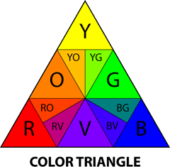
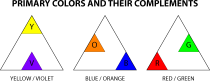
The primary colors are yellow, red, and blue. These are considered the foundation of color because when mixed together and in different combinations, all other colors can be created from using these three primaries. Notice that the primary colors are located on the corners of the color triangle. The primary colors are the “cornerstones” from which all color principles are based.
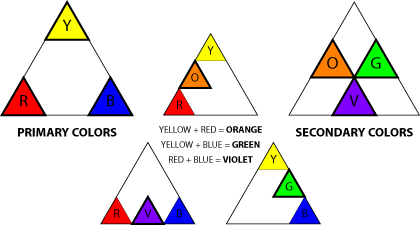
Secondary colors are created when equal amounts of any two primary colors are mixed together. (You may remember having difficulty with this in grade school. That may have been from the use of “student grade” materials which use fewer and cheaper pigments, sometimes achieving unpredictable and disappointing results.) The secondary colors orange, violet, and green are located on the sides of the color triangle.
Any pure color is also referred to as a hue. Each color is a hue. Changing hue means changing the color itself.
Primary and secondary colors can be used in an image to attract attention and create energy, but be warned that overuse of these colors may give a design a simplistic, childish, or even amateurish look. Children’s toys often use primary colors to keep attention focused, but many people carry those associations into adulthood and don’t react positively to pure primary/secondary color usage.
It has been suggested on many occasions that an artist’s sophistication and career development can be observed through their use of color. The argument is that visually using mainly primary and secondary colors suggests that the responsible party has not had the time to experience, develop, and explore color and its infinite possibilities. That doesn’t mean these colors shouldn’t be used, but it is something to be aware of and to watch out for when designing for some audiences.
Tints and Shades
When white is added to a color, the color is diluted and produces a tint (also referred to as “pastels”). A shade is created when a color is mixed with black.
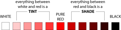
Brilliance and luminosity are terms used to describe the amount of black mixed with the color to create the shade. “Zero brilliance” or “zero luminosity” is black.
Whenever a color is “diluted” by mixing white or black into it, the color loses saturation. The color pink is created by mixing red with white. Technically the color pink can be described as “a tint of red” or “low-saturation red.”
The effect of tints and shades upon the observer varies based on how they are used, but both are visually weaker and have less energy than does pure color. Traditionally, products targeted to women include more tints, while products for men are often more saturated. Whether this is the development of social conditioning or is based on physical gender is difficult to tell, but it does appear to work when targeting a gender-based audience.

Analogous Colors
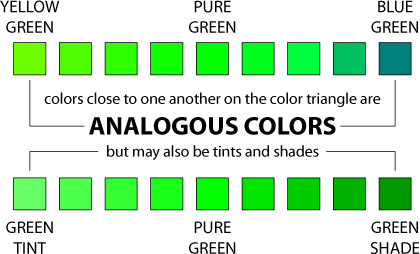
The term analogous means “like” or “similar.” Analogous color can be used to create subtle differences in an image or design. These subtle differences create a peaceful and more harmonious feeling from an image.
In the previous article (Using Value) we created a simple logo with type and value changes. The same design can be used but with color applied. Many times designs may match colors used in existing publications and products, and for this example blue is used by the institution and is the required color in the design.
Using blue as a starting point, analogous tints and shades can be applied to create many different options. The result is that each variation creates a unified feel (some more than others). This is a particularly good method for applying color to designs which have limitations on reproduction. For example, the design may appear not only on paper but on T-shirts and coffee mugs. The cost of reproducing a design multiplies for every additional color used. If only blue and tints of blue are used in the design, only one ink needs to be used in printing the design on a T-shirt. Shades will require the use of two inks, both blue and black.

Analogous hues can also be used to create different results. Using different (but similar) colors adds more visual interest to the design. Be careful when using analogous colors not to make the variations too similar, since the results may not appear in reproduction.

Complementary Colors
Find a primary color on the color triangle. Draw a line directly opposite the color and you have discovered the complementary color.
Complementary colors have many uses. As opposites on the color triangle, the colors react off one another visually when placed alongside each another. This effect has been described as creating energy, or a visual “vibration,” that can be used if those results are desired. Others find the results outright heinous, so it’s important to be aware of how complements effect one another. Either way, complements definitely demand attention.

Another use of complementary colors is in traditional media. If we were to mix paint using two complementary colors, we would end up with gray. Interestingly, the resulting gray isn’t the same as would occur when mixing white and black to create a value. Mixing complements produces a chromatic gray that is considered to be more visually interesting than a value.
The next time you’re in an art museum, look closely at the gray on a painting and you may be surprised to find it is actually composed of colors rather than black and white. The common CMYK printing process (cyan, magenta, yellow, and black—the printing equivalents of the primary colors), while very versatile, just isn’t capable of completely reproducing all of the nuances of color. This is one of the reasons why reproductions (posters and prints in books) often lose some of the feeling and impact that can be seen in the original.

Split complements are a variation on the concepts of complementary color. Split complements are analogous colors on either side of the complement. Because the split complements are close in color to the complement, they still carry some of the visual energy that is observed in complementary colors but without as much of the harshness.

Applying the concepts of complementary colors to the logo creates drastically different results from what was achieved previously. The logo takes on a completely different feel based on how the concepts are used.

Setting either the descriptive text or the acronym as blue and then applying complementary color concepts to the remaining text creates an effect of separation. The results attract attention but are not unified and visually break down the balance of the original design. Because the acronym and descriptive text are divided by the use of color, the results attract attention to the separate parts. While that isn’t the desired result for our example, it does show how complements might be used in other applications.

In the second example, the descriptive text remains black and complementary color concepts are applied only to the acronym. The results are improved, keeping the design more unified and the type more legible. The use of complements show an increased energy over the logos that used analogous colors.
This is when color usage may become tricky. The Department of Physics, Computer Science & Engineering may enjoy the increased energy from the complementary color usage, but the results also resemble the logo designs from some sports teams. If the client wanted to suggest a greater excitement in their public image, these examples might be their preferred choice. These might also be suited for recruitment purposes by attracting attention and suggesting energy.
On the other hand, the Department of Physics, Computer Science & Engineering may not find the results appropriate for their public image and decide that the analogous color examples are more representative. When using color in design it is important to know the desired end result to use color most effectively.
Psychology of Color
There are theories as to why we react to color the way we do, many based on what color means in nature. Bright colors, like the yellow on a bee or a flower, attract attention but can suggest different meanings. For the bee, the yellow is there to warn others to pay attention or they’ll get stung. For the flower, the yellow is there to attract others so that the flower will be pollinated. Either way, yellow is a color that demands a reaction from earthly observers.
One method for applying color is by dividing it into warm and cool colors. The primary color yellow is “hot,” red is “warm,” and blue is considered “cool.” The “warmth” of secondary colors can vary based on how close they are to yellow and red. Yellow-green is “warmer” than blue-green, and draws more attention from the observer.
The technique of using warm and cool colors can be used in an image to draw attention to a specific area or to suggest space. Warm colors advance, and cool colors recede.
Applying Color Theory to a Photograph
Many people are unaware that the professional photographic images they see on a daily basis have been modified to produce greater impact. With color theory it’s possible for anyone to “dress-up” their photos to create more dramatic results.
With the photograph at hand, it often helps to take a look at the colors already present in the image before making changes. Working with the existing color will allow the modifications to fit more seamlessly within the image.
Many landscapes, either in print, television, or motion pictures, have been modified to create greater impact. The blues in the sky and/or water are often exaggerated, and other colors may be applied to further emphasize the changes. Because many landscapes contain blue from either the sky or from water, blue is a good base color to begin modifying a landscape. Cranking up the amount of blue is a simple modification that just by itself can create dramatic results.

With blue increased, the options for making a foreground subject stand out are relatively simple by applying complementary colors or split complements. In our landscape example, the most direct method of applying blue’s complement orange also worked with the existing red hues that were natural in the photograph. The “warmer” nature of tinting the foreground orange also made the subject more immediate to the observer. With careful application of this technique, the observer wouldn’t be aware the image was modified unless they had the original available for comparison.
In our second example we have a photograph with a woman walking past an alley. There is already an abundance of yellow in the image, so yellow will be our staring point for the modifications. Blue-violet is a split-complement to yellow and presents contrast between the alley and the foreground’s already yellowish tones. Further contrast was created by slightly increasing the yellow in the foreground, but only by 15% so as not to make the woman look jaundiced.
The results in this example are obvious, but not necessarily negative. Most viewers will be able to notice the modifications, but that isn’t necessarily a problem if the modifications encourage the viewer take more interest in the image.

These are simplified examples of how color theory can be applied to photographs, but it’s easy to find other methods to apply to your own work. Looking more closely at the media will lead to discovery and many more ideas of how color can be applied to images.
Interaction of Color
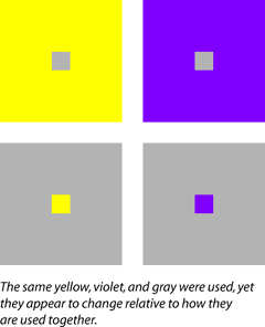
When is yellow not yellow? When does gray change and look more like a color? In our example there are four boxes. Depending on which box you look at, the colors can appear to change even though they are all the same.
The gray box within the yellow square looks darker than the same gray box within the violet square. Stare at any of the examples and you may notice the gray doesn’t appear to be “just gray” anymore, but instead takes on some of the appearance of the complementary color of the color next to gray (the gray next to yellow can appear more violet).
Even though color is based on scientific principles, how our brains interpret color is an entirely different thing that can’t always be explained as easily.
Color Processes
The discussion of color thus far has been based upon the principles of reflective color, meaning when light bounces and reflects off an object. Things change when the color is emanating from light. When light is used to create color, yellow is no longer a primary and is replaced by green. Instead of mixing yellow, red, and blue to create color, light uses red, green and blue (RGB). This is the same technique used in televisions, which is why if you look very closely at a CRT screen you can actually see the separate RGB pixels. The RGB color mixing process is the most common option available in computer software, primarily because most computers present information to users with CRT screens or LCD’s, both of which use RGB color mixing.
Another color process that is widely used is CMYK (cyan, magenta, yellow, and black). This is the process used for most print reproduction, whether it is a color inkjet printer or large printing presses for books and magazines. CMYK color mixing is a common option in most computer graphics software.
RGB and CMYK are just different methods for creating color. All of the principles of color still apply. Many beginning users of computer graphics software are frustrated by the RGB and CMYK color mixing restrictions. Some software (Painter is one example) is targeted to users of traditional media, like oil painting or watercolor, and offers different color mixing tools that more closely resemble the color triangle presented here.
Even though this discussion has covered some of the basics of color theory, it’s important to remember that color, like all visual tools, is subjective. How people react to the same image differs greatly from person to person. By using some of the principles discussed, it is possible to use color to more consistently affect how viewers react to visual work and to communicate a specific message.
The next article will build on what has already been presented in a discussion of Perspective and the Illusion of Depth.
![]() Copyright © 2003 Andrew Kator,
akator@atpm.com.
Copyright © 2003 Andrew Kator,
akator@atpm.com.
Also in This Series
- Part 8: Pattern · February 2004
- Part 7: Type as Shape · January 2004
- Part 6: Color Science · December 2003
- Part 5: Shape · November 2003
- Part 4: Line · October 2003
- Part 3: The Illusion of Depth · September 2003
- Part 2: Using Color · August 2003
- Part 1: Using Value · July 2003
- Complete Archive
Reader Comments (17)
The primary colors of light are red, green, and blue. This is why the phosphors in CRT screens are those colors. If you have a white wall in a dark room, you can shine red, green, and blue lights onto the wall at various intensities to produce different colors. Shining all three colors onto the same spot at the same intensity produces a white spot. (You can try this experiment yourself with three flashlights and some colored cellophane.)
The primary colors of pigment are cyan, magenta, and yellow. This is why inkjet printer ink comes in those colors. You can mix these three colors of ink in different proportions onto a white page to produce various printed colors. Mixing all three produces black. Magenta, yellow, and cyan are close enough to red, yellow, and blue that art teachers can convincingly claim the latter to be the primary colors of pigment.
Note that the primary colors of light are the secondary colors of pigment, and vice-versa. So the color wheel for light and the color wheel for pigment are complimentary.
Scientifically, additive color mixing is when red, green, and blue are mixed from light sources to create color. Red, green, and blue (RGB) are the primary colors of light. The secondary colors of light are yellow (green + red), cyan (green + blue), and magenta (red + blue). Subtractive color mixing is the color we see around us on a daily basis, the color reflected off of objects (described as reflective color in the article). The CMYK process, commonly used for printing and print reproduction, uses cyan, magenta, and yellow as the primary colors. As mentioned in the article and by Mr. von Laudermann, CMYK is the color process used by color printers.
When applied to art and design, color usage is not as objective as the scientific principles. Human reaction to color is subjective and there are multiple methods for applying color principles. The article presents color not from the purely scientific viewpoint, but from the perspective of art foundation theory as has been taught and successfully used for many years. Color theory as applied to the visual arts is more than just how the cones in the human retina react to light. Artists and designers in traditional media have been using the information presented in this article for many generations and with great success and the color principles presented in this article are still taught to art and design students.
Art, design, and aesthetics in general cannot be taught or discussed purely from a scientific basis, nor from a viewpoint of "right and wrong." Be assured that the upcoming presentation of color will include the science behind additive and subtractive color principles and how they are used in traditional technique, reproduction, and video.
The term Reflective Value applies to all color and describes the lightness or darkness. White has the highest reflective value and black has the lowest. Tints have a higher reflective value than shades. Different colors, in their pure form, also have different reflective values. Yellow is brighter than Red which is brighter than Blue.
The term Reflective Paint usually refers to paints that have fine metal or plastic particles mixed with the paint that reflect light back to the viewer. The paint used for marking lanes on highways is reflective.
There are also ways of printing transparent inks onto reflective surfaces that make an overall image reflective. These techniques are common in sign manufacturing and can be used with other forms of screen printing. 3M has a series of paints and reflective films that you can use for printing.
I could answer your questions about reflective color more specifically if I knew what you needed or your intended application of the concepts.
The "amber" lenses are a shade of orange, which is the complement of blue. By canceling out the predominant blue light scattered by our atmosphere, contrast is improved and eyestrain is decreased.
Upon further investigation, everything I have read seems to agree that "amber or brown" tinted lenses offer better protection than "violet or gray."
I found most of these references by Google searching "amber lenses eye health."
Nancy
As a primer, check out some of the books about color with interior design. Searches for "color psychology," "color interior design," and "color psychology interior design" will reveal some good books on the subject.
Congratulations for the nice explanation.
Tio Ilmo
São Paulo - Brazil
Thank you,
Mike
The RYB model is primarily used for aesthetic color choices. Aesthetics are not an exact science. The RGB model is scientific, which makes it great for color reproduction. If RGB works for your aesthetic choices, use it. Some people use Pantone, some HSB, etc., so it's your choice.
However... don't assume your client picked their colors because they were traditional complements. They could have picked those colors for any reason. If your client insists on using that color combination, I would suggest using tints, shades, and analogous colors. You still have a lot to work with, even if you are restricted to just "two colors."
The reason blue/orange were selected still does not solve the problem of which wheel/model to draw additional colors from. Analogous of which color wheel - RYB - that draws the conclusion that the colors were selected as intentional compliments.
I guess my real question is, given a website works best off the RGB color model, do I try and fit a RYB color scheme into the RBG model, from which to draw additional website colors (analogous, for example), or do I stick with the RYB color wheel and work off of that (different set of analogous colors)?
Add A Comment