Quick Tips in Design
Part 5: Shape
In visual art, shape can be defined as simple or complex, geometric or natural, and abstract. A shape may combine different qualities, for example one shape can be both simple and natural, and another shape can be simple, geometric, and abstract.
Simple
The simple shapes are the square, rectangle, circle, ellipse, and triangle. These are the basic forms that are used as the foundation for all other shapes.

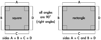
Squares and rectangles are the most common shapes in man-made objects. From architecture to the arrangement of text on a page to the shape of the page itself, most of what people encounter on a daily basis is composed of squares and rectangles. Because so much of the man-made world is composed of these shapes, squares and rectangles are familiar, safe, and comfortable, but their uniformity can also create a conservative or rigid effect. They can be used to suggest stability and truth. Squares are considered to be one of the most honest shapes, even more than other types of rectangles, because of their mathematical and visual simplicity.
Triangles suggest action because of movement from the corners “pointing” in a direction. Equilateral triangles are the most stable of the triangle shapes because all sides and angles are the same. Triangles can suggest growth or “reaching the top.”
Circles suggest infinity, completion, softness, and security. Many ancient cultures considered the circle to be a perfect and even a sacred form. Circles are useful for focusing attention because of the closure of the shape, and because they are less common in man-made objects than shapes with straight lines. Ellipses share the psychology of circles, but to a lesser extent depending on the how close they are to a true circle.
Complex
Complex shapes combine parts or all of the simple shapes. These include polygons or less “definable” shapes that may include parts of circles, squares, triangles, ellipses, and rectangles.
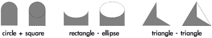
The effects of complex shapes can be predicted by how many overall similarities they have to the basic shapes. An easy way to visually simplify a complex shape is to squint and/or get some distance. As the complex shape becomes more blurred, the details “disappear” and the overall effect will be easier to see.
Symmetry
The easiest way to explain symmetry is by cutting an object in half through the middle. If the two pieces are the same, an object is symmetrical. Asymmetry is when the two halves are not the same.
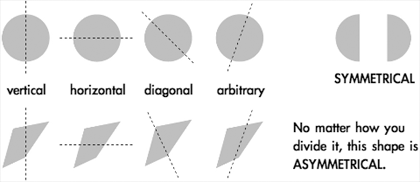
The direction of the cut is the axis of symmetry, and it can be horizontal, vertical, diagonal, or arbitrary. A circle is the most symmetrical of all objects, meaning no matter how you cut it in half the two pieces will always be exactly the same. Squares are also highly symmetrical, exhibiting vertical, horizontal, and diagonal symmetry. Ellipses and rectangles are horizontally and vertically symmetrical, but lack diagonal symmetry.
Another method used to view symmetry is reflection. Imagine holding a mirror down the middle of an object. If the reflection in the mirror completes the shape, the object is symmetrical along the axis with which the mirror is aligned.
Shapes like circles and squares gain some of their positive visual emotional reactions, like completion and honesty, from their symmetry.
Geometry
Geometry, in mathematics, is the study of shapes and their relationships, but the definition of geometric shape in visual art is more flexible. Geometric shapes are structured, often symmetrical, and often contain straight lines. The simple shapes squares, rectangles, circles, ellipses, triangles, are all geometric. While knowing all of geometry isn’t necessary to create visual art, understanding some of the principles helps to explain human responses.
People naturally tend to align objects to the horizontal and vertical. This is based upon instinctive interpretations of the world around us, where gravity holds objects “flat” to the earth’s surface. The horizon, where the earth meets the sky, is a long horizontal line when seen from a standing position with a clear view into the distance. These instinctive visual interpretations make horizontal alignment the strongest method of visually arranging objects. Vertical alignment (90° from horizontal) is also a strong method, but not as strong as horizontal.

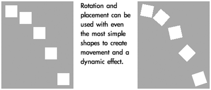
Because of their straight lines, symmetry, and comfort, rotating squares and rectangles from horizontal/vertical alignment can create dynamic effects. The visual reaction to the object changes based on the amount of rotation and whether the angle is arbitrary or more rigid 30° and 45° increments. Shapes of all kinds with right angles (90°) share visual stability, but that can be changed with rotation.
Being simple or geometric doesn’t mean a shape isn’t a powerful tool. Placement, scale, and rotation of simple and geometric shapes can alter the stability and predictability of the original shapes and thus increase their complexity. Even the circular effects of ellipses can change when rotated.
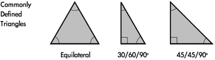
Triangles can be of any shape or size, but there are three three specific types of triangles that are geometrically defined and used most often. Equilateral triangles are visually the most “complete” triangle, because all sides are the same length and all angles are 60°. This gives equilateral triangles some of the same simplicity and “honesty” that is interpreted from squares.
The two other commonly used triangles are a 30/60/90° and a 45/45/90°, both named from the angles used to construct the shape. The 30/60/90° is one-half of an equilateral triangle, and the 45/45/90° is one-half of a square, cut diagonally.
Parallelograms combine some of the psychological stability of squares and rectangles with the same dynamic effects and movement seen in triangles. Increasing the “slant” or “shear” of the parallelogram makes the dynamic effects more triangular, while lowering distance of the “shift” can create effects similar to rotating squares and rectangles.
The effects of all other geometric shapes, including other polygons, can be predicted by how they resemble the basic shapes. Use the same techniques for predicting reactions to complex shapes for interpreting polygons. For example, an octagon shares many elements with rectangles but also creates a circular effect.

Notice the “painful” feel to the two right stars. As the multiple “triangles” in the polygon become thinner, they suggest a pointy or cutting edge. It is important to be aware of the emotional reactions evoked by shape.
Gestalt: Similarity

Gestalt: Closure
Humans tend to visually close a space by completing a contour and ignoring gaps in the figure. When something is left to the imagination, people tend to find visual images more interesting than when the entire image is “complete.” People naturally fill in the missing information.

Natural
Natural shapes are usually complex and most often represent real world objects. Because the real world is rarely perfect, natural shapes are more irregular, asymmetrical, or random than geometric shapes.

Perfect symmetry can create an unnatural, conservative or even stagnant appearance. Even slightly asymmetrical shapes can create more visual interest by allowing the viewer to subconsciously discover symmetry instead of having it perfectly defined. This can make natural asymmetrical shapes feel more dynamic and spontaneous.
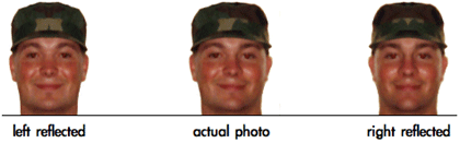
A good example of natural variation of symmetry can be found in the human face. Even with many facial features balanced in pairs, there is variation between the placement and shape of the features. In some cases, one half of a person’s face reflected to create a symmetrical whole will become an entirely different and unrecognizable person.
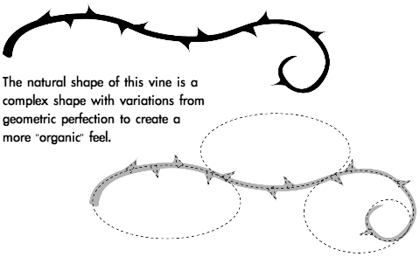
Tearing a piece of paper instead of cutting it results in an irregular edge with many variations, even if the overall rip is straight. Simple and geometric shapes can be made more natural, visually complex, and less monotonous by changing the outline of the shape. The same techniques used with line for a more natural effect can be used with shape. Adding breaks in the shape, randomness and variations, or “notches” to their outlines can all make shapes more natural and “organic.”
Abstract
Abstract shapes are images used to convey concise meaning or identity without the use of written language. Abstract shapes may be universal to all people or culturally based, and are often stylized natural shapes. Many signs, icons, and logos use abstract shapes.
Abstract shapes are often silhouetted and exaggerated to focus on recognizable shape rather than being realistic. The silhouettes and lack of detail make them easily understood from a distance and by people with different cultural backgrounds. Because most abstract shapes are used to communicate, they must command attention, convey a clear and simple meaning, and command respect. When abstract shapes are used for signs, they must also give adequate time for proper response.
The interpretation of many shapes is cultural. Octagons mean stop, especially when combined with the color red, but that same meaning doesn’t apply in countries where stop signs are not shaped as octagons. Stars and star-bursts are used to emphasize and identify “new and improved,” but this is another cultural meaning through repeated use in mass communication and advertising.

The most universal symbols are based upon nature and easily recognizable human shapes and tools. Most people, regardless of background, can recognize a stick figure as a person or the silhouette of a wave or a bird because these are abstractions of natural shapes they have experienced in the world around them.

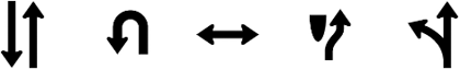
One of the most basic abstract shapes that is taken for granted is the arrow. Combining the effects of triangles and line, arrows are used to illustrate and indicate movement. Because of this universal visual interpretation, arrows are used worldwide to control movement of people and their vehicles.
Cultural symbols can evolve to become universal symbols once their use saturates a majority of societies through the world. One hundred years ago the shape of a car or bicycle might not be recognized by most people, but since these forms of technology have influenced people across the world they are now more universal.
Because of their widespread use in electronics, triangles can mean play, action, and next. Triangles are also used to represent stability, a cultural reference to the pyramids. They are also used for beacons, arrows, and pendants, and can symbolize the Christian principles of the Holy Trinity and the unifying concept of three.

The “power/on/off” symbol is a combination of the 0 and 1 logic expressions of true of false. This symbol is not yet universal, but it is possible to watch it change from something only recognized by the computer-literate to mainstream use. This icon is now used on many computers and electronics, and many people are already unaware of the logic expressions in the symbol and accept it as an abstract shape representing the power switch.
Abstract shapes are often used in logos by marketing and advertising to create brand identity. People in every country recognize certain shapes with products, the best examples being the logos for Coca-Cola and Pepsi. Regardless of the language, almost anyone can pick out one of these products. Effective logo design often uses abstract shape to create a universal product identity that transcends language and other cultural barriers.

Copyright © 2003 Andrew Kator, ![]() akator@atpm.com.
akator@atpm.com.
Also in This Series
- Part 8: Pattern · February 2004
- Part 7: Type as Shape · January 2004
- Part 6: Color Science · December 2003
- Part 5: Shape · November 2003
- Part 4: Line · October 2003
- Part 3: The Illusion of Depth · September 2003
- Part 2: Using Color · August 2003
- Part 1: Using Value · July 2003
- Complete Archive
Reader Comments (17)
I like this article. I paint, and I am going more toward abstract art. Do you know where I can find more complex shapes and their names? Such as triptych.
explained in most profound manner.
There are many factors that can affect your decision, including not only location but shade, color, and any other "objects" in your layout (including text, graphics, and anything else on the page).
this page is very helpfull
Thank you to share
moyasser777@hotmail.com
However, I need additional indepth information and have been searching for the basics of human recongition of shapes and what shapes tend to gain attention the quickest.
I had read in the past that the triangle tends to command a persons attention quicker than the other basic shapes.
I ride a motorcycle and have a triangle of lights up front. In my experience, other motorcycles that have this arrangement of lights always draw my attention the quickest, thus the reason that I have the triangle of lights.
As I have instructed motorcycle skills in the past and currently developing a skills/survival presentation, I needs facts supporting my information because I do believe that this arrangement is more visable and commands attention faster than other lighting arrangements.
Can you confirm on the human reaction to noticing one shape quicker than another or point me in the right direction to obtain this information?
Thank you,
Cds
Responding to Charles' point, could it be that the triangle of lights is highly visible simply because the shape is so different from the rest of what we "see" on the road? Most vehicles are square or rectangular when viewed from the front, and most lights are round. I notice my vision is drawn to those new headlights we see on some European cars, which have a linear arrangement of small lights instead of one headlight.
Someone told me once the main reason on-road cyclists/motorbikes are at risk is that car drivers' minds are expecting to see big boxy things on the road, not skinny vertical lines, and that's why even well-lit highly visible bikes sometimes don't register in drivers' "vision". Since there is too much to see in our field of vision, our mind saves effort by picking out the familiar and ignoring the detail. This article backs all that up.
Add A Comment