Software Review
Comic Life for iPad 1.1.1

Function: Make comics on the iPad.
Developer: plasq LLC
Price: $5
Requirements: iPad with iOS 5.0.
Trial: None
Having recently reviewed Comic Life for Mac, I was curious about Comic Life for iPad when I stumbled upon the iOS app. What functions does it inherit from its desktop-bound sibling? How would my iPad-created comics be shared with the world? Would I be able to edit the iPad comics using the desktop version and vice versa?
Let Us Make Comics, the iPad Way
When you first launch Comic Life for iPad, you are taken for a tour of the app’s basic functions, which is a good thing because unless you’ve already used other apps to create content on the iPad, the transition from Mac OS X on the desktop to iOS on the iPad can take time to adjust. The Comic Life for iPad interface somewhat resembles that found on the Mac version, although the touch interface makes all the difference. Probably both to save on screen real estate and to have a clutter-free environment, most of the controls found in Comic Life for iPad are located in the upper right of the screen. Depending on the graphic element you select, the few controls offer up the gadgets applicable to the objects.

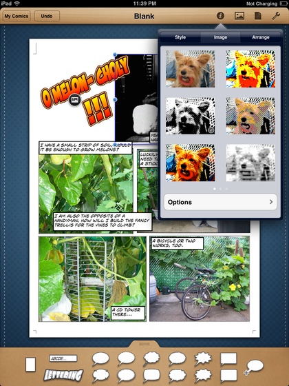
Most of the tweaking of photos and such is to be done with the controls in the upper right.
Based on my experience with Comic Life for Mac, I expected to be offered a set of fun templates to choose from, but none were found. I went ahead with a blank template and chose the usual humdrum templates, which are just a bunch of rectangles in various sizes. Luckily, upon further poking around with Comic Life for iPad, I noticed that the next available template barely shows on the right side of the screen. Instead of a window full of templates, you just have to scroll horizontally to see the templates. While there are not as many templates as found in Comic Life for Mac, there are enough to get you up and running. Even my favorite template, Road Trip, is present.

There are fun templates to be found; you just have to scroll horizontally to find them.
Photo Input
Whether you chose a blank template or a fun template, the next part of the process is the same. Into the panels you would place photos, add speech or thought bubbles, captions, and lettering—only you have to do so through the touch interface. Instead of dragging and dropping a photo into a panel, you would first select the panel, find the photo, then tap the photo. For a first-generation iPad, the only source of photos is whatever is found in the iPad’s photo library. Note that the photo library does not only have photos synced from a Mac but also screenshots and images created in other apps, such as Doodle Buddy.
With an iPad 2 you have the extra option of using the camera to include captured photos. I do not have an iPad 2, so I can only say that having the camera opens up an almost endless source of photos. Lastly, you also have a small collection of symbols to spice up your comic creation. In the sample comic that I made, you can find some gold stars in the next-to-last panel. If you are so inclined, you can also make your own shapes. After some experimentation, I made the check mark seen in the last panel. The tool is actually quite powerful, as you can add control points, smooth out sharp corners, and more.

There are not too many shapes, but if you have the skill and patience you can make your own.
While reviewing Comic Life for Mac, the most welcomed feature I found was being able to have multiple pictures in a panel. I am happy to find that Comic Life for iPad has the same capability even though the process is different. With Comic Life for Mac, when you drop another photo onto an existing one in a panel, you are prompted to decide whether to neatly replace the first photo or simply slap the new one on top of the old one. Since there is no drag-and-drop with Comic Life for iPad, to overlay another photo atop an existing one, you would just touch some area outside the panels and insert a photo there, then move it into place afterward. To precisely replace a photo, you would select it, then tap again to bring up its context menu. Personally, I would just delete the photo and insert a new one.

Tap a photo to bring up a menu of what you can do with the photo.
Once you have your photos in position, you can carry out some rudimentary photo processing. You can also add a border and shadow, with both properties having more settings you can tweak.

Some simple effects to spice up your comic. I used the black-and-white effect to indicate the past tense of first panel of my sample comic.
One thing I quickly learned is that my photo library needs much more organization. Comic Life for iPad uses the standard list box for photos, with folders and their albums listed first, followed by events. There are just too many items to scroll through! For the sample comic, I did group the photos I needed into an event, but it was still much work scrolling to the bottom to get to it. In the end, I moved the event to the top of the list, although I now know it is best to create an album with the photos for the project, place that album in a folder, then move the folder to the top of the list. All those steps are to be done in iPhoto, on the Mac, of course.
Text Me
A good comic has more than just a bunch of pictures. It has captions, bubbles, and lettering that together with the pictures tell the whole story. Comic Life for iPad provides all these text gadgets in the well at the bottom of the screen. Again, using the controls in the upper right, you can customize your texts by changing typeface, point size, justification, etc.
As a font lover, I was glad to see that Comic Life for Mac comes in only one version with many fonts. There is no deluxe version, and all the extra styles and fonts are already included. To my pleasant surprise, Comic Life for iPad too has all those fonts, including the few decorative or dingbat fonts. I certainly can use more dingbat fonts to supplement the shapes collection.

Adjust typeface, point size, style, etc. from the same controls on the right.
Lost in Transition
Not every feature in the desktop version comes to the iPad version. You cannot group objects so that they can be moved together. On a Mac, grouping usually involves clicking an object, then holding down the Shift key and clicking the next object(s). The two or more could then be resized or moved as one object. Sometimes I can be a perfectionist and want every panel lined up properly. On the iPad, I will just have to let things be. Not having grouping is not a big deal as I do not use the function that often.
Share the Laughter
Making comics would not be so enjoyable if you could not share the final products with friends. Comic Life for iPad takes care of our desire to socialize by letting you send the comics via e-mail as JPEG or PDF, send to Facebook, or print out on paper. You can also add the comic pages as individual pictures to the iPad’s photo library. Sync your iPad, and now you have a backup of the comic on the Mac. However, I would love to be able to transfer the comic file itself to the Mac for editing. I would use the iPad to hash out some ideas then sync the draft to the Mac, all in a more familiar environment with mouse and keyboard shortcuts to speed up the work.
In case you are curious what my sample comic is all about, you can find them at the end of the review.
Last Panel
If you want to create content on the iPad, Comic Life for iPad is a Very Nice app to use. With the new fun templates, you can create not just comic books but also greeting cards, travel reports, and posters. While constrained by the touch interface, Comic Life for iPad still lets you do most of what you would normally do with Comic Life on the Mac. It would be nice if the comic files could be synced to a Mac then edited on the desktop, but I consider this a wish-list item.


Reader Comments (0)
Add A Comment