Software Review
Caliander 1.0.2

Function: iCal replacement with linear timeline display.
Developer: Little Maruader
Price: $19
Requirements: Mac OS X 10.6.
Trial: Fully-featured (30 days)
I was intrigued by the calendar program Caliander. I wanted to try it. Now that I have done so, I confess I don’t understand it. Nonetheless, it might be for you if you find its unique user interface helpful.
Caliander offers a different means for visualizing information. Basically, it rotates iCal 90 degrees. iCal presents information vertically: the lower an item is, the later it is. Caliander presents it horizontally: the further right an item is, the later it is.
But Caliander also stratifies the information vertically. The reason is apparent. If the time line it used just ran from left to right, earlier to later, it would stretch out too long for even the largest monitor. So entries are bars running left to right through time, and then top to bottom. An individual item has a length correlating to the time amount of time allotted to it (note the compression feature that is available), and groups of items appear top to bottom. So more items can be displayed at once than would be the case if everything were strung out along a single dimension.
As might be expected, it is easier to comprehend visually than verbally. A glance will show the differences, especially if placed adjacent to iCal; the trouble is a glance isn’t sufficient to take in what the data actually shows in all its detail.
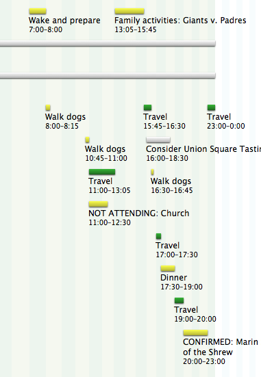
This is a moderately busy day when my nephew was visiting town: the main events were a Giants baseball game and Shakespeare’s Taming of the Shrew at the Marin Theatre.
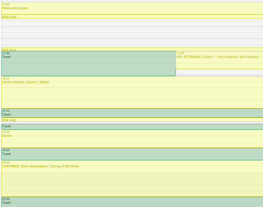
This is the same day in a conventional iCal Day view.
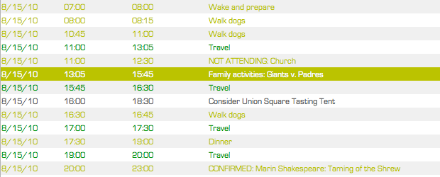
This is the same day in BusyCal List View.
It has one other “trick” (the developer’s word, not mine). The perceptual log mode, which is optional, compresses the future. According to the product Web site, “This means you’ll see today’s schedule in great detail, but still be reminded of all the things coming up in the next couple of days.”
The program does what it claims to do. But my reaction is that I don’t need that thing done. As I tried to use Caliander, I concluded I could not adapt. Perhaps it’s me, not the program.
Here is background. I use BusyCal and iCal. I use BusyCal to sync with Google Calendar, and I use iCal set to a different time zone when I am on the road. I have about a dozen different calendars in active use, all color-coded, so I am able to distinguish between work, professional activities that are not part of my day job, my personal life, social occasions (meaning my wife is involved as well), and so on. More than a dozen people have read-only access to these calendars, two people aside from me have write access, and my wife needs to see everything but wants to be able to switch off those items she is not participating in. In a typical day, I have a dozen appointments, and there is often travel time between them, meaning it is not abnormal for a 24-hour period to contain as many as two dozen entries. Beyond that, I keep track of a number of events that I am not attending but need to know about, both because they relate to my responsibilities (e.g., a presentation I’d like to appear at, in order to greet the speaker, if a moment frees up) and also out of interest (e.g., my college friend’s puppet show is in town). All this means my calendar is packed, and it fills up weeks in advance.
Accordingly, when I consult BusyCal or iCal or Google Calendar, I am trying to do one of two things. It’s pretty simple. Either on the one hand I need to know what I am supposed to be doing at X o’clock or I am trying to find blank space representing free time in order to slot in Y event. Occasionally, I am playing with the calendar just for the aesthetic recreation; that happens rarely and, anyway, there is only so much pleasure to be had from moving around virtual blocks to form a pretty pattern.
My conclusion is that Caliander did not work well for either use. I could not read it without effort to see what I was supposed to be doing at X o’clock. I also could not see the blank space representing free time in order to slot in Y event.
To be fair, I tried for only two business days before reverting to BusyCal and iCal. I believe the reasons it was difficult were the two-dimensionality of the calendar, such that I had to read left to right and top to bottom simultaneously; and the intrusion of the words themselves, which meant that sometimes I was looking at a little speck of an event (15 minutes of travel) with explanatory text that took up much more real estate.
As I experimented with Caliander, I wondered what design experts would have to say about its look. Someone such as Edward Tufte, who wrote The Visual Display of Quantitative Information, likely would not be enamored of this format. The reason is it requires too much concentration to decipher. There is a reason that calendars look as they do. Clarity is a great virtue.
Caliander reminds me of the novelty clocks that you see now and then, the ones that display the time in base-two or with a series of colors. I never understood them, literally. I would have to look and ponder, and it’s not worth the effort when the simple goal is to determine when to leave the house.
I was also reminded of Gantt charts. If you’ve ever done project management, chances are you have seen a Gantt chart. It shows a project as separate tasks, running as bars left to right through time just as Caliander does. The relationships between tasks, whether they are sequential or parallel, can be depicted. Unlike a Gantt chart, however, Caliander shows only that time has been blocked out, and it doesn’t show how items interact with each other. Even if it could, it’s difficult to imagine a life that required such complexity for a daily task list. (If I were trying to devise a new means of showing a day, for the sake of originality, I’d do it using a pie chart corresponding to a clock. That would match another means we have of depicting time, namely using a circle. There’s an idea, for free, for some developer to try out!)
Caliander does have more to it. It allows the creation of new items using a shortcut and a natural English description. The syntax matters. It appears to put the item into the right place (meaning the right time) only if the date and time are specified at the beginning of the description, rather than the end. The shortcut also works without Caliander being open and the frontmost application.
I found that Caliander and iCal synced seamlessly. If you entered new events to one, they appeared in the other just about instantly, and edits were made with the same immediacy. Thus, you could use Caliander and iCal together.
Finally, I feel obligated to note that when I was playing around with the program, I found that trying to display dates several months in the past brought on the spinning beach ball of non-responsiveness. In general, the program appeared to be stable, but it has not reached the stage of development of BusyCal.
In conclusion, this is a piece of software that benefits from the demo mode. My advice is to download it, try it out for a bit, and see if you like the graphical user interface. The reason to buy it is the display. If it works for you, terrific. If it doesn’t, then there isn’t much of a point.
![]() Copyright © 2011 Frank H. Wu. Reviewing in ATPM is open to anyone. If
you’re interested, write to us at reviews@atpm.com.
Copyright © 2011 Frank H. Wu. Reviewing in ATPM is open to anyone. If
you’re interested, write to us at reviews@atpm.com.
Reader Comments (5)
I too use BusyCal every day, and I would not dream of using Caliander to look at my daily—or even weekly—schedule. What I do find it very useful for is roughing out time blocks three, four or five months into the future (using a calendar that I don’t have showing in iCal/BusyCal); this is something that it can do very well, but which is simply not practical in the other apps.
Seen in this light, I believe that the aesthetic objections also lose weight. I would like to see more options to customise the text that is displayed alongside the bars, but as a fellow admirer of the principles of Edward Tufte, my feeling is that the overall design is actually pretty good.
But I don't want to buy my apps from my computer OS vendor.
PE
Add A Comment