Software Review
Art Text 2.0.2

Developer: BeLight Software
Price: $40 (download); $50 (boxed); $20 (upgrade, free upgrade for purchases made since July 1, 2008).
Requirements: Mac OS X 10.4. Universal.
Trial: Fully-featured (completed projects are overlaid with the words “Trial Version”).
Art Text has a special place in my experience reviewing for ATPM. This is not only because it was the first review I wrote, but also because of a heated discussion that was started from the review. It has been almost two years since then, and I now find myself revisiting Art Text in its jump from version 1.2.5 to 2.0.2. Let’s find out what’s new with version 2 and if all the changes are for the better.
Overview
For those who are not familiar with Art Text, it is used to turn plain text into art, thus the name, although Text Art might be what English speakers expect. Starting with a word or two, you can apply textures, shadings for a 3D appearance, shadow, and strokes (also known as outlines). Within each of the many ways to enhance the text, there are more options. For example, shading appearances include plastic, glass, metal, and many artistic modes. Shadow properties that can be adjusted include blurriness, distance, and angle. When you are satisfied with the text’s appearance, you can move on to the Geometry tab to adjust its shape. There you can tug and squeeze the text, as well as rotate and warp it. If you find yourself applying the same effects and bending the text the same way time after time, you can save the settings as your own style. Likewise, if you want to quickly apply effects and make geometric changes, there are over 200 pre-set styles to choose from. Eventually you will have tinkered enough with the text; then you can export the work as an image file in PDF, TIFF, JPEG, and other formats, or copy it to the clipboard for pasting into another application.
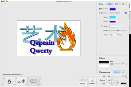
There are many effects to spruce up your otherwise plain-looking text.
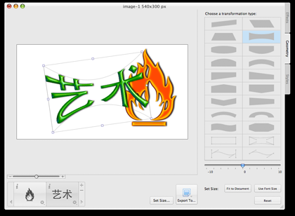
Bend and warp the pretty text to your heart’s content.
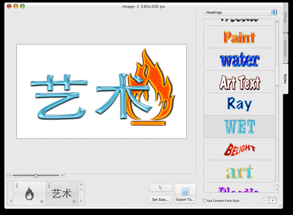
Use the canned styles to quickly make your text looks good.
Changes
The observant Art Text 1.x user probably already noticed that in all the screenshots so far there appears to be more than one piece of text in the working area or canvas. The old Art Text could at most handle a line of text, whether the words and letters remained on one line or many. Thanks to the new Layers feature in 2.x, you can now add multiple objects to the canvas, each with its own styles and so on. In the case of the first screenshot, I have three layers—the words “Qaptain Qwerty” in blue on two lines, then the Chinese characters for arts in watery blue, and lastly the flame symbol in orange. Note that the Chinese characters are just text and not a graphic element like the flame.
Like all good layers, the Art Text layers have properties like Opacity and Blend Mode. They can also be rotated and resized, much like a typical Photoshop layer. To handle the different objects, under the Edit menu you now have the plain Copy command, which copies everything in the canvas, and Copy Selected, which would copy just the selected object. Finally, you can merge the different layers into one.
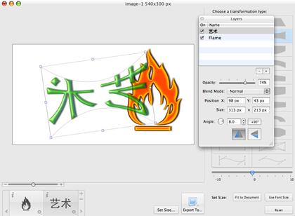
With the introduction of layers, you are no longer limited to working with one object at a time.
Less useful but a more obvious change is the Template Gallery. The very first time you launch Art Text 2, you are presented with the Template Gallery, which is nothing more than the Styles menu taken to the next level. In addition to buttons, icons, and headings, you also have logos. While the pre-built logos are nice-looking, if you are in the business of designing logos, you must be sure to put some effort into tweaking the pre-built logos to have a unique look. You cannot just take an existing logo, change one shading, and call it your own. The software may be popular enough so that some day your “unique” logo turns out to be just like someone else’s. I think of Art Text as a tool to quickly whip out a product, but with logos you have to be unique. I do think the logos can be useful for non-essential designs in newsletters or personal home pages. By the way, for those who don’t want to see the Template Gallery each time Art Text starts, disabling it requires only a trip to the Preferences window.
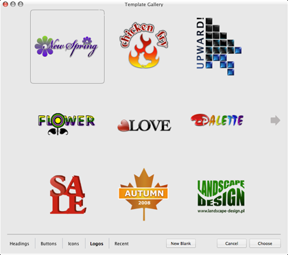
Get a quick start on your logo design. Just be sure to give it a unique look when you are done.
My personal favorite of the new features is the way styles are now presented. Earlier, they were not given enough exposure, as the Styles panel slid in and out of the main window. Only late in the review process did I notice it. In Art Text 2, there’s a Styles tab alongside Effects and Geometry. What’s more, styles are now, to borrow a term from the 1980s, WYSIWYG, short for What You See Is What You Get. With the old Art Text, you didn’t know what the style would do for you until you selected it. All you had was a name to go by. Wave and “Glow in Dark” are self-explanatory, but other styles are not. In version 2, the styles visually show you what they do. Not all of them have unique names, as a few styles’ sample text simply reads Art Text. You don’t need to know the style names, anyway; just see what you like and select it.
The source of the heated discussion that I mentioned earlier was that I couldn’t paste from Art Text 1 into other programs like Microsoft Word and GraphicConverter. Art Text only used the PDF format when copying to the clipboard, instead of multiple formats. PDF-capable programs like Preview had no problem using the clipboard, but others that rely on TIFF or PICT formats couldn’t paste. I am happy to report that I have no problem copying and pasting from Art Text 2 now. Yet another welcome addition.
Unwelcome Changes
Not all the changes are for the better. While there are now many built-in textures for use with the Fill effects, you no longer have a background picture to work with. The background of Art Text 2’s final output now is either white or transparent. I can live with this unwelcome change or loss of a feature, but there is one other change that I really want to see improved.
With the old Art Text, whenever you exported the canvas, you were prompted to interactively specify the area of the export by dragging the four edges. In version 2, you must specify the working area by entering numbers for the width and height. Even though you have the choice of specifying in terms of pixels, inches, or centimeters, I really want to be able to just drag the edges to adjust the size of the final product. I suppose that after a while I would know the proper dimensions to indicate, but it is so much easier just to set the size interactively.
Wishes
I am fond of animated GIFs and especially animated text, so when I first found out about Art Text 2’s layers feature I immediately tried to create an animated GIF. In Photoshop, you would use layers as the cells of an animation. Art Text 2 doesn’t work that way. The GIF that it exports is just a plain vanilla single-frame picture, not an animation. Perhaps in a future major version of Art Text, there could be some way to export to animated GIF or, even better, to a Flash animation.
Conclusion
Art Text 2 brings many welcome changes to something that was already great. Layers, the Template Gallery, and WYSIWYG styles are on top of the list. It is no longer an issue to export from Art Text to other application via the clipboard, but it is somewhat awkward to specify the size of the working area. If you do a lot of fancy manipulation of text, symbols, and logos, Art Text 2 makes a Very Nice addition to your toolbox.
Reader Comments (3)
Add A Comment