Software Review
The Daily 1.0.6

Function: Newspaper-like app for iPad.
Developer: The Daily Holdings, Inc.
Price: free app; subscriptions are $1/week or $40/year.
Requirements: iPad with iOS 4.2.
Trial: Fully-featured (14 days).
Perhaps your news-gathering habits are not too far from mine: I used to enjoy reading the newspaper on a regular basis, but more recently have found it to be more tedious with a tendency to cluttering my home as stacks of newsprint await my attention. I recoil at 95% of the news available on television, and find the radio only marginally better (and neither is convenient to my schedule). Thus, in recent years I’ve cancelled my subscription to the local rag, avoided TV and listened to radio when I’m in my car, and relied upon weekly print magazines such as Newsweek or US News & World Report, supplemented by RSS feeds to sites such as The NY Times and Slate.
Perhaps, too, you’ve recently found yourself where I have: lacking a paid subscription to The NY Times, my per-month article limit (based on new policies) is quickly maxed-out. That, in tandem with the great percentage of local NY news in the RSS feed—since I’m not in New York, and thus find few of these pieces of real interest—has led me to question whether the Times still deserves a place in my RSS reader. As Merlin Mann recently quipped via Twitter, “The New York Times will ALWAYS be this country’s newspaper of record for the first few days of a given month.”
Slate, while free, doesn’t quite hit the news as I want it, either: it is good for broad-stroke coverage of issues and events, but often leans more toward editorial and opinion than “objective” news (and yes, I realize that all news coverage is subjective). And Newsweek, my current subscription of choice, is great—but lacks the attention to daily happenings in a timely (read: the next day!) manner.
What to do? Where do I go for news?
A 21st Century Solution
Enter The Daily—a newspaper, if you will, designed exclusively for Apple’s iPad. Introduced in February, 2011, by Rupert Murdoch (the media mogul behind News Corporation, with holdings in book publisher HarperCollins, 20th Century Fox, The Wall Street Journal, The New York Post, Fox Broadcasting Company, and literally hundreds of other newspapers, magazines, and television and radio stations) as a new venture into journalism and news reporting, The Daily is, as its name/title suggests, a daily source for news.
The Daily offers seven sections in each new issue: News, Business, Gossip, Opinion, Arts & Life, Apps & Games, and Sports. Combined, they represent about 100 pages of new content every day. Furthermore, updates through the day are frequently available, so if you’re following a particular story, you may find new content in the evening to flesh out what was missing or vague that morning (insofar as that content was unavailable before; I don’t mean that description as a comment about the quality of reporting, but about the inherent limits of it).
The app—and its content—is, as The NY Times described it, one-part Web site, one-part news magazine, and one-part newscast, and it does a surprisingly good job at combining these. The effort’s success is clearly due to the vast resources of News Corp.’s empire, for without the content availed to them from the various sources listed above, it would be impossible to envision how a startup like The Daily (as an organization, not as an app) might pull it off.
But with the resources at hand, they do pull it off. And if you’re like me, it’s a welcome option.
What They Get Right
First, an overview: The Daily is rich in content, chock-full of beautiful color photographs as well as video, audio, and interactive 3D illustrations. A lot of this media is embedded into articles, meaning that more “story” is offered than simply the words on the page. This is a prime example of how The Daily takes advantage of News Corp.’s wide-reaching resources.

Tapping the different photos in the sidebar brings them into the main window.

Tapping the red dots brings up different information about each item.
The interface is also nicely designed, and navigation is simple and intuitive. Anyone who has made use of Web sites and is familiar with the conventions of many iOS apps will find The Daily follows interface guidelines to an adequate degree; there are no special tricks or gestures required to find your way around. Once the app is open, readers can get to the content they want without any hassles or delays.
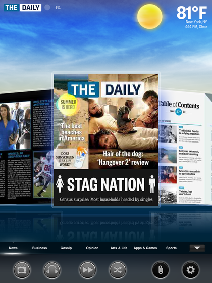
The opening screen to The Daily—easy to navigate.
As for price, I find $1 a week (theoretically, 14¢ an issue) to be a fair price. At some point, I may opt for the greater savings represented in the $40 annual subscription (reducing the rate to a theoretical 11¢ per issue), but until then I’m happy to renew on a weekly basis. (By comparison, incidentally, a subscription to full content through the NYTimes app costs $1 a week for the introductory four weeks, then jumps to $5 a week after that!) What’s great also is that, if you skip a week entirely, you aren’t hit for the $1; in the weekly subscription model, you essentially re-subscribe every week, so if you go on vacation and choose to ignore the news for a week or more, it doesn’t cost a dime.
Now, more specifically: I appreciate The Daily’s coverage of national and world events, business, and cultural matters, and find the articles generally to be of adequate length. Some have commented on their brevity as a mark against them, or even of inferior reporting; to the contrary, my experience has been that the articles largely cover the material adequately, if sometimes only just. True, you won’t find the longer exposés or detailed pieces typical of traditional newspapers—but two things mitigate this as a complaint: first, today’s reader (and especially the “online” reader) gives far less attention to long articles, even to the point of shaping the way most Web sites determine content; and second, there’s always more information available online, should the reader desire it (and The Daily will sometimes refer to such).
I also love the way The Daily handles sports coverage. There is a truly broad appeal, with good attention given to the “Big Three” (football, basketball, and baseball) at both professional and college levels.
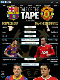
Great info-graphic about current soccer events; what you can’t see is that it scrolls down almost another page’s worth.
But there is also well-deserved focus on less-mainstream sports such as soccer, tennis, boxing, and even cricket, when current events require it. A nice touch, also, is the capacity to set up favorite teams and keep a particular eye on their performance.
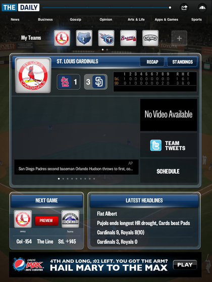
My favorite teams are easy to check on, thanks to the customized sports setup.
The Daily also includes a decent crossword puzzle and Sudoku in every issue, which will help many readers of print newspapers make the transition easier. And these tie in with Apple’s Game Center, in order to offer seamless statistics on completion times for users. Readers will also find local weather information, quick bits on “news of the weird,” and other fun surprises.
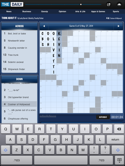
I like the crossword’s easy interface and automatic advance to the next clue.
As a nod to the interests of typical iPad users, The Daily also includes pieces on games and gadgets. Both PC Games and iOS games are reviewed regularly, and articles about new mobile phones or iPad accessories are common as well. These, while unnecessary, punctuate the attention given to answering the “needs” and wants of their target reader.
Finally, while archives are not explicitly available, The Daily offers options for “clipping” particular articles and also posting them to Facebook and Twitter (with comments). A clipped article can be read indefinitely after it has been saved, allowing readers to scan the content if needed and return to articles days or weeks later.
Not So Much
While The Daily is obviously a capable app and news source, it isn’t without its foibles.
For starters, the app takes a long time to load. This is, in one sense, understandable: the amount of content that must be downloaded is not insignificant, and the intention is apparently to provide a seamless experience once it is opened—which means that all content must be downloaded before it will grant access to it. I get it, but still I roll my eyes every time I have to wait. My hope is that the folks behind the app itself will take some cues from others who face similar problems (the OmniGroup, with OmniFocus for iPad, comes to mind) and build in ways to begin accessing content immediately while continuing the download in the background.
This is the screen that you’ll watch for 20–30 seconds as the content loads.
To make matters worse, The Daily doesn’t work with iOS’s multitasking option. Thus, if I leave the app to, say, e-mail a quote or link to someone, I have to wait for the app to load again when I return. Given the long loading times, I regularly wish for this option to be available.
With regard to content: personally, I could do without the gossip section, and my conviction is that everyone else could too. I just don’t care about what this celebrity wore on some colored carpet at the entrance to an event, or what so-and-so looks like in the grocery store parking lot when she is six months pregnant.
In its stead or in addition, I would far prefer something that highlighted local news, even if briefly. I could see this fleshing out in one of two ways: echoing what USA Today has offered for years, a single-paragraph touching briefly on a local story from each state would be nice. Or, making use of the personalization allowed via The Daily’s interface, one or more local regions could be designated and specific content provided. This seems like the final missing piece to making The Daily a real option as everyone’s primary news source—well, that and the fact that some people haven’t given in and purchased an iPad.
The ads in The Daily are also tedious. Ad-buyers must love the options to embed rich media into their ads, and I’ll grant that they do a good job of making use of this—so much so, that they inevitably bog down the experience. Every time I get the grey circle animation (the iOS equivalent of the Mac’s “beach ball”) it is always because an ad is loading. I won’t begrudge them the right to sell ads to support their product, but I’d be grateful if the editors at The Daily imposed a bandwidth restriction on ad-makers, forcing them to harmonize their ads with the overall flow of content.

Usually, the only time the app “beach-balls” on my first-gen iPad is when an ad is loading.

When the ads come up, they are pretty cool; this ad for Land Rover is a common one, with the same kind of interactivity of many of the other graphics.
Finally, a scaled-down iPhone version would be great! I can’t see why this would be too difficult, but it would certainly extend their reach with existing and new subscribers.
In Summary
I like The Daily a lot and find myself reading it most days. There’s a lot to like, and the aspects that I dislike are certainly not deal-breakers. News readers looking for long, deep, and exhaustive pieces will probably still prefer The NY Times or its like, but folks like me will do well to give The Daily a chance.
Reader Comments (3)
Add A Comment